
Welcome to the Friday Website Review. In honor of Halloween, I went searching for a spooky or horror related city name in which to find a candidate jeweler to review. Sadly, populated places like Devil's Peek, Hells Corner, and Pumpkinville are nothing more than tourist traps in the middle of nowhere with nothing more than a general store.
I then tried a search for Haddonfield, Illinois, the city portrayed in the Halloween movie series. But as it turns out Haddonfield, Illinois is a fictitious place named after the movie's co-screenwriter and producer Debra Hill's hometown of Haddonfield, New Jersey.
So after all that, let's visit Haddonfield, New Jersey for some website trick-or-treating by starting the search with the phrase "jewelers in Haddonfield, New Jersey." Here's the results I saw in Google:
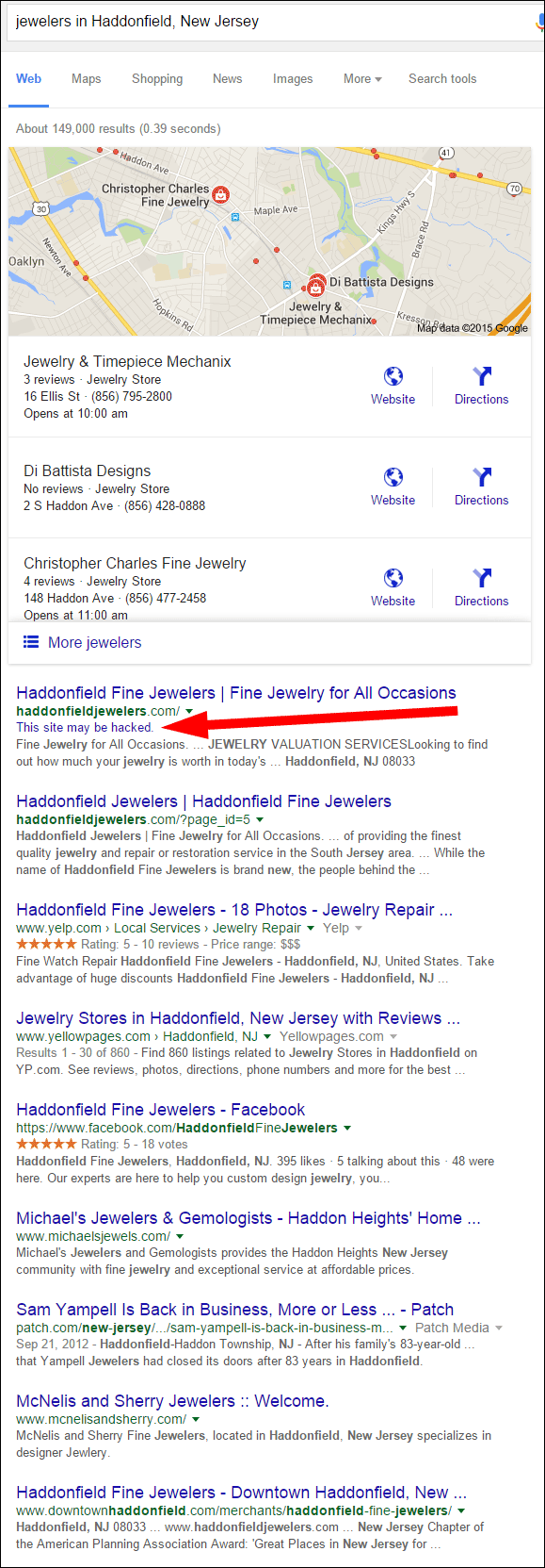
Haddonfield Fine Jewelers dominates the organic search, and I might be tempted to use them as my review candidate, however the SERP warns that "this site may be hacked." Honestly, I'm not really interested in being tricked this Halloween into having a virus downloaded onto my computer, so I'll choose the first jeweler in the Google Local 3-pack...
Jewelry & Timepiece Mechanix with the website:
http://www.jmechanix.com/
First Impressions
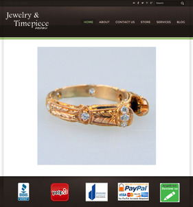
Here's what the home page looked like when I first visited:
(click to enlarge)
This home page is pretty underwhelming. I don't know what to click on next, in fact the bright red Yelp logo captured my attention first. I resisted the urge to click on Yelp and, instead, went to the About page shown here:
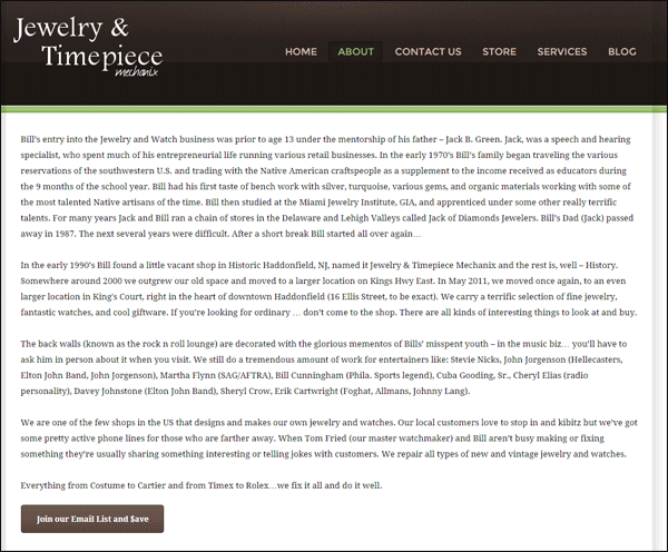
Once again, a very underwhelming page that I don't really want to read without the help of pretty pictures.
Thankfully, the Services page is a little more interesting to look at:
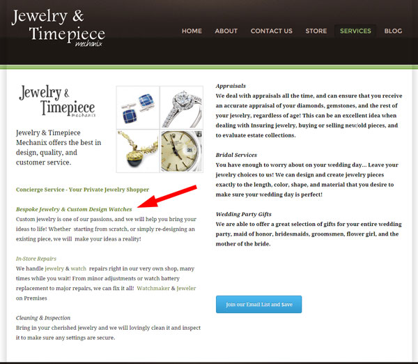
The layout of the Services pages is interesting to look at and broken up into single sentence descriptions of each service. This is much more pleasing than the boring About page. The red arrow I'm showing in the above image indicates a broken hyperlink to the page:
http://jmechanix.weebly.com/bespoke-designs---watches--jewelry.html
It looks like Mechanix used the temporary "jmechanix.weebly.com" domain while building and testing their website, but never went back to change those links to "www.jmechanix.com" once the website was published. This is a common failure of newly published websites. After months of preparations, it's easy to forget the small things that you set up during the construction of the website, like these links.
Mechanix could have avoided this problem all together by omitting the domain name in the first place. Specifically, instead of using the link
"http://jmechanix.weebly.com/bespoke-designs---watches--jewelry.html," they could have just used
"/bespoke-designs---watches--jewelry.html" instead.
Email Signup
I decided to test the email signup invitation since it appears on several pages. Here's a screen grab of the signup form:
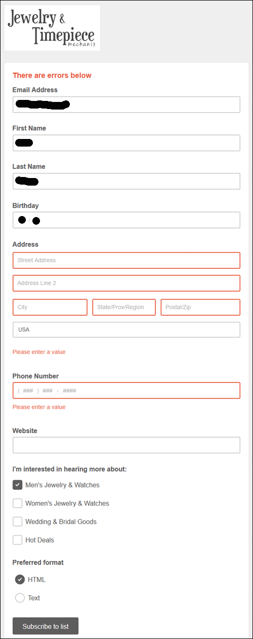
The red boxes shown above indicate that the form blocked my signup because I didn't enter my street address. I'm not sure why all their buttons say "Join our Email List and $ave" when in fact you have to give your full street address, not just the email.
The better approach here is to just mandate a first name and email address, and leave the rest as optional. Speaking of mandatory and optional, the signup form didn't clearly indicate which fields were required until I submitted it. I find it a lot more user friendly to have some type of required field indicator.
Online Store Catalog
I admit that I was a little surprised when I found the online jewelry catalog page. At first glance, I had assumed that "STORE" link in the main navigation would give me details of the retail store, after all, my search was for a local retail store. Instead, it brought me here:
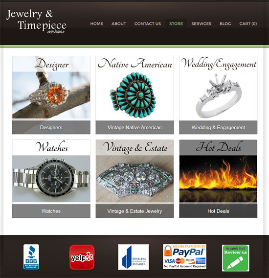
Words and phrases like "store," "jewelry," "online store," and "online catalog" often cause a little confusion. Which one do you specifically mean for what purpose? Do your best to use unambiguous words in all your navigation links.
I was further surprised when I drilled down into one of the product detail pages to see this type of setup:
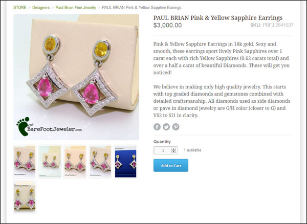
The above screen grab shows several product photos, a clear product title, a SKU, and a good description that I usually never see on a retail jeweler's website. I congratulate them on this setup, it's one that every jeweler should strive for.
However, even though there are several photos for each item, they are all average quality at best. The lighting is not giving me a true indication of the jewelry colors, and none of the shots are in full focus.
Online Reviews
Every time I clicked a new page on the site, my attention was still being drawn to the Yelp icon in the footer. I gave in and clicked on it to see this:
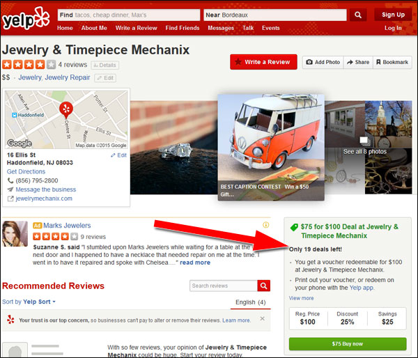
At the time of this writing, Mechanix had claimed and filled out their entire Yelp profile, including uploading 8 photos. You can also see in the above screen shot that they are using one of Yelps built in deal features offering a voucher $100 for the price of $75.
I was also pleased to see that the business owner took the time to reply to every review as shown here:

Most business owners get caught up only answering the bad reviews, leaving the happy customers to feel left out. You should always take the time to reply to all the reviews, good and bad.
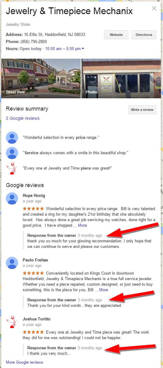
I went back to check the reviews on his Google account, and sure enough, there's a reply to each review there as well. Shown here:
Conclusions
What we learned here today is that the bad first appearance of a website, and poor navigation, might discourage a customer from digging into the good content found on your site. Positive online reviews will lead customers to you, but once they get to your site, you have to satisfy them with every page and every click in order to keep their attention. Boring pages and broken links lead to high bounce rates and dissatisfied website visitors.
FTC Notice: I randomly choose this website and won't be telling the retailer jeweler that I'm doing a review. Unless someone else tells them, they will only find out about this review if they examine their Google Analytics and Google Webmaster Tools. I'm not doing this to solicit business from them, but rather as an educational exercise for everyone. This review is completely impartial and all my comments are listed in the order that I discovered them.


