
This is the Friday website review edition of the Daily Golden Nugget. Each week, I dig down into a random retail jewelry store website to discover the good and bad of what they've done with their online identity. The goal is to learn something that you can also apply to your own online identity.
This week I've decided to search San Luis Obispo, CA for my candidate jeweler. I'm starting my search with the phrase "wedding rings San Luis Obispo, CA." This is the Google SERP that was returned:

I see that Kevin Main Jewelry has the 1st place in the Local Pack and second in the organic results, so I'll choose them this week. Yelp has 1st place in organic results, but I always skip directory and review sites.
The Kevin Main Jewelry website is http://kevinmain.com/
This is what it looked like when I visited:
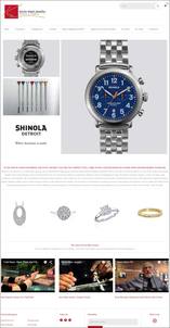
(click to enlarge)
Kevin Main's Home Page
Although that's what the full home page looked like when scrolling up and down, this is what actually how I viewed the home page when I landed on it:
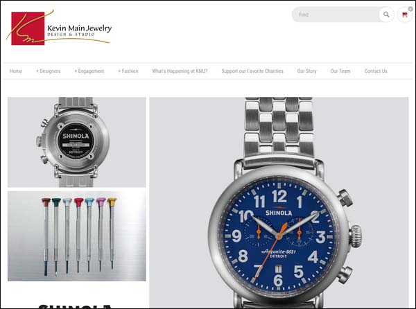
Although my first impression of this site is that I do like the design, I don't like the main image on their home page. In addition to it being a rotating image, it's also too tall. The above screen shot shows how the image is cut off at the fold.
Although the new trend in websites is to have an infinity scroll of information, I have plenty of heatmaps showing how the top of the page is still the most important part of the page. You must give users a clear incentive to scroll down. In this case, the logo of the watch company was cut off. They should reorganize this photo so the logo is above the fold.
On the other hand, I do like the overall layout of their home page because it has introductory information about them, photos of product, and videos.
Email Signup
Being the curious analyst that I am, the first thing I decided to do was sign up for their email newsletter that you see in the footer.
Unfortunately, their email signup box is broken. Instead of signing me up for their email I was routed to the error page you see here:
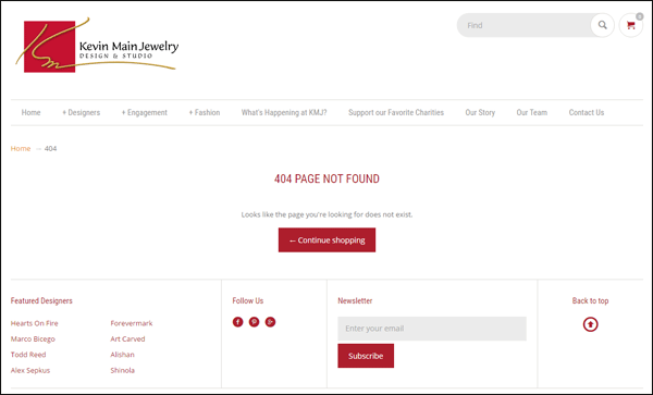
Issues like this often happen on websites when you don't perform periodic testing of all pages and features. There's no telling how long this has been broken and they probably think no one is interested in signing up for their email list.
Product Catalog
I was very pleased with the setup of their product catalog because they took the time to photograph every item and write detailed descriptions.
Here's a screen shot of one of the products:
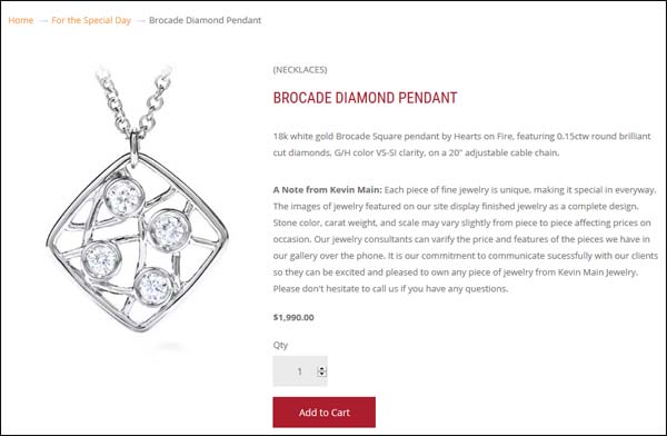
Notice how they gave the product the name "Brocade Diamond Pendant" and they wrote a full description of the item. There's also "A Note from Kevin Main" that appears on every product in the catalog.
They didn't spend a lot of time writing a romantic description for their items, only enough to give the specific details of the item without using any abbreviations like RB and Dia. There are too many cases where retail stores simply transfer the descriptions from their point of sale software, including strange abbreviations and codes that only store employees would understand. Don't be that retail jeweler, write out your descriptions like you see them here on Kevin Main Jewelry.
Also, take note of the breadcrumb trail at the top showing Home - For the Special Day - Brocade Diamond Pendant. Just to be clear, this pendant appears in the "For the Special Day" product category. Google uses those breadcrumbs to better understand a website site structure, but many product catalog sites don't have them.
Their Blog
There's a curious link on their top navigation that says "What's Happening at KMJ?" I say curious because I was immediately wondering what *is* happening?
My expectation was that I'd find out about the latest upcoming event being held at the store, yet this is what I was immediately greeted with:
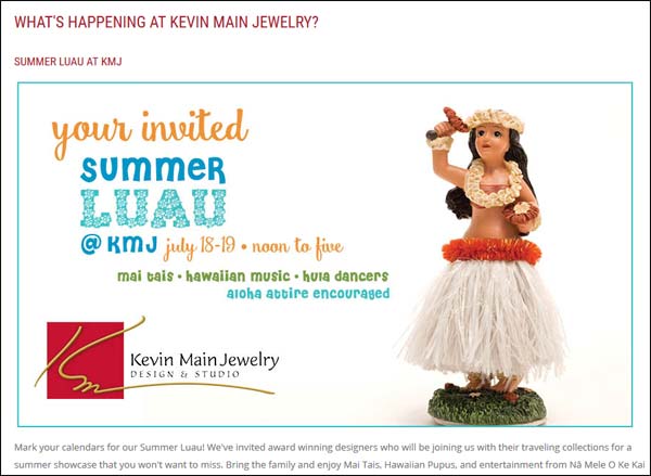
It's the end of August as I write this, yet to my disappointment the latest happening at Kevin Main says "July 18-19." I was about to explain how you shouldn't mislead a customer into thinking they will see the latest information and then keep old information on the website... Then I started to scroll down the page...
It turns out that the "What's Happening" area of their site is in fact their blog, and it makes sense to have this outdated announcement in the blog. However, a better strategy would be to change the title of the blog section to say "Blog" yet maintain another link (assuming they want to) that still says "What's Happening at KMJ" where they continue to post the upcoming information. I would change the What's Happening page as needed while also posting the upcoming event information into the blog at the same time. This new strategy should better suite potential customer expectations like I detailed here.
That's it for this week's review; I'll see you next time...
FTC Notice: I randomly choose this website and won't be telling the retailer jeweler that I'm doing a review. Unless someone else tells them, they will only find out about this review if they examine their Google Analytics and Google Webmaster Tools. I'm not doing this to solicit business from them, but rather as an educational exercise for everyone. This review is completely impartial and all my comments are listed in the order that I discovered them.


