
This is the weekly random website review where I search for a website candidate in a town near you and review how well their website is put together.
I never know what I'm going to find. Sometimes I find great sites and sometimes I find sites with a lot of problems. I do my best to write down my first impressions of the sites in an attempt to illustrate how a consumer might be reacting.
No matter what, there's always something to learn from.
To kick off the review, I'm searching for "engagement rings holland mi." The results I received back show that I'm currently stuck in another Google test. In order to make their services better, Google runs random tests with users all the time. The search results you see below are normally seen on a mobile device, not a desktop. They are streamlined for the needs of a mobile user. Right now they are probably measuring how I react to seeing a mobile SERP on my desktop.
Here what I saw:
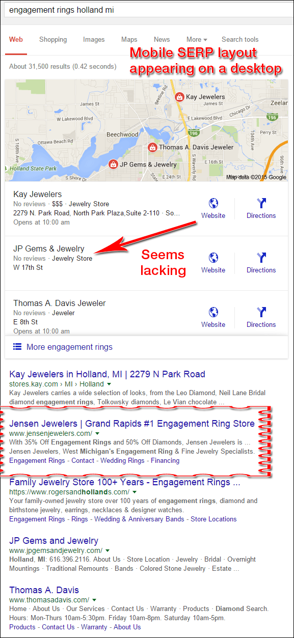
The biggest difference between the mobile and desktop SERP is that you can't easily look up more information about the retail stores. There's no way to expand their business description or to jump to their Google+ page if I wanted to. The above screen shot also shows a limitation of 3 business listings instead of the typical 7 that you see on a desktop results page.
Improving The Odds of Being Chosen
My goal is to find a local jeweler, not a chain store. Thus I always skip over the big chains, like Kay Jewelers shown first in the above list.
Something seemed off about the second jeweler's listing, so I unconsciously skipped it, and my eyes gravitated to Jensen Jewelers because their headline said "#1 Engagement Ring Store," and that's what I searched for. I will choose them as this week's review candidate but before I do...
I had to stop myself and think about why I skipped JP Gems & Jewelry. Of the 3 stores listed there, JP Gems & Jewelry is the only one without store hours listed. In this current screen format, that just seems oddly lacking.
In fact, I did a little more digging and found that JP Gems & Jewelry never claimed their business account and they never set up their Google+ page.
This is a business listing appears when you don't claim it through Google My Business:
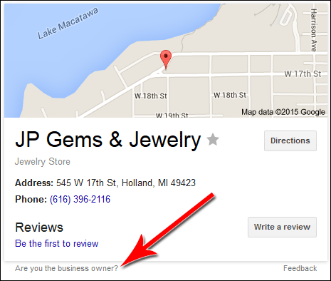
To claim the business you have to click the "Are you the business owner?" link shown above. That brings you to this next screen:
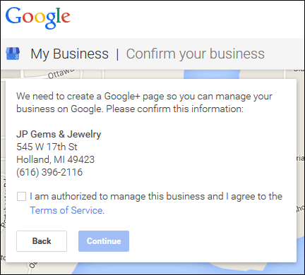
Following through those steps to claim the business require either a post card to be mailed or a telephone call from Google's automated system.
The unclaimed business is why the store hours were missing.
On with the review...
Jensen Jewelers Initial Thoughts
The Jensen Jewelers website is here:
http://www.jensenjewelers.com/
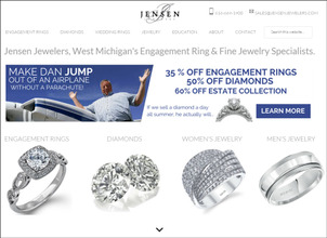
This is what the website looked like when I first visited:
(click to enlarge)
The large silly headline certainly got my attention:
"Make Dan jump out of an airplane without a parachute!"
That headline is clearly "clickbait," which is something vaguely stated but presumed so intriguing that you must click to find out more. Will he really jump out of an airplane without a parachute? Maybe the plane will just be on the ground and he's jumping into a safety net. All these questions flooded my thoughts, so I clicked the big Learn More button to see this page:
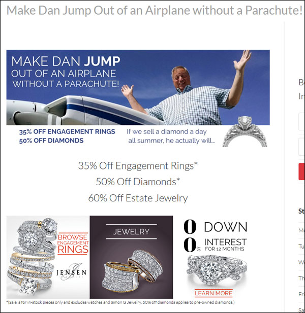
None of my questions were answered, but he is certainly getting the point across that there's a big sale happening right now with 35%, 50% and 60% off many items in the store.
There are 3 boxes below the sale announcement that invite people to browse for engagement rings and jewelry. There's also a box for financing.
I like this whole strategy he's using here. He got my attention on the home page, got me to click, and then lead me to a place where I might click further into his catalog. Let's do that... I'm going to click the "Browse Engagement Rings" box shown in the above image.
Engagement Rings Page Setup
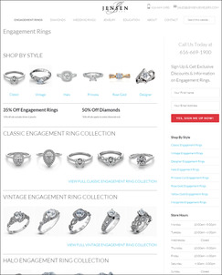
Clicking the Engagement Rings link from the top menu brings you to this page:
(click to enlarge)
I like this setup a lot. It gives the user many visual choices rather than just words and a single photo. I like the option to shop by style as it appears at the top, but then to view 5 different photos from each of the collections that they expanded a little further down the page.
I clicked on one of the ring under the Vintage Engagement Ring category and arrived at this page here:
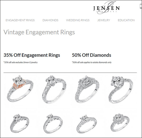
I've liked everything on this website so far, but I don't like how this page functions. I need to know what goal they are trying to accomplish on this page. Is it just to show a group of ring photos? Each of the photos is clickable, but there's no description or directions of what to do next.
In other words... They lead me right to this product catalog, but now that I'll looking at potential products to buy, they are not offering me to add any items to the cart, or inviting me to make an appointment. They've completely forgotten that the website is a tool to help them either initiate an in-person sale, or close an online sale.
I also don't like how inconsistent their image sizes are. The image sizes change as you browse through the catalog. Here are two examples:
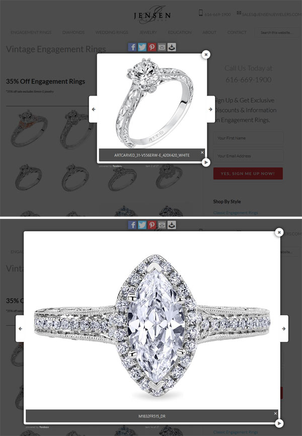
The reason I don't like it is because the user is forced to concentrate on readjusting their mouse to click the next arrow rather than concentrating on looking at the rings. This is a usability flaw that is too common on many jewelry websites.
Closing Thoughts
There's a lot happening on this site that I didn't write about. There are several other nice features, and there are several bad ones. Overall, they did a better job with this WordPress site than dozens of other WordPress sites I've seen.
They are using the WordPress Genesis theme, and it has a lot of code bloat like all WP themes have. But then they impressed me when I noticed they are also using an advanced technique of hosting some images on Amazon S3 to help increase their speed.
Quickly looking through their code I also found that they are using GetResponse.com for their email marketing and that they have Google tracking and remarketing tags as well. I expect I'll start seeing their ads following me around the internet.
Jensen Jewelers is doing a good job here, and they have a lot of fresh ideas that you could learn from if you spend an afternoon browsing through their site. The site is not perfect, but this is a vast improvement over many other jewelry sites out there right now. One thing is certain... They are putting a lot of time into their site to make it look this good.
Until next week...
FTC Notice: I randomly choose this website and won't be telling the retailer jeweler that I'm doing a review. Unless someone else tells them, they will only find out about this review if they examine their Google Analytics and Google Webmaster Tools. I'm not doing this to solicit business from them, but rather as an educational exercise for everyone. This review is completely impartial and all my comments are listed in the order that I discovered them.


