This is the Friday website review edition of the Daily Golden Nugget. I'm always on the lookout for a jewelry website we can learn from, both good and bad. In honor of my visit to St. Louis, MO this weekend I'm going to look for one of the retail jewelers in St. Louis to review.
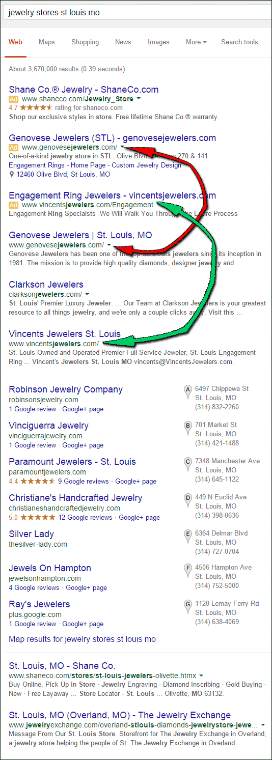
Using Google Chrome in incognito mode, I searched for "jewelry stores st louis mo." This is the SERP that was returned to me:

By the look of it, the St. Louis area has several competitive jewelry stores. Although the organic raking for Genovese Jewelers and Clarkson Jewelers had them right at the top, both of them were also paying for AdWords ads that I've indicated above.
I'm also noticing a rather unusual situation with the diversity of organic results and the Google+ Local pack. Both Genovese Jewelers and Clarkson Jewelers are not in the +Local pack at all. It's very rare that I see this happening, and it makes me think that Genovese and Clarkson have something wrong with their Google+ Page.
In any case, I'm choosing Genovese Jewelers for this review and their website:
http://www.genovesejewelers.com/.
Home Page
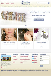
This is what the home page looked like when I first arrived:

(click to enlarge)
The home page is easy to understand. The top menu has all the appropriate categories you would expect for a retail jewelry store. I'm quite happy to see that they are using the word engagement in the top menu rather than the word bridal.
I don't like home page sliders, however they really did set up their three sliders using the best possible techniques. Specifically:
- 4 seconds per slide
- large, high quality product photo
- easily readable headlines
- brief, easily readable description
- call to action, specifically the "View The Collection" button
Clicking these calls to action buttons brings you to exactly where you'd expect.
The "Engagement" slider brings me to a landing page for engagement rings, on which I can drill deeper into 4 different ring categories.
The slider for "Stackable Rings" brings me into the product catalog, to the section showing stackable rings.
The slider for "Rings" brought me to a landing page showing the options to view diamond rings, fashion rings, or stackables.
All too often, I see home page sliders that just click to other sections of a website without any real thought of what the customer expectations will be. In this case, the slider image gave me an expectation and the next page I was brought to didn't require me to dig any deeper at all since my expectations were met.
General Website Overview
This website has a lot of good features. So many in fact that I think I might make them my poster child for an almost perfectly organized website. Some highlights:
- Useful breadcrumbs
- Good photography
- Multiple product photos
- Charitable donation information
- Videos to highlight important areas of the service they provide
- News/Blog area of their site, although they are not updating it regularly enough
- Mobile website
- "Shop by" feature to search their catalog by price or birthstone
- Testimonials throughout their site
The last time I came across a website so well put together, it turned out that they were readers of mine. I didn't find Michael Genovese Jewelers in my list of email subscribers, so I don't know if they are. Are you guys reading this?
It's more likely that they hired a really good internet agency to guide them through this process. This current website was only launched last in 2014.
Product Detail Page
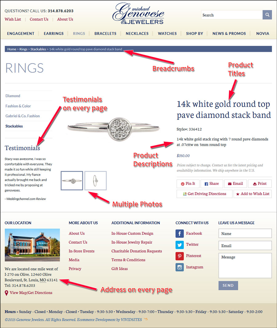
Take a look at one of their product detail pages shown here:

(click to enlarge)
In the interest of keeping things simple, I've indicated the 6 top things I really liked on this page. What I liked the most was that they included a testimonial on the page; in fact, they have a testimonial appearing on every page of the site.
They copied the testimonials from other online review sites and indicated where it came from. The above screen shot shows a review from Weddingchannel.com. These reviews change every time you refresh the page, which is a technique I've also discovered works very well.
Conclusion
By the look of it I have to assume they spent a lot of time putting this site together. What I can't tell is if they are keeping it updated. Their social media accounts are not very active and the blog on their website is a few months out of date.
The site looks great, but they need to put more of an ongoing effort into maintaining it.
That's it for this week's review, see you next week.
FTC Notice: I randomly choose this website and won't be telling the retailer jeweler that I'm doing a review. Unless someone else tells them, they will only find out about this review if they examine their Google Analytics and Google Webmaster Tools. I'm not doing this to solicit business from them, but rather as an educational exercise for everyone. This review is completely impartial and all my comments are listed in the order that I discovered them.


