This is the weekly website review edition of the Daily Golden Nugget. Each week, I work through these website reviews to give you real examples to learn from. It doesn't matter if the website is good or bad, there's always something to learn from.
I'm changing it up a little this week. Normally I search for the phrase "jewelry store" and a random town name, but not this week. In honor of this weekend's official kickoff of the Jewelers Equality Alliance (JEA) I'm searching for "wedding rings." JEA's mission is to help the jewelry industry realize the importance of moving away from the word "bridal" and instead replace it with the more accurate term "wedding rings."
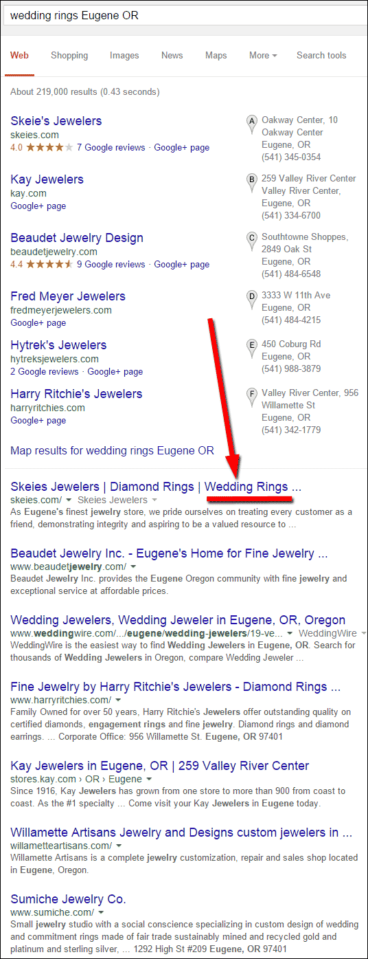
That said, let's find out who in Eugene, OR is already using the phase on their website. Here's the organic Google SERP I saw when searching "wedding rings Eugene OR":

Skeie's Jewelers is the top ranking jeweler for both the Google+ Local pack and the organic results. They probably ranked so high because they are the only website with the phrase "wedding rings" in the title of their home page.
Here's the website: http://skeies.com/
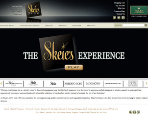
This is what the home page looked like when I first landed on it:

(click to enlarge)
The first thing I did was click the PLAY button you see in the above screen grab. It was a 3 minute video about the store, a little about their history, and a lot about the services they provide. The video had an extremely high production value.
After watching the video and seeing the inside of their store, I couldn't help but wonder why their website looks a little outdated. Specifically, the text on the home page seemed a little small, perhaps designed when computer screens were not as large as they are today.
The time stamp on the website said February 13, 2013. It seemed odd that a jewelry store would launch a new website the day before Valentine's Day. I went to http://web.archive.org to investigate their website a little further.
According to the Web Archive, the Skeies.com website went live back in March 2001. They certainly were forward thinking by starting that long ago. Since then, the website has had 4 different looks to it.
According to the web archive, they launched their websites on or about the following dates:
March 30, 2001
December 16, 2004
December 5, 2006
February 13, 2013
It seems really odd to me that a jeweler would launch a new website during their busiest seasons. Every website relaunch usually causes a fluctuation in ranking; most of the time, it's a drop in ranking while Google figured out how to read your website again.
Changing your site during the busy season is like tempting your financial fate. One mistake and your website ranking would be temporarily removed from the SERP when your customers need to find you the most.
Cumbersome Usability
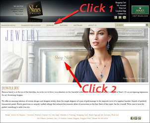
From what I can tell, they had their website custom built with a shopping cart system. The actual product catalog has a lot of good features, but first you have to figure out how to get to it, which takes 2 clicks each time as shown here:

(click to enlarge)
You first have to click on one of the top navigation menu options, then you have to click on the large photo. It seems like they were trying to create landing pages for each product category, but the navigation directions are pretty unclear as to what to do after clicking the top menu. It might seem obvious to simply click the "Shop Now" words, but I found the words to blend into the photos too easily, i.e. hidden in plain sight.
It really seems like they took a shopping cart website template and tried to turn it into a full website. It seems like they need a better content management system (CMS) to flesh out more pages on their site, and even a blog. In other words, they need a CMS in addition to the shopping cart they have now. It might make things work more smoothly.
Shopping Cart?
I see several references to a shopping cart throughout the site, specifically:
* First link in the header
* On every product detail page
* One of the footer links
Even though they mention the shopping cart in these places, there is no way to add something to said cart. It looks like they either turned off the cart feature recently and didn't hide these references, or worse, they launched the site 2 years ago and never hid this feature to begin with.
Either way, consumers who want to buy online more and more will certainly find this confusing.
Social Media Accounts
Another positive note for Skeie's is their use of social media. I'm impressed by their Pinterest account because they have more than 2000 pins:
https://www.pinterest.com/skeiesjewelers/
I'm also impressed that they have made an attempt to use Google+; not often, but they are at least trying:
https://plus.google.com/+Skeies/posts
They also have more than 4,600 people who like their Facebook page, but they don't even use it as much as they should:
https://www.facebook.com/Skeies
Obviously, they've been managing their social accounts on their own in the store, but they need to do a better job at it.
Closing Thoughts
Judging from the photos and the video of the store, they seem like a very large store that carries many designer names. Their long online history and social visibility tells me that they've tried, but what they have done is only a half hearted effort so far.
Skeie's Jewelers needs to hire an in-house website director or get on the ball and hire a good agency who they can pass all the work to.
FTC Notice: I randomly choose this website and won't be telling the retailer jeweler that I'm doing a review. Unless someone else tells them, they will only find out about this review if they examine their Google Analytics and Google Webmaster Tools. I'm not doing this to solicit business from them, but rather as an educational exercise for everyone. This review is completely impartial and all my comments are listed in the order that I discovered them.


