This is the weekly website review edition of the Daily Golden Nugget. Each Friday, I work through these reviews to help you understand the good and bad ways a retail jewelry store website works. I look for good and bad website design, content, photography, usability, and search engine optimization in hopes that we can all learn something new.
Each week, I use Google Chrome in incognito mode to search for review candidates. Incognito mode allows me to hide potentially personalized search results and gives me the best chance to see what a customer would see the first time they search for a jewelry store.
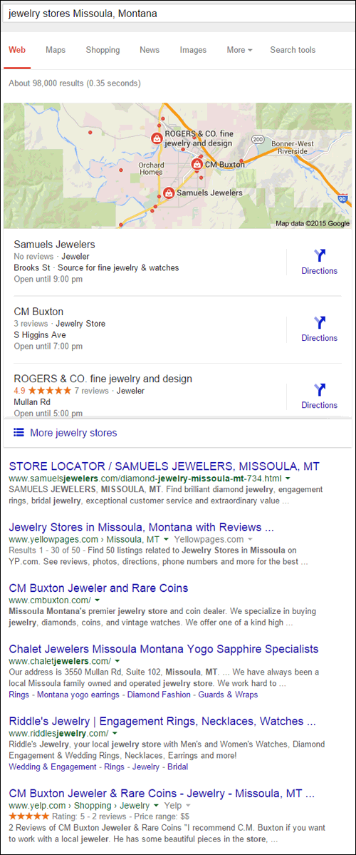
This week, I began my search with the query string "jewelry stores Missoula, Montana," which is similar to all my previous weeks doing this; however, the results page you see here looks very different than expected:

The SERP format you see above, looks like the mobile version of Google's results, not the desktop version. I thought this might be a special display for Google Chrome, but I saw the exact same SERP layout when using Mozilla Firefox in Private Browsing mode.
At the time of this writing, the desktop format of the SERP only manifested when I was logged into my Google account. Since Google reported that more than 50% of searches are mobile, it certainly seems like they are showing the mobile format by default now.
Choosing a Review Candidate
I usually choose the first independent retail jeweler in the Google+ Local Pack list, which eliminates Samuels Jewelers because they are a chain store.
Next up is CM Buxton, but it turns out I previously reviewed them back in March 2014 when searching for "antique jewelry Missoula Montana."
That leads me to Rogers & Co. Fine Jewelry and Design and their website:
http://www.rogerscojewelry.com/
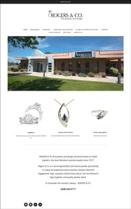
This is what the website looked like when I visited:

(click to enlarge)
The Design
The website design you see here is the epitome of clean-looking design. Here are the specific design elements I noticed immediately:
- No outer border to give the site shape; it relies upon the large open space to define it
- All the text is pleasant dark gray color, which is complimentary against the stark white background
- Everything is centered, which isn't quite such a good thing
- The site has an extremely simple appearance
- Built for mobile first
My full thoughts on each point...
Borderless - The site doesn't have defined edges anywhere. There is an invisible structure of columns and menus that is held together with negative space rather than traditional borders. All the photos are on pure white backgrounds, blending perfectly with the pure white background of the pages. One of the problems I notice is that the photography isn't consistent; sometimes there is too much negative space, resulting in unbalanced pages.
Text Color - The text color is almost black, but not quite. Specifically it's HEX value #232323. The results would look very jarring if they used a pitch black color against the pure white background. This was a really good choice that worked well for all the font sizes they used throughout the site. The smaller fonts looked like a lighter gray and the larger fonts looked almost black.
Center Justification - I think it was 2003 when I last took notice of a website that centered all the text, photos, header, menus... everything. I suppose the centering works for this borderless layout, but it's certainly not my personal preference.
Simple Appearance - The website is built in Squarespace with one of their minimalist themes. In fact, it's so minimalist that it would be completely blank without words and photos. This type of theme is very difficult to populate and it requires someone with a creative eye, to realize that single photo with a colorful background would through the entire looks of the site into chaos.
Built For Mobile - I read this post on Medium which says we need to design our websites to be "mobile first" and then desktop. Most websites are designed with the desktop in mind first and only create a mobile website as an afterthought. The Rogers & Co. site, and it's Squarespace theme, are certainly designed for mobile first. I feel the site looks much better on my smartphone because it's not overwhelmed by all that negative space.
Photo Rich, Content Poor
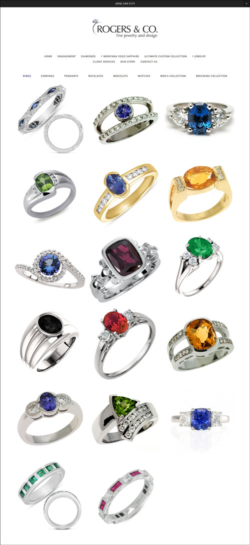
The website has a lot jewelry photos organized into galleries like this ring page you see here:

This layout is simply a photo gallery; it's not a product catalog. Clicking each ring opens a larger version of the image, but it doesn't have any jewelry details. This leaves curious customers wondering if all those blue stones are sapphires, and if those green stones are emeralds. It is not very inviting, however, for them to ever find out. They'll see the piece, say "oh, that's pretty," not see any other info, and forget it immediately because no words were attached to the images for them to associate with their initial feeling.
There's no way to know what the product details are because Rogers & Co. completely omitted that information. They would have a greater organic ranking if they fleshed out descriptions and pages for every product instead of the way it's set up now.
Their Story Confused Me
The "Our Story" page begins like this:
Chalet Jewelers began in Missoula, Montana in July of 1977. Over the years Chalet has grown and changed. Chalet has been able to offer a large, beautiful collection of rare Montana Yogo sapphires and absolutely beautiful custom jewelry to our customers. Over the last 37 years, the family jewelry business has come to be known as the premier family jeweler offering only the best quality craftsmanship, honesty and integrity. As of July 2014, Chalet Jewelers is now doing business as Rogers & Co. fine jewelry and design.
It took too long to explain the store's name change. Initially, I thought that someone put the wrong store information on this page. They should rewrite this a little so the store's name change is mentioned in the first sentence.
That's all for now. While they made very good choices with their design, I see a lot of room for improvement with their content. I will make a mental note to check them out again in the future to see if they make efforts to strengthen their content, since they are on the right path.
FTC Notice: I randomly choose this website and won't be telling the retailer jeweler that I'm doing a review. Unless someone else tells them, they will only find out about this review if they examine their Google Analytics and Google Webmaster Tools. I'm not doing this to solicit business from them, but rather as an educational exercise for everyone. This review is completely impartial and all my comments are listed in the order that I discovered them.


