While it's customary for people to take long holiday weekends off from work, your website is never closed. The first impression that your website makes is as important as that first greeting when a customer walks into your store.
This is my Friday Website Review edition of the Daily Golden Nugget. I write these reviews to demonstrate live examples of both good and bad retail jewelry websites. I never know where these reviews will end up and I try to be as impartial as possible when writing them.
I also try to give my first impressions before digging into the sites with my SEO and code analysis.
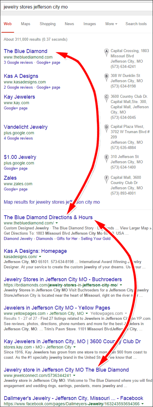
For this review, I'll search Google for "jewelry stores jefferson city mo." Here's the search engine results page I saw:

The Blue Diamond is first in the Google+ Local Pack, first in the organic, and they also have a JewelConnect site listed further down the organic results. I usually choose the first jeweler in the list here, but before I look at the Blue Diamond website I'd like to talk about JewelConnect again.
In September 2014, I did an in-depth review of how two competing jewelers were both using JewelConnect; read that review here.
The Blue Diamond Jewel JewelConnect page is here:
http://www.jewelconnect.com/5736344241
Now take a look at the home page for Roth Jewelers, one of the sites I reviewed back in September 2014:
http://www.jewelconnect.com/3192346979
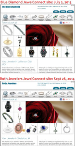
Here they are together:

(click to enlarge)
In a quick comparison, you can see that the JewelConnect website service has the same inventory and images today as it did 9 months ago. These types of websites are good for retail jewelers looking for online shortcuts, but they don't help build customer engagement.
Think about it... If these websites never change, then what would motivate your customers to return back to the site? No new information + No new inventory = No return visitors or customer funnel conversion.
These managed website services are good for attracting the first time visitor, but after that you need a better sales funnel and online conversion method.
Now, on with the review of the regular website...
Home Page
Here's the home page for The Blue Diamond:
http://www.thebluediamond.com/
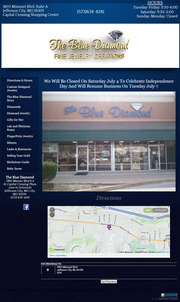
This is what it looked like when I wrote this review:

(click to enlarge)
The first thing I want to congratulate them on is putting that prominent "Closed On Saturday July 4" notice on their home page. This is such a small detail, but it's also very helpful. Their regular store hours are very easy to find at the top right of their web page, without this quick notice their customers might assume they are open on Saturday.
Now, the real test will be if they take this notice down on Tuesday July 7th or if it will languish. In case you are not aware, a website programmer should be able to add a notice like this one to a website and have it automatically disappear after the appropriate date.
I don't see a Contact Us page on their website. Perhaps they feel that the map, store photo, and address that they have on their home page serves this purpose. Although this might be true, website visitors might feel a little confused because most websites have a Contact Us Page.
Using the Home Page as a Contact Us page also leads to other potential missed opportunity to quickly deliver better home page information like current events, new product spotlights, or latest news.
They do have a link for "Directions & Hours" at the top of the left navigation. It seems to lead back to the Home Page, which is very confusing.
Custom Design Page
If you provide custom design service in your store then you should have a web page dedicated to that service. Don't simply list it as one of your services; prove it with a description and photos.
They could spend a little more time editing the description on their custom design page, and the photos are all too dark.
Take a look at this screen shot and notice how disorganized the layout is:

(click to enlarge)
I didn't realize it at first, but it took more than 1 minute for this page to fully load. Eventually it changed to look like this:

(click to enlarge)
Unless you intentionally stay on the page, you would never see what it really looks like. Two things are working against them here:
1. They are using a very large JavaScript to display the page
2. They are hosting with Network Solutions, which I've always notice had a slow hosting service
DIY Look
The Blue Diamond is using the Website Builder provided by Network Solutions. This is a do-it-yourself system that saves you money. Typical results are like what you see on the Blue Diamond's website. To achieve a more professional looking website you would have to take a more professional approach than just this DIY service.
Now that I mention it, I'd like to explain that GoDaddy, Network Solutions, Host Gator and other companies like 1-and-1 all advertise their easy to use DIY website builder services. They all work, but I've yet to see a professional result. Also, none of them are as simple as they say they are. Most of the ads say you can build a website in a day, but that doesn't take into account the learning curve for using their software or figuring out the best way to portray yourself online.
The Blue Diamond site has a lot of good content on it, but I feel the color scheme is poor and the layout of the pages was disorganized. It needs a professional touch.
That's it for this week's review, see you next time!
FTC Notice: I randomly choose this website and won't be telling the retailer jeweler that I'm doing a review. Unless someone else tells them, they will only find out about this review if they examine their Google Analytics and Google Webmaster Tools. I'm not doing this to solicit business from them, but rather as an educational exercise for everyone. This review is completely impartial and all my comments are listed in the order that I discovered them.


