This is the weekly random retail jewelry store website review. The purpose of these weekly Friday reviews is to find out how to improve your own website by dissecting the techniques of another website.
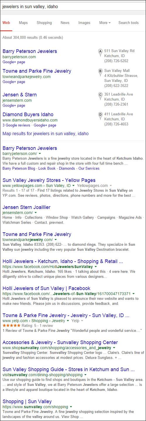
This week I'm searching for "jewelers in sun valley, Idaho." Here's the SERP for that search query:

I'll look at Barry Peterson Jewelers because they are the top result in both the Google+ Local Pack at the top and the organic results right below it. Their website is: http://barrypeterson.com/
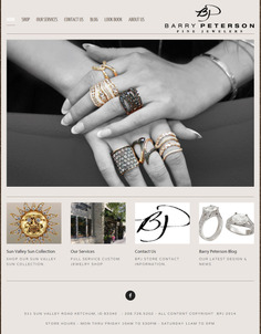
Here's what the home page looked like when I arrived:

(Click to enlarge)
This is a relatively simple looking website design, but looks are deceiving... This site has a responsive design. Most responsive designs I've seen lately simply use percentages to control how the fonts and images appear on different screens. On large screens, things tend to look bloated, and then on small screens things look too small.
The Barry Peterson Jewelers design is well balanced without the inflated look on desktops. The home page even looks reasonable on a smartphone as shown here:

(Click to enlarge)
Simple Layout & E-commerce
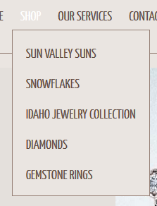
The website has a simple layout with a top navigation menu that's really easy to understand. Hovering over the "Shop" menu option reveals a drop down menu for their online catalog as you see here:

I found it very refreshing to see product catalog menu items that bring me to those pages specifically. For example, "Sun Valley Suns" shown in the above screen shot brings you to a page dedicated to their Sun Valley Sun pendants.
This simple navigation is easy to for Barry Peterson to achieve since they have a very limited online catalog. Customers can also purchase from the website. This website is using Square Space hosting and the simplified credit card merchant processing service that Square Space offers. This makes it very affordable to manage their e-commerce.
Square Space offers a good service for anyone who wants to set up a small e-commerce website without all the overhead needed that once plagued all e-commerce setups.
Services Page
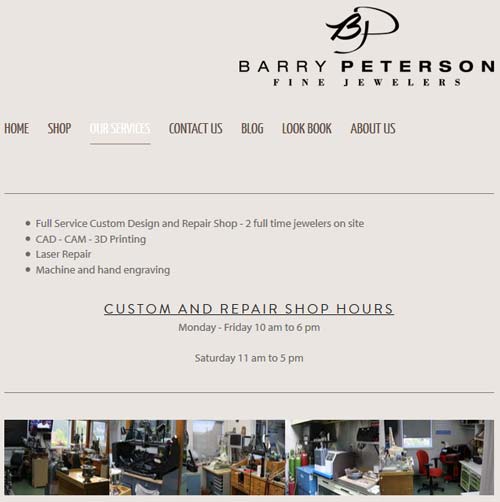
As you can see below, the services page has very little information on it:

I'm surprised to see that they have "Full Service Custom Design" and "CAD - CAM - 3D Printing" mentioned on this page without any mention of it elsewhere on the website. I bet they could attract more custom design business from more people outside their area if they dedicated several pages on their site to tell their customization story.
Abandoned Blog
At the time of this writing, the last blog entry they had was dated February 28, 2014. That's 14 months ago.
Take a look:
http://barrypeterson.com/blog/
You should update your blog at least once per month, and if you don't, then don't include it in your primary navigation. Don't delete it -- but don't unnecessarily draw attention to it.
Here's another trick for those of you who don't update the blog often... Don't include a date! Although most blogs will still include the date as part of the URL, you can have your website programmer hide the date field from appearing on the screen.
That's if for this week's review; until next time...
FTC Notice: I randomly choose this website and won't be telling the retailer jeweler that I'm doing a review. Unless someone else tells them, they will only find out about this review if they examine their Google Analytics and Google Webmaster Tools. I'm not doing this to solicit business from them, but rather as an educational exercise for everyone. This review is completely impartial and all my comments are listed in the order that I discovered them.


