This is the Friday website review edition of the Daily Golden Nugget. Today I'm searching for "jewelers in North Charleston, South Carolina" using the Chrome browsers on my iPhone 6. I have Chrome set in incognito mode to avoid personalized search results.
Here are the full results returned on my phone. As you can see, I've indicated that all the organic results are "mobile-friendly":

Standalone Mobile Site
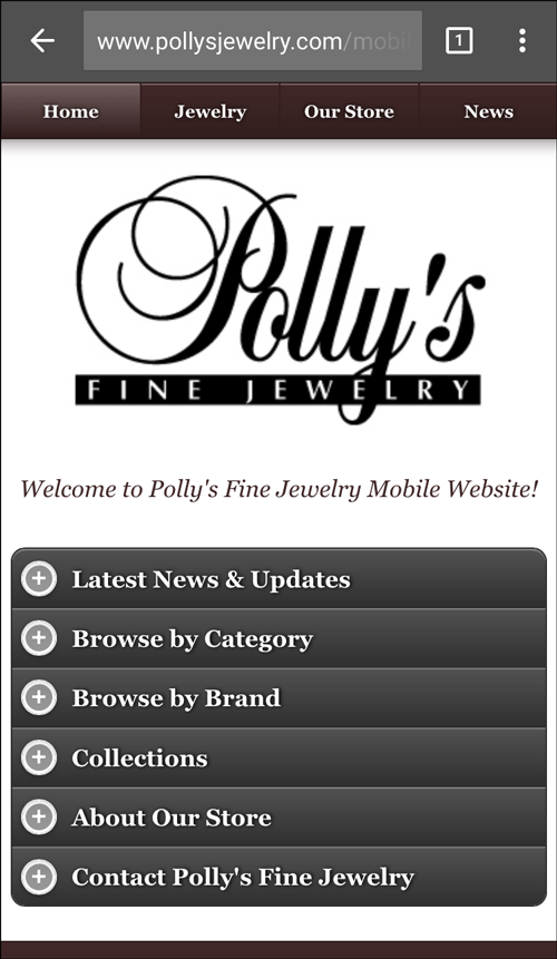
For this week's review, I'm selecting Polly's Fine Jewelry. They have a standalone mobile website that you can view here: http://www.pollysjewelry.com/mobile/index.php
This is what it looked like:

I was pleased to see the mobile website and buttons that seemed large enough to use with a fat thumb.
Home Page Usability Issue
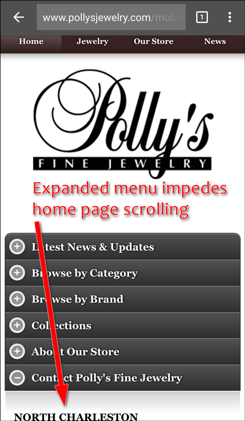
Sadly, on the home page, as soon as I tried to slide the screen down, I experienced a usability issue. The buttons you see in the image above will reveal a sub-menu below them when tapped. This feature impedes the ability to scroll down.
One of the menus opened up every time I tried to scroll, for example:

Is This What The Mobile User Wants?
I found the tab buttons on the mobile home page to be in this, very curious, order:
- Latest News & Updates
- Browse by Category
- Browse by Brand
- Collections
- About Our Store
- Contact Polly's Fine Jewelry
What I found curious is that the "Contact Polly's Fine Jewelry" is shown as the last option and there's another "Contact Information" button hidden further down in the footer of the home page. Meanwhile, the "Latest News & Updates" is shown as the first option.
I can't say if this makes sense or not. The only way to tell is to look at Google Analytics to find the most common page people navigate to after landing on the mobile home page. That 2nd navigated page should be positioned as the top tappable item.
The rest of the items should be organized according to their descending popularity. In case you are wondering, you won't know this order when you launch a new website. You need to make some guesses and then revisit the order again a few months later once you've collected enough Google Analytics information.
Latest News
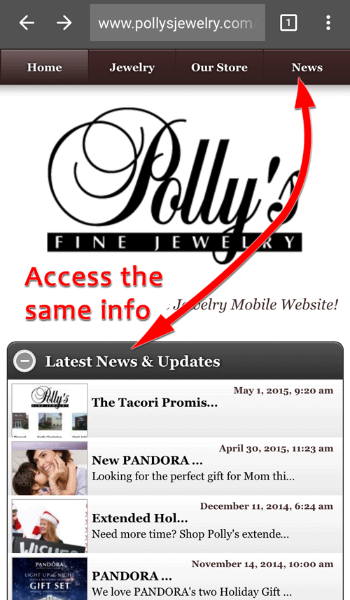
Clicking on the Latest News & Updates button opens a submenu of their latest blog posts. You can also go directly to the News page by tapping on the News option on the top menu as you see here:

I was a little disappointed that their "latest" news was posted on May 1, 2015. I'm writing this seven weeks later on June 17, 2015.
I also notice that the penultimate post is dated April 30, 2015 and the one before that goes all the way back to December 11, 2014.
This latest news area should not hold such a prominent position on their website if they are only updating it randomly throughout the year. They only updated it 7 times in the last 12 months; in fact, upon close inspection I see that all of their latest announcements are related to store hours or special offers. It's more appropriate to refer to this section as "latest offers" rather than "news."
There's nothing newsworthy about a promotional offer. That's not news, that's you trying to make some extra money.
My suggestion here is to rename that home page button and move it to last position.
Something Overlooked
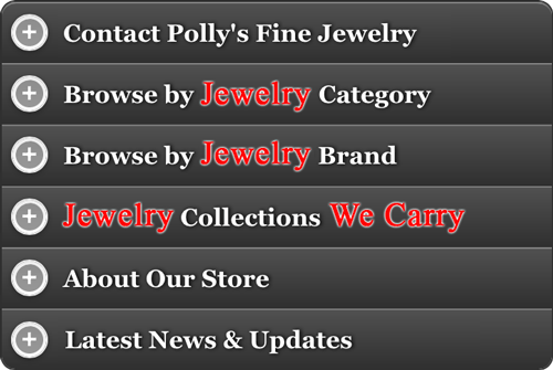
It might seem simple, but they overlooked the need to include the word "jewelry" in their navigation buttons on the home page. Even though they are obviously a jewelry store, I would have included the word jewelry in the buttons for Category, Brand, and Collections. I feel it helps it clearly state what those buttons do without cluttering up the screen, and it would add a little more SEO value to their mobile home page.
Another curiosity are their buttons to "Browse by Brand" and then "Collections." Looking at them in the list like that doesn't help me understand the difference between those pages, and perhaps that's because of how I interpreted them as I read them.
Let's follow my thinking when I first looked at those buttons...
Latest News and Updates... okay, that's probably their blog. Browse by Category... okay I could probably drill down by rings and necklaces. Browse by Brand... alright, I'm not going to know who these brand are. Browse by Collections... will I be interested in the collections they have?
Stop right there! So that's a replay of what I said to myself, but did you see where I screwed up?
The button for "Collections" doesn't say "Browse by Collections," it just says "Collections." My thinking got completely crossed wires just like you might get tripped up by this question:
JOKE, FOLK, BROKE, OAK. What's the white of an egg called?
Their "Collections" page provides write-ups for the different designer lines they carry while the "Browse" page brings you to the product catalog area for each designer.
To prevent this mental tripping, I would change the "Collections" button to read "Jewelry Collections We Carry."
Here's how I would reorganize the navigation on this mobile home page:

That's it for this week's review; I'll see you next week.
FTC Notice: I randomly choose this website and won't be telling the retailer jeweler that I'm doing a review. Unless someone else tells them, they will only find out about this review if they examine their Google Analytics and Google Webmaster Tools. I'm not doing this to solicit business from them, but rather as an educational exercise for everyone. This review is completely impartial and all my comments are listed in the order that I discovered them.


