It must be summer. That's the only time I ever go to IHOP. In fact, this is the second time this month I've visited this family favorite. I was preoccupied with JCK work during my first visit earlier this month, but this time around I'm able to relax and leisurely enjoy a Saturday morning breakfast.
I always know what to expect when visiting IHOP. The menus always show crystal clear, large photos of mouthwatering stacks of buttermilk pancakes topped with loads of fruit. Ahh...
I certainly wasn't disappointed when opening the menu this time, but I was also pleasantly surprised by the new format. Actually, had I been paying attention two weeks ago I would have noticed this already, but like I said, I had JCK on the brain last time and this time it's a leisurely day.
The new menu format still has large photos on the cover and on every page, but now they also have a really clear photo for almost every item on the menu next to the usual description of the food choice. Items without photos were positioned at the bottom of the menu pages and looked out of place, especially since there was room for a photo. I'm assuming photography snafus caused these omissions.
Here's a photo of the menu:
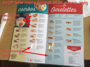
(click to enlarge)
Side dish selections didn't have photos either, but they did have plenty of room for follow through. Speaking of room, as you can imagine all these photos added a few more pages to the menu to prevent it from looking cluttered.
Overall, the menu redesign looked a lot like an e-commerce website with great photos, plenty of negative space to make it readable, and appropriate product descriptions.
Get Them To Agree With You
Diners and fast food restaurants that show photos of their food often have disclaimer messages saying something like "photos are suggestions only," but I couldn't find that disclaimer on the new IHOP menu. I assume it was there somewhere, but it certainly wasn't obvious.
But then again, maybe it wasn't...
Every time our server brought meals out to other tables, I overheard her asking "Now doesn't that just look like the photo from the menu?" Sure enough, she asked the same question when our food came out too.
I could not help but wonder if she had new sales and customer experience training to go along with the new menus. How could we possibly know if our food looked exactly like the menu when the menu is no longer in front of us? Asking a positive question to reinforce someone's expectations will usually yield an agreeable response... Of course this looks exactly like what I ordered!
Here's one of our meals:
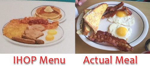
Obviously the meal does not look exactly the same because we customized our choices with toast instead of hashbrowns and 2 strips of bacon instead of 2 sausage links. Did we still agree that it looked the same? Of course we did!
I was completely aware that our server, Linda, was using Jedi Mind Tricks on us. Her suggesting that our meals looked exactly the same is a little sales trick is called Confirmation bias. It's a technique that you can easily employee in your store when presenting a special order item or a finished repair job to your customer. Instead of saying "here you are" or asking "how does that look?" you should initiate the positive attitude by asking "now doesn't that look exactly like you wanted?"
Increase That Turnover
When I was younger, my parents and friends always teased me that I'd have to read everything on a restaurant menu before making a decision. This was true and I was always the last to decide. I remember a few of my friends teasing me that menu indecision was a classic Virgo trait... yes, my birthstone is Sapphire.
Looking back, it probably wasn't my Virgoness that slowed me down at a diner; it was probably my undiagnosed mild dyslexia that gave me trouble. Many times, I wanted to just choose from the photos on the menu only to find out they were not real food choices. Quite stupid.
The Virgo in me cheered as soon as I opened the IHOP menu this time, and I recognized the stroke of genius. IHOP created a menu that would speed the menu selection process, which of course would mean they could have faster turnover in the restaurants. Faster turnover naturally means they can service more people.
Our server, Linda, said that the menu has been a benefit for non-English speaking customers and a few elderly that were hearing impaired, both groups just point to the photo of the food they want. This is probably a serendipitous result of the new menu because I doubt that the IHOP menu designers considered the benefit for non-English speakers when they put it together.
Linda explained that some of the other servers, when faced with ordering adversity and language barriers, will give the customer exactly what they see in the photo. Naturally, every item on the menu comes with a choice of toast, pancakes, hash browns, or a fruit cup.
One Improvement Can't Do It All
The potential increase in ordering speed won't help speed the turnover in the IHOP restaurant unless they've also improved speed everywhere else, especially in the kitchens. I assume the new menus are speeding the ordering process by about 1 minute per table. Imagine how that time accumulates and allows them to have shorter wait times and seat more families every week.
Sounds like profits to me.
IHOP Smile
IHOP's new menu isn't the only thing that changed on June 1, 2015; they launched a completely new identity that day. They have a new logo, a new website, and a new social media campaign.
The last time IHOP changed their logo was at the dawn of the internet age... 1994. That's when they officially started calling themselves IHOP rather than International House of Pancakes.
Here's their old and new logos:
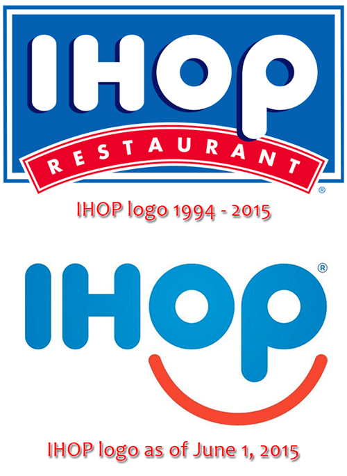
See how they used the O and P to create a smiley face? This logo is quickly being applied to all their marketing and restaurant signage.
IHOP also launched a social media campaign to promote their new menu and logo. The table tent you see here invites you to use the hashtag #IHOPsmile to post photos to any social network:
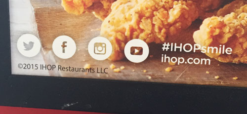
Take a look at the results:
Instagram #IHOPSmile
Twitter #IHOPSmile
Facebook #IHOPSmile
Tying It In A Nice Bow
I've always felt that success leaves a footprint... something you can look at, study, and emulate. It's not too often that we see the successful rebranding of a big company. JCPenny is the most recent failure I can think of when they tried to convert to a blue and red box logo in 2011, only to return to their previous logo two years later.
I think IHOP is on to something here. They figured out how to design their menu with the look and feel of a modern website, they created a fun new logo, new ads, and a social campaign. I have a strong feeling that they also gave their employees new training to help reinforce their new image.
Obviously this took a lot of research, planning, and time to execute.
Here's what you can take away from this as a jeweler:
- Confirmation bias is a good positive reinforcement technique that you can use in your store
- Website design and in-store image should strongly complement one another
- The right marketing campaign and hashtag can turn many of your clients into advocates that help promote your brand
- Routine employee training is needed, especially when you launch new marketing campaigns, promotions, and products
My goal here today was to present a good model of all around branding, marketing, and social engagement which you can emulate. You don't have to spend a lot of money to research and rebrand yourself... Unless you are one of those jewelers who needs a store face lift and improved image.
As you probably already know, IHOP's slogan is "Come hungry. Leave happy." Wouldn't you like your customers to leave happy too? Study what IHOP is doing and try to apply some of these techniques to your own store.


