It's officially been one month since Google Mobilegeddon on April 21, 2015. I've been eagerly following the blogs and new channels of several companies that are tracking the results, and they all seem mixed.
Google started showing mobile friendly websites in search results earlier than April 21st. Reports from Search Engine Land stated that the mobilegeddon rollout seemed to be slower than expected.
After the first month of measuring, I finally have some results to share today. They certainly are not what I expected.
Benchmark From 2014
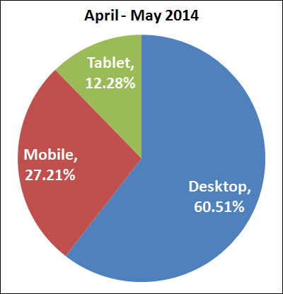
Here's a pie chart of the desktop, mobile, tablet usage from April - May 2014:

Device usage from April 21, 2014 through May 21, 2014 was as follows:
* desktop was 60.51%
* mobile was 27.21%
* tablet was 12.28%
It's important to keep in mind that mobile usage continues to rise as desktop usage falls. I expect this trend to continue for several years.
Just Prior to Mobilegeddon
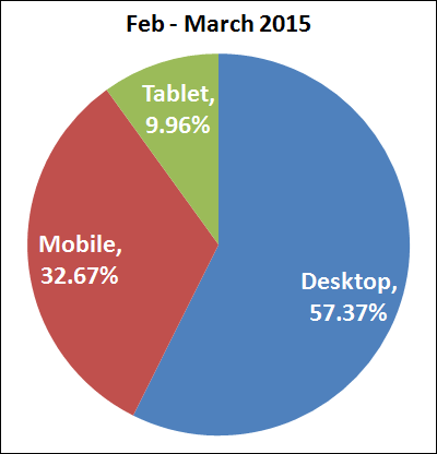
In fact, you can see this trend in this next pie chart of the desktop, mobile, tablet usage from February - March 2015:

Device usage from February 18, 2015 through March 20, 2015 was as follows:
* desktop was 57.37%
* mobile was 32.67%
* tablet was 9.96%
As smartphones grow in size, the need for a tablet seems to be waning. Mobile certainly was the big winner prior to Mobilegeddon.
Post Mobilegeddon
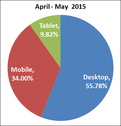
Here's a pie chart of the desktop, mobile, tablet usage from April - May 2015:

Device usage from April 21, 2015 through May 21, 2015 was as follows:
* desktop was 55.78%
* mobile was 34.00%
* tablet was 9.82%
This certainly is not what I expected! I didn't expect mobile usage to show an increase in the first month. In fact, I expected to see a drop of mobile visitors.
About These Numbers
I've taken these numbers from the jewelry store websites that I host in my server room. In order to see the affect of mobilegoddon on non-mobile websites, I had to filter out all the responsive sites and those with stand alone mobile sites.
The majority of the retail jeweler websites I encounter are non-mobile friendly. I expected to see the percentage of desktop usage for non-mobile-friendly sites to increase while the mobile usage decreased. Instead, it appears to have a continued growth of mobile usage.
Mobile-Friendly Sites
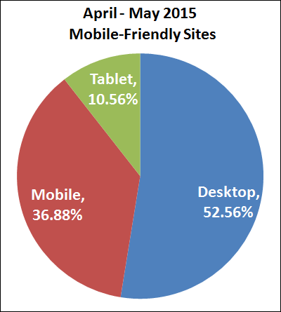
When we examine the websites that are mobile friendly we do see the expected increase of mobile traffic and decrease in desktop.
Take a look:

Device usage from April 21, 2015 through May 21, 2015 for jewelry sites that were mobile-friendly was as follows:
* desktop was 52.56%
* mobile was 36.88%
* tablet was 10.56%
The jump in mobile traffic here is as expected because Google is displaying those mobile-friendly sites more prominently in mobile results.
Closing Thoughts
It looks like mobile usage will continue to grow for all websites even if they are not mobile-friendly. Sites that are mobile-friendly will simply have a faster mobile growth rate.


