
This is the Friday website review where I search for a jeweler in a random town around the United States then review their website. By reviewing a live site, I'm usually able to highlight good and bad points that we can all learn from.
For this week, I wanted to find a retail jewelry store in Laguna Beach, California. Here's the SERP when I googled "jewelers in Laguna Beach, California":
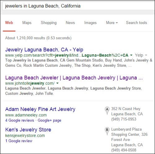
I usually review the first jeweler listed in the organic results or in the Local Pack. In this case, that looks like John Tolle Jewelry and the website http://www.johntollejewelry.com/.
This is what the home page looked like when I visited:
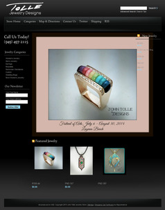
(click to enlarge)
If I were a real customer in need of a jewelry store, this website would turn me away. But then again, if I lived in the Laguna Beach, California area I would probably be aware that the entire area was established as an art colony more than 100 years ago, in which case, this jeweler might be perfectly fine.
E-Commerce Site Setup
This website only has a few pages and they are all focused around their product catalog, except that the ability to sell online is not activated. There's also a lot of lost SEO opportunity in the way their product display pages are set up.
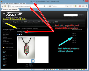
Take a close look at this:
(click to enlarge)
The three red arrows in the above screen shot are pointing to the Page Title, URL, and the Product Title. Those are the most important characteristics for SEO, and they should all be something that would make sense for the customer rather than the "PND357" style number you see there.
A better choice would be to call this a "Sapphire and Black Diamonds Pave Pendant" and then include those words in all three characteristics.
The cyan colored arrow in the above screen show is pointing to a list of related products, but only the style numbers are showing. This list should also include thumbnail images of those products. Without the thumbnails, you are wasting someone's time as they have to click each, evaluate, and then click back to the previous item. This is not very user friendly at all.
The large white box you see in the above screen shot, shows us all the available area we have for the product image, but the image they are using does not fully fill this space. This wouldn't be so obvious if the site had a white background, but the black background draws your attention to it. It's not aesthetically pleasing.
Lastly, notice the yellow arrow in the above screen shot. This points to the correct use of breadcrumbs on the site. This is the only positive SEO feature they are using in their catalog.
Bad Navigation
The second item in the top navigation menu says "Categories." This is what you see when hovering over it:
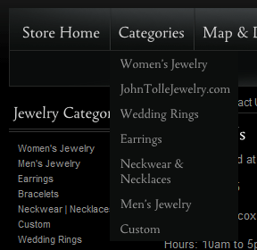
It's very difficult to distinguish from the drop down menu and the rest of the web page. Furthermore, the site breaks when you click the word Categories. This is what you see:
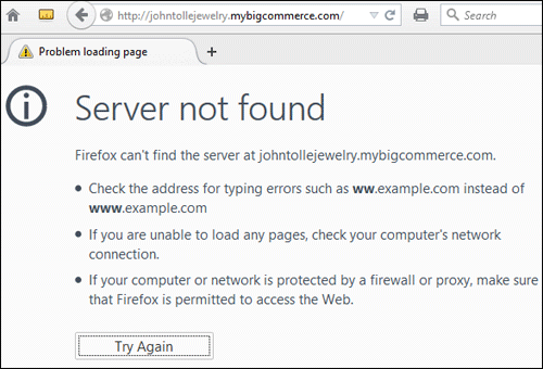
This looks like a case where the navigation menu was hard coded for the URL http://johntollejewelry.mybigcommerce.com/ but no one changed that when the site went live with their domain name.
Socially Awkward
Their top menu prominently includes a link for Twitter. I didn't find any other links to their social accounts either.
Sadly, it looks like they set up their Twitter account back in July 2010, tweeted twice, and then abandoned it. Take a look:
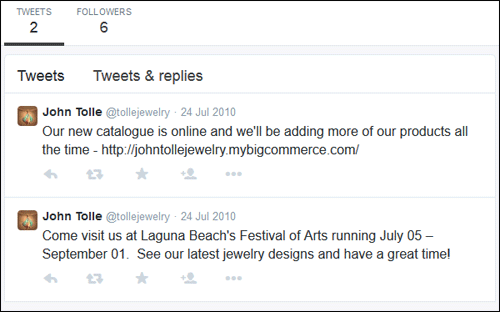
In marketing terms, social media activity is one of those top-of-funnel activities that capture the attention of customers. It doesn't bother me that they are not doing it; it bothers me that they leave it in their main navigation even though they never used the account.
Just having a social media account is not good enough. You have to use them; otherwise, you should remove the social network information from your website.
Conclusions
I could say a lot more about this site, but I think I've beat them up enough. It seems like they wanted to set up an e-commerce store, and had every good intention. Perhaps they didn't realize how much time and effort it was going to take.
I also recognize that they launched this website during the Great Recession and haven't touched it since. A lot of other factors could have prevented further work. Perhaps they also realized that e-commerce wasn't the solution to financial trouble.
FTC Notice: I randomly choose this website and won't be telling the retailer jeweler that I'm doing a review. Unless someone else tells them, they will only find out about this review if they examine their Google Analytics and Google Webmaster Tools. I'm not doing this to solicit business from them, but rather as an educational exercise for everyone. This review is completely impartial and all my comments are listed in the order that I discovered them.


