
Way back on May 3, 2013, I reviewed the website for Alletti Jewelry. In that review, I explained that they were using the GoDaddy WebsiteBuilder and showed why it was a pretty bad content management system (CMS).
Recently. I came across a different retail jeweler's website using the new version of GoDaddy's Online Store CMS. The store is Goldirocks Jewelers and their website is http://goldirocksjewelers.mysimplestore.com/.
Normally, I would locate my weekly review candidate by searching for a jewelers in a particular town; in this case that would be "jewelers oceanside ny." I would also choose the first jeweler in the SERP, but as you can see in the screen shot below, Goldirocks Jewelers is in 4th place within the Local Pack and 8th place of the organic results. Right away, it seems like the new GoDaddy Online Store CMS has poor SEO features.
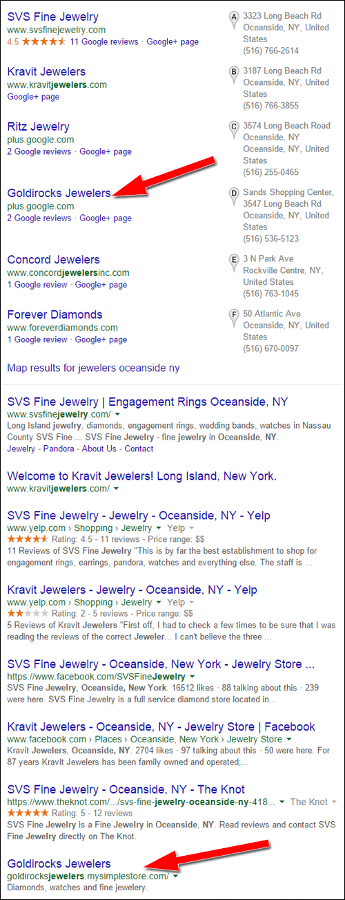
Take notice of the website address listed in the Local Pack above for Goldirocks, you'll see it says "plus.google.com" rather than their website goldirocksjewelers.mysimplestore.com. That's simply because they have not updated their Google My Business account.
By the way, it seems like they've foolishly chosen not to attach their domain name to their GoDaddy website. This is pretty odd since they own the domain name goldirocksjewelers.com, but it forwards to goldirocksjewelers.mysimplestore.com. This is not a good approach for long term branding. They should switch it to use their real domain name; after all, GoDaddy naturally allows this.
First Impressions
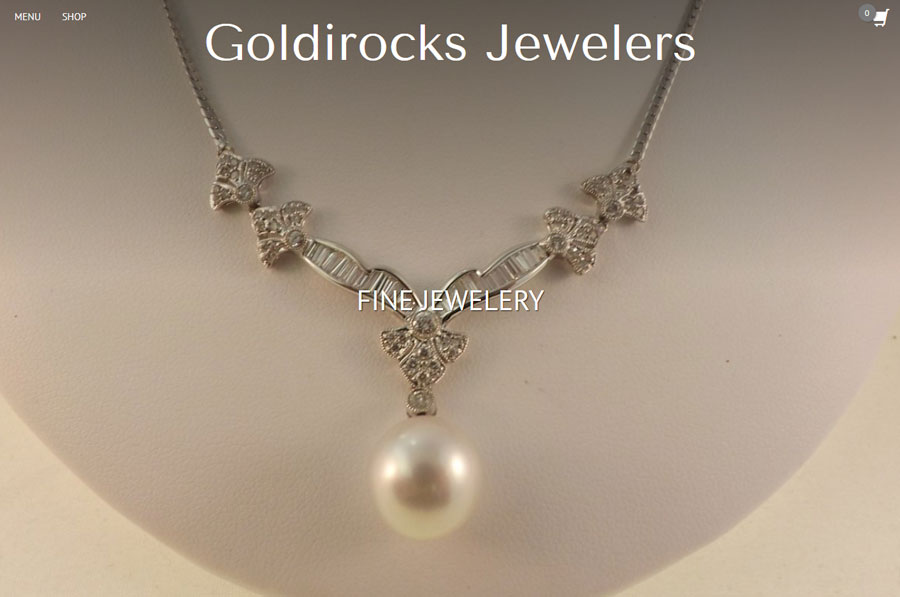
This is what their home page looked like at the time of the review:
(click to enlarge)
Right away, I realized that this was a desktop version of a mobile website. Although the design template they selected uses responsive website design techniques, it really is geared more for mobile users than desktop users.
The navigation is hidden behind the word "MENU" at the top left of the page. You have to click that to expand the side menu whenever you want to go to a different page. Very cumbersome for a desktop site.
Here's what it looked like on my smartphone:
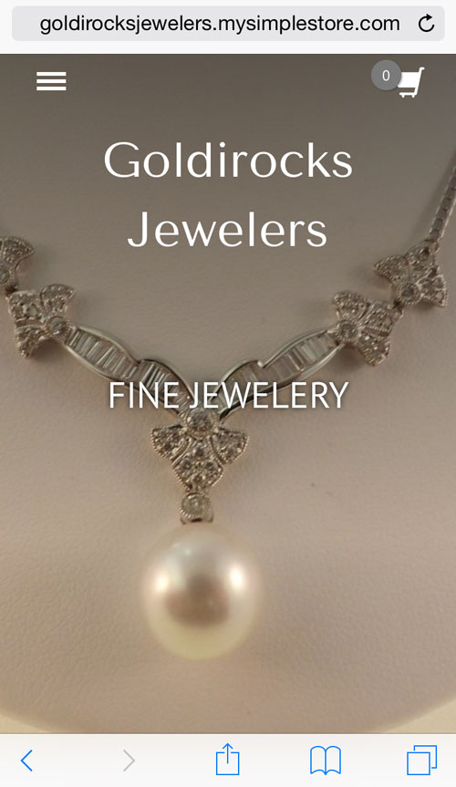
Notice the "hamburger icon" on the top left of the screen shot. You need to tap that to reveal the same navigation that you see on the desktop. A good responsive design would have different navigation techniques for the desktop version and the mobile version.
This design template was a poor choice for them.
By the way, look closely at those screen shots and you'll notice the word "jewelry" is misspelled. That's a great way to make a first impression.
Online Catalog
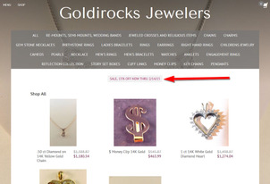
Clicking the "SHOP" link brings you to this page:
(click to enlarge)
That large menu at the top is yet another poor layout choice, but it's probably the only option they had with this particular theme. As I write this the date is May 2, 2015, but the red arrow in the above image points to a "Sale, 15% Off Now thru 2/14/15" message. This clearly shows all visitors that their website isn't updated regularly.
Here's what the catalog looks like on the smartphone:

As you can see, that large menu at the top of the desktop site turns into a long list of links on the mobile site. Again, this is another cumbersome choice.
Product Photography
I give them credit for trying to take their own photos, but they need help with them. The "$" money clip you see in the above screen shot is just one example of all the blurry photos they have on the website. They set this up as a fully functional e-commerce site, but their sales will suffer because of the poor quality of their photography.
They should use a consistent background and light source. They would also benefit from a few jewelry photography classes. A simple Google search will surface a few good companies that offer video training classes, or perhaps just search through YouTube for plenty of free tips.
About Us
The typical About Us page drones on and on with the history of the store. Although I do like to read the store history from time to time, many About Us pages are boring. When I visit an About Us page for a retail jeweler I want to know the names of the current store owners and what kind of people they are, perhaps even details of their community involvement.
Only then am I interested in the store history. I hate About Us pages that make me read through everything to find out who the store owner is.
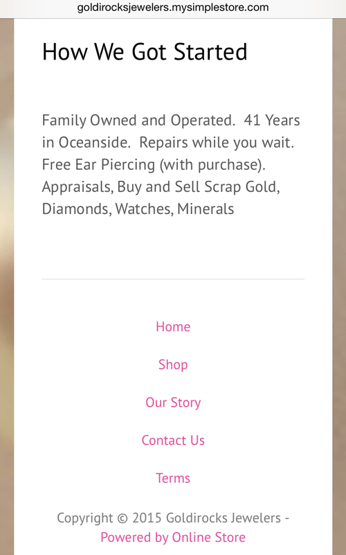
Anyway, the Goldirocks website has an "Our Story" page rather than an About Us page. It's a strange list of fragmented sentences the likes of which I've never seen before. Take a look:
How We Got Started
Family Owned and Operated. 41 Years in Oceanside. Repairs while you wait. Free Ear Piercing (with purchase). Appraisals, Buy and Sell Scrap Gold, Diamonds, Watches, Minerals
I'm not sure why they feel the headline "How We Got Started" is even relevant for the page. Honestly, without some details of who these people are, I highly doubt they will have anyone buying from them. They might as well try to sell their product through eBay where users expect nameless, faceless sales.
Best Advice I Could Give...
Start over.
It's a harsh reality, but the do-it-yourself website software from GoDaddy is still not a good choice for people who do not know what they are doing. While writing this review, I searched for other websites using the GoDaddy software, and found many really good looking ones.
My feeling here is that Goldirocks Jewelers is trying to save too much money with a dirt cheap DIY website, but in the end, their personal labor and poor online appearance will completely work against their bottom line profits.
That's it for this week, I'll see you next time...
FTC Notice: I randomly choose this website and won't be telling the retailer jeweler that I'm doing a review. Unless someone else tells them, they will only find out about this review if they examine their Google Analytics and Google Webmaster Tools. I'm not doing this to solicit business from them, but rather as an educational exercise for everyone. This review is completely impartial and all my comments are listed in the order that I discovered them.


