
Welcome to the weekly edition of the Friday jewelry website review. Every week, I randomly choose a candidate website and put it to the test for design, SEO, usability, content, and a wealth of other website and business related issues.
I never know how they will turn out; sometimes good and sometimes bad. I always try to write these reviews in the order in which I browse around the site, providing my first reactions as I discover things.
This week, I'm searching for "Jewelers in Asheville, North Carolina." Here's a snapshot of the SERP that Google gave me:
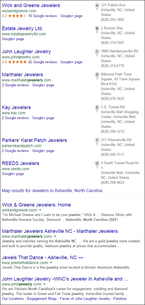
As usual, I'm going to choose Wick and Greene Jewelers because they are the first jeweler in the Google Local Pack; however, before I clicked on them my attention was drawn to the 42 Google reviews that the 3rd jeweler in the list had.
We interrupt our program...
Wick and Green Jewelers has 10 reviews with a 4.2 rating and John Laughter Jewelry has 42 reviews with a 4.9 rating. Something seemed very strange about a single store in the list having so many reviews when 5 of the others didn't. I had to look...
On their Google+ page, I found 41 reviews with 5 stars and 1 review with 1 star. Here's the really long list of reviews:

(click to enlarge)
While I'm impressed that John Laughter Jewelers is replying to 5-star reviews, since no one usually thanks people for leaving good reviews, I'm more than a little perplexed by the near perfect score. Perhaps it's time to re-read this important Nugget I wrote last year about Google reviews.
The new generation of internet savvy clients demands transparency from everyone they do business with. Right now, I see three 5-star reviews written a little more than a week ago, and two written within the last week. That's five perfect scores within the last 10 days or so.
Well, all I have to say here is that John Laughter Jewelers succeeded in the wrong type of transparency. It shows a sincere likelihood that these reviews were requested, or compensated. Sure, it's possible that all the John Laughter Jewelers customers are extremely happy, but without serious motivation, customers simply do not write this many reviews.
If anything, this many reviews will turn people away. I'm guessing that the only sincere review is the lone 1-star review that I've highlighted in that long screen grab above. I'm betting the rest of these reviews are motivated by a monthly contest held in the store; if so, they all break Google's terms of use and, in fact, break at least 1 FTC regulation.
Now back to the review...
The Wick and Greene Jewelers website is here:
http://wickandgreene.com/
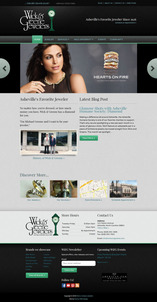
This is what it looked like when I visited:
(click to enlarge)
First Impressions
Whew! This is refreshing! I've become so accustomed to finding bad looking websites that this one was a surprise.
I like the color scheme. The link colors are easy to read against the background. The headline font styles are easy to read, and they have a subtle use of visible and invisible borders.
I do see that the line spacing of the headlines could be expanded slightly, as well as the line spacing of the general text, but I like what I see here so far.
I normally would not nit-pick font style usage like that, but when a site looks good by today's standards I have to look for the finer details.
According to the time stamp, I see on the website, it was launched in October 2013. I feel it's held up well for the last two years and they might not need a redesign for at least another year, depending on how website designing changes. Although this design is responsive, it doesn't fill the full browser width when I expand it. With wide right and left side margins, I find the invisible structured container to be very pleasing.
There are two things I don't like about the home page: the slider and the dated notice in the footer that says "March 19-24," which has long since passed.
Marketing Faux Pas
Sometimes your outcome just doesn't work out well when you throw a bunch of ingredients together.
This WordPress template has an attractive set of green buttons built in. Typically, you can make those buttons appear anywhere around the site.
Take a look at this slide from the home page:

I had a chuckle when I read the message "She is my everything; the center of my universe... Find out more"
The placement of the green "Find out more" button doesn't quite read correctly with that particular Forevermark ad. None of the other slider images have green buttons, so I wonder why they felt this one needed it.
SEO
They are using the ever popular Yoast WordPress SEO plugin to manage their SEO settings. Although Yoast is a good plugin, it doesn't do the SEO work for you, it only guides you on what needs to be done.
Several of the pages I looked at had page titles, but were missing meta descriptions. Some of them had the Open Graph variation of the meta description, which is a meta og:description.
The og:description is typically used to feed information to social networks. Although the "meta description" and the "meta og:description" usually contain the same information, it's best to include them both to prevent hiccups in search engines and social networks.
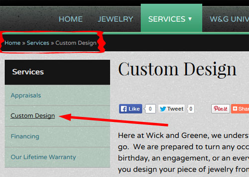
I was also impressed to see the use of a full breadcrumb trail in this design. You can see it here:
It's complete coincidence that my #TBT yesterday was on the topic of breadcrumb trails.
The other thing I really liked about their navigation is the use of a drop down menu at the top, but then a sub-menu appears on the right side. As you can see above, the sub-menu shows the main section name with the pages listed below it. The current page you are on is clearly identified by an underline and a change in link color.
Derailed!
Everything was going really well until I clicked on the Jewelry button on the menu.
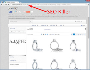
Here's a screen shot of the jewelry page:
(click to enlarge)
They are using the product catalog plugin by Gemfind. In the above screen shot, I'm pointing to the # character in the URL. Unfortunately, the use of the # character in the URL creates a stop point that Google cannot see beyond.
The Gemfind plugin is providing Wick and Greene with an easy to manage product catalog with a few thousand product in it. Customers can use it just fine once they get to the site, but it doesn't add any value to the SEO of the site.
A product catalog with 3000 items in it should provide 3000 extra pages of content. Even if the content is thin, those catalog pages would still provide images to Google Image Search.
As a test, I searched Google with the query "site:wickandgreene.com a. jaffe" to see how many A.JAFFE items Google knew about. The Gemfind plugin showed 84 items, but Google doesn't see any of them.
Look for yourself...
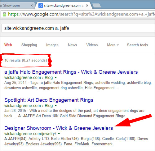
Google only reported 10 pages, not 84.
Closing Thoughts
My suggestions for Wick and Green Jewelers:
- Set up a real product catalog with a WordPress plugin.
- Update the blog more often.
- Review the Yoast SEO settings and improve them a little.
That's it for this week's review.
FTC Notice: I randomly choose this website and won't be telling the retailer jeweler that I'm doing a review. Unless someone else tells them, they will only find out about this review if they examine their Google Analytics and Google Webmaster Tools. I'm not doing this to solicit business from them, but rather as an educational exercise for everyone. This review is completely impartial and all my comments are listed in the order that I discovered them.


