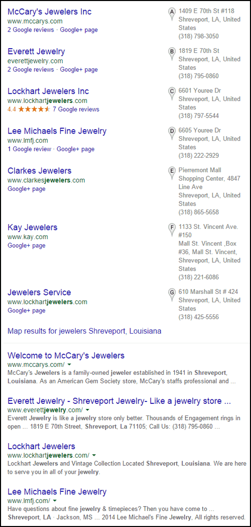
In this edition of the Friday website review, I'm traveling to Shreveport, Louisiana in search of my review candidate. Using the Chrome browser in incognito mode, I searched for "jewelers Shreveport, Louisiana" and saw these SERP results:

I'll be choosing McCary's Jewelers for today's review since they are at the top of the list. Before I get started, I do want to give honorable mention to Lee Michaels Fine Jewelry that appears 4th in the SERP list. You can read the review I did of their website back in November 2011here. Lee Michaels should be getting ready for a redesign about now, especially since their site isn't mobile friendly and the last time they redesigned it was 2011.
Let's look at the McCary's Jewelers website located here:
http://www.mccarys.com/
Here's what their home page looked like when I visited:

(click to enlarge)
Epic Fail
The year 2003 called and they want their website back!
Today is April 24, 2015. As of 3 days ago, Google implemented their new policy on mobile-friendly websites.
This website uses flash on their home page to create the sliding animation effect for those top images. Although home page sliders and rotators are bad many jewelers like them. Instead of using Flash, this should be done with JavaScript or CSS.
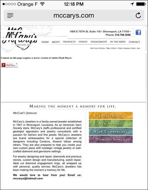
Since Flash does not display on mobile devices, this is what a mobile user sees:

I found a time stamp in this hidden code on the website:
Fireworks CS3 Dreamweaver CS3 target. Created Fri Apr 29 16:20:53 GMT-0500 (CDT) 2011
According to that, this website was created on April 29, 2011. As of this writing, that's almost exactly 4 years ago.
It doesn't surprise me that a website is 4 years old, what surprises me is that they chose to use Flash 4 years ago when it was already an outdated technology. They probably hired a web designer that wasn't keeping up with current technology.
This website needs an immediate redesign!
SEO Fail
While looking at their source code I noticed that they are using meta keywords on their pages. Here's a sample from their engagements.htm page:
meta name="keywords" content="shreveport, louisiana, mccary's jewelers, bossier city, jewelry, diamonds, gemstones, engagement ring, jewelers, jewelry making, fine jewelry, ags, jewelry designer, engagement rings, diamond engagement rings, wedding rings, wedding bands, engagement rings diamond, wedding ring, bridal sets, engagement ring setting, engagement ring settings, engagement rings design, ring settings, wedding sets, jewelry, jewelry stores, jewelry store, custom jewelry simon g, star129, the lazare diamond, cordovan, coast, james breaks, zeghani, carl messier ltd., gottlieb and sons"
It's a waste of time and payroll to set up meta keywords on your site. Google doesn't read them, but Bing might still use them, although I've not heard any mention of it in years.
McCary's isn't the only jeweler still using meta keywords, looking back through my previous reviews I found 7 previous times when I mentioned meta keywords in older reviews.
SEO Pass
The SEO on their site isn't all bad. They actually did a good job with the page URLs, Titles, and meta descriptions.
Here's a sample from their Engagement ring page:
page URL: engagements.htm
page title: Engagement Rings
meta name="description" content="Mccary's Jewelers wants to make your engagement a memory that lasts forever."
page title: Engagement Rings
meta name="description" content="Mccary's Jewelers wants to make your engagement a memory that lasts forever."
Here's a sample from their Staff page:
page URL: staff.htm
page title: Meet the Staff
meta name="description" content="Mccary's Jewelers has a team of highly skilled jewelry professionals."
page title: Meet the Staff
meta name="description" content="Mccary's Jewelers has a team of highly skilled jewelry professionals."
The meta description is a little short in both cases, but it does get the point across.
Bad Use of Videos
I'm not a fan of pages that tout a jewelry store's "commercials" or "ads." Once an ad has outlived its usefulness, it should be removed from the website. If a large ad campaign included blog posts and photo content, then the photos should be moved to a gallery and the blog will naturally be usurped by the next published blog.
Screen shots of direct mail pieces or this week's newspaper ad would qualify as "snackable content," which is something of quick interest today, but useless for tomorrow. Content is "snackable" when you can read it, look at it, or watch it in a short period of time, perhaps under a minute.
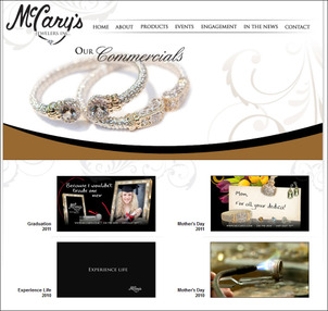
This is a screen shot of the McCary's commercials page:

(click to enlarge)
What really bothers me is that they captioned these 4 commercials with the year they were used:
* Graduation 2011
* Mother's Day 2011
* Experience Life 2010
* Mother's Day 2010
Clicking each of those video icons brings you to a .swf version of the video. By the way, .swf files are Flash files!
The better approach here would have been to upload these 4 videos to YouTube and embed them into the site. If the videos are designed to be evergreen, that is, without mention of trendy jewelry, years, and dates, then you can reuse it every year.
Overhead Details Are Missing
The last thing I'd like to call attention to is the complete lack of a footer. The footer of every website should include a copyright statement, the company name, address, telephone number and links to other standard pages on a website. Specifically they are missing a Privacy Policy, Terms of Service, and a Sitemap.
This information is commonly referred to as "overhead information" and "overhead pages" because, just like the required bills you need to pay every month to stay in business (i.e. your financial overhead) all of this information is usually required for every website. Some states and countries even have laws requiring this information to be on your site.
That's it for this week's review; see you next time.
FTC Notice: I randomly choose this website and won't be telling the retailer jeweler that I'm doing a review. Unless someone else tells them, they will only find out about this review if they examine their Google Analytics and Google Webmaster Tools. I'm not doing this to solicit business from them, but rather as an educational exercise for everyone. This review is completely impartial and all my comments are listed in the order that I discovered them.


