This is the Friday Jewelry Website Review edition of the Daily Golden Nugget. Every week, I randomly choose and dissect a retail jeweler's website to see what makes it tick. I never know what I'm going to find each week; sometimes it's something new to learn or a refresher on topics I've previously written about.
To find this week's review candidate, I searched Google for "jewelry stores in Bridgeton, New Jersey" and was given this SERP:
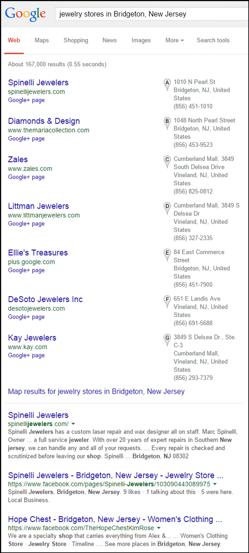
I'm choosing Spinelli Jewelers as this week's review candidate because they have the top listing in the Google+ Local pack and the top two spots in the organic results.
Here's their website:
http://spinellijewelers.com/
Here's what it looked like when I visited:

(click to enlarge)
This is a really long home page with a lot happening.
Home Page Lacks Focus
Their home page has these components:
Component 1: Hero Graphic
A large hero graphic at the top with the message "DIAMONDS. GEMSTONES. GOLD. WATCHES. GIFTWARE. CUSTOM DESIGNS. REPAIRS & APPRAISALS. VIEW JEWELRY"
I find the uppercase letters and the font choice to be very difficult to read. I'd like to see them swap out this laundry list of their products and services with a real message; perhaps their mission statement or just a warm greeting.
My experience tells me that this hero graphic is just a waste of space the way it is now.
Component 2: Introduction Message
The first block of text on the page explains why someone should be shopping at Spinelli Jewelers. It starts with "Spinelli Jewelers is your full service jeweler, with over 20 years of experience ..." and continues to explain a little about the owner.
This section is written from the "what we can do for you" point of view. To help attract more customers this should be rewritten from the "customer ownership experience" point of view.
Writing your marketing message from the customer ownership point of view has been around since the earliest days of marketing, except that few business owners who manage their own marketing ever learn this technique.
Component 3: Services
The services they provide are briefly explained on their home page and nowhere else on the site. This information would help their customers more if it was on a self-contained Our Services page.
Component 4: Deal of the Month
Diamond studs are their apparent deal of the month, but they don't give the details of that deal. I noticed that the photo of a diamond stud pair used to promote this deal is clickable, but that link doesn't bring me to more information... It just brings me to a WordPress popup window that allows me to see the same image.
The timestamp on that diamond stud image is May 8, 2013. That made me wonder if they ever change their deal of the month, so I checked the Internet Wayback Machine and found that those studs have been on special since at least November 27, 2013.
According to the Wayback Machine, Spinelli Jewelers didn't have a website prior to April 7, 2013. I have to assume this is the first time that the owners have attempted a website... Hopefully my comments here will help them.
I'd also like to point out that, although the "Deal of the Month" and "Deal of the Day" types of promotions are still viable, they are not as popular as they were in 2010 when Groupon was first launched. It's not surprising that Spinelli chose to set up a WordPress widget for their own deal of the month.
Just a hint here... If you are going to use a "deal" promotion, you really should tell people how good the deal is and what the prices are.
Component 5: Coast Diamonds
At the bottom of the home page, you'll find a random image promoting Coast Diamonds. There's no information to accompany this image so I simply have to assume they sell this line of jewelry. Clicking it brings me to the http://www.coastdiamond.com/ website without any further directions.
They should probably set up a dedicated page to give details of the Coast Diamond line of jewelry, why they carry it, and show some product images. That's a better method than a stray off-site link from the home page.
Component 6: Left Column
The left side of the screen has a mixture of several different items. It has:
* Contact information
* Link to Facebook
* Mailing list signup
* Stone of the month
* How to buy a diamond banner
* We buy gold banner
* Rembrandt Charms banner
* Bridgeton Area Chamber of Commerce banner
Results of the Home Page lacking focus...
As you can now see, there's too much happening on the home page. The visitor has no clear directions of what to read and where to click. It's easy to get lost. Confusing home pages like this often have higher than average bounce rates. I'd expect this site to have above a 60% bounce rate. By comparison, the current average bounce rate for retail jewelry website is 53.89% as measured from my own network from the last 30 days.
The best way to clean up the home page is simply to reduce the number of things a visitor will see. Pick the most important item to stay on the home page and move all the rest to their own, individual, pages.
Product Page
This is what I see when click the Products link in the top menu:
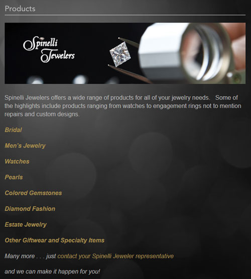
Each of the yellow links there brought me to a simple sub page showing a product, a short message, and links to other website.
This is what the watch page looked like:
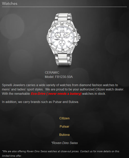
The other pages looked similarly boring. The better approach would have been to include more photos and additional product details.
Instead of linking to the vendor websites it would be better to set up a product catalog directly on the website for each set of vendor products.
Marketing Page. Marketing?
I was going to skip this page, but it was so out of place that I had to mention it. There's a "Marketing" link on the top main menu that brings us to this page:
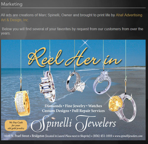
The message reads "All ads are creations of Marc Spinelli, Owner and brought to print life by Aha! Advertising Art & Design, Inc."
The better approach to this page would be to call it "What's New," "Our Latest Promotion" or even "Have you seen our latest..."
Under the guise of What's New, you can show off the latest direct mailer, email blast, or newspaper ad.
A jewelry customer does not care about your "marketing," but they would be interested in your "latest promo" that might be found here. Consider your language; no one is walking into your store and saying "What are your latest marketing specials?" They want to know what's on sale, what's new in the store, or what is hot for the season. You should be using the same language online that you use in person.
WordPress Disaster
Overall, I think this is a good example of a WordPress website that didn't have enough customization. One of the common problems I see with WordPress sites is how navigation links unexpectedly open new browser windows. This happened a few times while clicking the banners in the left column.
Speaking of the left column area, it remained static throughout the entire site. After the first few pages that information in the left column becomes boring to look at. Its not only boring, but many people won't even notice it any more... which probably defeats the reason you put it there in the first place.
It would be better to change the information in that column to better match the other content on the page.
That's it for this week's review, until next time...
FTC Notice: I randomly choose this website and won't be telling the retailer jeweler that I'm doing a review. Unless someone else tells them, they will only find out about this review if they examine their Google Analytics and Google Webmaster Tools. I'm not doing this to solicit business from them, but rather as an educational exercise for everyone. This review is completely impartial and all my comments are listed in the order that I discovered them.


