What I mentioned in that Nugget was to create different groupings of pages on your website that all represent the same topics and link together. I mentioned "Silo Structure" in that previous Nugget but I didn't fully explain what that was. Today's Nugget is dedicated to explaining what this is and how you would correctly design your jewelry website using it.
The Silo Structure is best thought of as website information architecture, or how you choose to organize your pages and the content. This wonderful article on information architecture shows how there are 6 specific ways to organize your website: All-in-one, Flat, Index, Hub-and-spoke, Strict hierarchy, and Multi-dimensional hierarchy.
For a full understanding of those 6 architectures, please refer to that article. For my purposes here, I'm going to talk about the Flat and Strict architectures only.
Over the last few years, the popularity of drop-down menu navigation at the top menu has grown significantly. These drop-down menus mimic the functionality you would see in all the normal software programs on your computer. They appear to be a side-by-side list of links to areas of your website until you hover over each of them with your mouse and reveal a secondary level menu below.
The ability to create these drop-down menus became much easier as CSS programming matured. Perhaps that's why they became so popular. Through the drop-down menu, you are usually able to reach every page of your website from any other page of the website simply by clicking through all those menu options.
The Flat Website Architecture refers to this ability to click from any page to any other page. All your pages are linked together and the user can go wherever they want. This seems like a very user-friendly navigation method for your website.
I've also noticed an increasing number of websites that use the drop-down menus at the top, but then they also include all, or most, of the same links in the footer of the page listed in a table format. Again, these add to the flatness of the website since it's easy to click from one area to another.
A simple WordPress website organizes all the pages so they link together into a Flat structure. You would have to apply a specific WordPress theme in order to create a more organized structure.
Since the Flat structure is so easy for people to use, why would you consider doing something different?
Well that all goes back to the idea to rank for topics that I mentioned two weeks ago. Here's the idea again in a nutshell:
Organizing your website into topics allows you to measure visitor traffic to your website based on those topics. If someone arrives on your website on any one of your 5 "engagement ring" pages then you can deduce that they searched for some phrase including the words "engagement rings." Those 5 pages collectively make up your "engagement ring topic."With the Flat website architecture, you could still have those 5 pages on your site, but the difference is that Google might not relate them all together as a single topic. Actually Google calls these groupings of pages "themes" but I find it more understandable to call them topics.
Collectively those 5 pages will have more potential to rank your website for "engagement rings" than any 1 of them individually. The potential for your ranking, and for easy tracking, increases if you correctly link those 5 pages together.
So how then do we increase our chances for ranking for topics?
This is where the Strict Website Architecture comes into play. This strict structure is often referred to, and better understood as the "Silo Structure." The idea here is that only pages within the silo will link to other pages within that silo. Only pages at the top of the silo will link to other silos.
What this means in practice is that you would create 1 page to act as the main heading of every topic then link to all topic related pages from that main page. Your home page would link to all the main pages and in order to jump from one silo to the next you have to click on a link for the main pages.
Here's how it looks using illustrated theory:

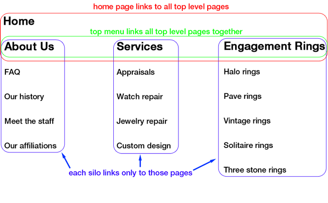
That diagram illustrates that there would still be a top menu showing items for About Us, Services, and Engagement Rings. The top menu is shown with a green border around it. Every page of the site would still have the top menu with those 3 items, and they would each act as the top of their respective silos. The Home page would only link to those top silo pages as is illustrated by the red border in the diagram. Each main silo page would then have a sub navigation that links to the pages below it. Those are illustrated with the blue border around them.
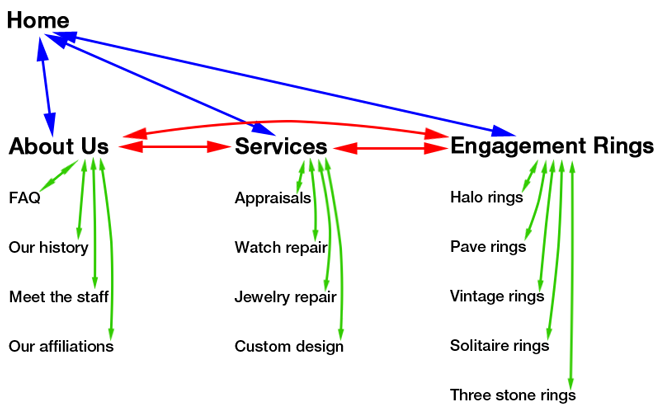
Here's a similar view of the same diagram showing how the pages would link together:

As you review these two diagrams, you will realize how the pages link together in their sets of topics. According to my previous example, you would link your 5 engagement ring pages together. For simplicity's sake, I used Halo, Pave, Vintage, Solitaire, and Three stone as those 5 pages and grouped them into the Engagement Rings silo.
If you'd like to dig deeper into this Silo Structure topic, then I recommend visiting Bruce Clay's page on SEO Siloing.
As I said two weeks ago, this change in website architecture should be seriously considered as a way to understand your website visitor traffic in the future. Since we can't measure keywords that attract people to our site, we need to use a more efficient method, and I predict many jewelry SEO Pros will once again start recommending siloing pages together.


