
This is the Friday website review edition of the Daily Golden Nugget. Today, I'm going to perform an incognito Google search for a random jewelry store candidate in Blackstone, Virginia, then review their website.
The goal of this weekly website review is to learn something new, or at least to see an implementation of something good or bad that you never knew.
When I used the search query "jewelry stores in blackstone va" I was given these results:
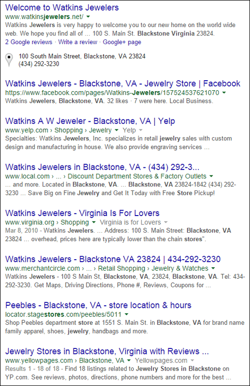
It's not often that the Google SERP only shows me one result, but there it is, the only jeweler in Blackstone is Watkins Jewelers. I found it hard to believe that there was only one jewelry store in that area so I double checked these results in Google Maps. Sure enough, the next closest jeweler is more than 20 miles away.
The Watkins Jewelers website is:
http://www.watkinsjewelers.net/
You might want to click that and open it up while you follow along with this review.
I always try to document my initial reactions and thoughts as I navigate through these Friday website reviews. This is my attempt to mimic how a new customer will also react when visiting the site for the first time.
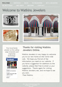
This is what the home page looked like when I visited:
(click to enlarge)
Certainly this is an older looking website with a very simple layout. My first reaction was to look for the copyright at the bottom, but they don't have one. I checked the internet archive and discovered that they registered their domain name around October 14, 2011 and launched this website around February 27, 2012.
It's now 3 years later and their home page has not changed. This is a problem.
I'm okay with the "Welcome to Watkins Jewelers" headline that they are using, and I know several jewelers that have "welcome" type messages on their website. However, I really disdain what they've written below that.
The sub-headline reads "Thanks for visiting Watkins Jewelers Online." The word "online" should not be used to describe the website of any retail store. The person reading this is using the internet, and therefore they are online, and they are looking at your website, which of course is also online. There's no reason to point out the obvious and welcome them to your online site. It sounds out-of-touch, and well, old.
Additionally, the use of the word online to describe your website implies that your website will provide a different customer experience than what you will get in the store.
Oh no, this is their first sentence:
"Watkins Jewelers is very happy to welcome you to our new home on the world wide web."
If you learn nothing else from this review today, please learn this point. You should never, ever, welcome users to your "new home." While you might be excited to set up your new website, don't say it. Invariably what happens is that you forget all the subtle text you write on your site and before you know it, months are flying buy and your website still has that same message, making you look silly. Also, "the world wide web" smacks of filler words from a company who was terrified of entering the internet. No one comfortable with the web has used "world wide web" since the year 2000.
Three years later, that "new" message now makes you seem completely foolish especially when it's side-by-site with this next one:
"Your local family jeweler on the cutting edge of jewelry and engraving technology."
Honestly, I'm not sure how anyone can say they are on the cutting edge of any technology when a website this simple looking is 3-years out of date. Rather than be specific, this jeweler has self-consciously put up phrases that sound impressive in theory, but read as flat when a customer is looking to find out what it is that you really do.
If their website is this out of date, I have to wonder if their Facebook page is updated. In previous reviews, I've found that jewelry stores will abandon their website but maintain healthy activity on Facebook. The link on their home page takes us to https://www.facebook.com/watkins.jewelers.
They are using a personal Facebook account rather than a Facebook Page! I've not seen this setup in a while because Facebook did a big push to convert profiles like this into Pages more than 3 years ago. You can read benefits of Facebook Business Pages here and even an interview on forbes.com here explaining why you should not do this.
I'm not friends with them on Facebook, so it's very possible that I can't see all their activity. As a business, you always want to post publicly to Facebook so any new customer can see what type of business you are. Those public posts are also good for Google search ranking. If you lock your Facebook, you're essentially painting your windows and putting on a padlock. If you're concerned about security, a business page is already the best course of action for you to put your store's information, as opposed to your own, at the forefront.
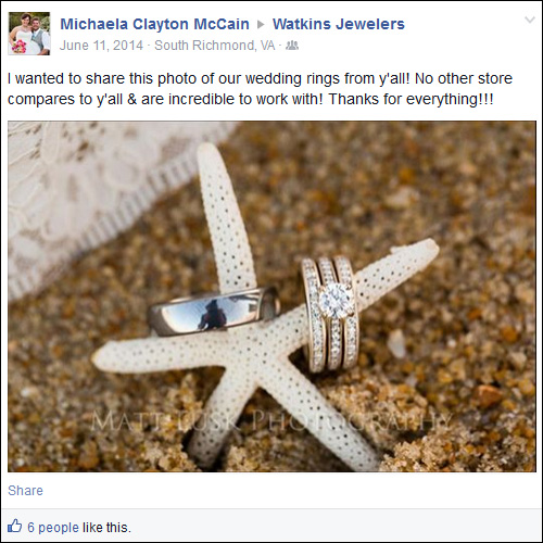
As I scroll down through their Facebook profile, I realize that they don't post very often at all. On a positive note, they do have some happy customers that publicly shared photos of the engagement rings purchased at the store, like this one:
As I reviewed their timeline of social posts, I noticed that they had more activity back in 2009 than they do now. It also looks like they had a push of momentum in late 2011, around the same time they registered their domain name.
Returning back to their website, I'm now visiting their Services page here:
http://www.watkinsjewelers.net/Services/Services.html
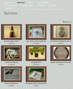
This is what it looks like:
(click to enlarge)
In case you can't tell from the above screen grab, those brown boxes are photo album covers. The photos within those covers change as you move your mouse over them. Clicking each one will bring you to another page where you can see larger, very detailed versions of all of them.
This might be the most unique version of a Services page that I've ever seen. The concept is really good. Instead of overly describing each service in words that few will read, they chose to create a photo album to show the actual process for each of the services they offer. The functionality is a little clunky on this page and could use a little improvement. I also recommend that they do add at least one sentence description of each service (ie photo album) so customers know what they will be clicking in to see.
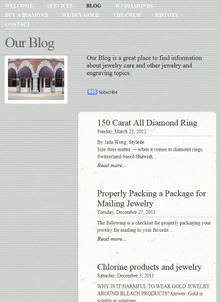
Moving on to their blog page, which looks like this:
(click to enlarge)
Your online blog is the easiest way to continually add new content to your site to help spotlight services you offer in your business, new products, fashion trends, and changes in the jewelry industry. It's also a way to let Google know that you keep your website updated, which is important when you are in a highly competitive area.
The closest competitor to Watkins Jewelers is 20 miles away (as the crow flies), and Google obviously ranks them highly, so I guess they don't care that they haven't updated their blog since March 25, 2012, which is about 3 years ago.
I read through The Crew page (staff) and the History page to find out that the Watkins family bought the business in 1951 and the 3rd family generation is now working there. As a generational store, they probably also have generational families as customers, which means they have a lot of really great stories to tell.
They should not let the lack of local competition stymie their internet progress. In fact, I view it as their freedom to stretch their legs and completely occupy the online space within 50 miles of their store.
The Millennial Generation is out there and is searching for businesses that understand them and are willing to provide information on their terms, i.e. via the internet. Watkins Jewelers appears to be in a good position right now, but one of those other jewelers within 20 miles could create unexpected competition if they launch an aggressive online marketing campaign with customer engagement.
My recommendations for Watkins Jewelers would be to first convert their Facebook profile into a page, and engage there. Next, they need to clean up their home page, and update it regularly. Lastly, they should add customer service stories and product features to their blog on a routine basis.
I'm not suggesting a massive website redesign, yet, just more activity. If they don't get started now, they might start wondering why business declines in a few years as other jewelers figure out how to better provide customer service through the internet.
While it might seem confusing for more jewelers to figure out where to start and what to do online to attract the Millennial Generation, Watkins has a built-in resource... Tate and Will Watkins, the 3rd Watkins (millennial) generation, are already on staff and they can use their own ideas to help the family business along.
That's it for this week's review.
FTC Notice: I randomly choose this website and won't be telling the retailer jeweler that I'm doing a review. Unless someone else tells them, they will only find out about this review if they examine their Google Analytics and Google Webmaster Tools. I'm not doing this to solicit business from them, but rather as an educational exercise for everyone. This review is completely impartial and all my comments are listed in the order that I discovered them.


