Welcome to the Friday website review. The goal of these weekly website reviews to learn something that can better your own website by analyzing someone else's live website. Every week I simply do a Google search in a random town or city throughout the U.S.
This week I'm looking for a review candidate in Terrell Hills, Texas. Using Google Chrome's incognito mode I searched for "jewelry stores in Terrell Hills, Texas" and was given this SERP:
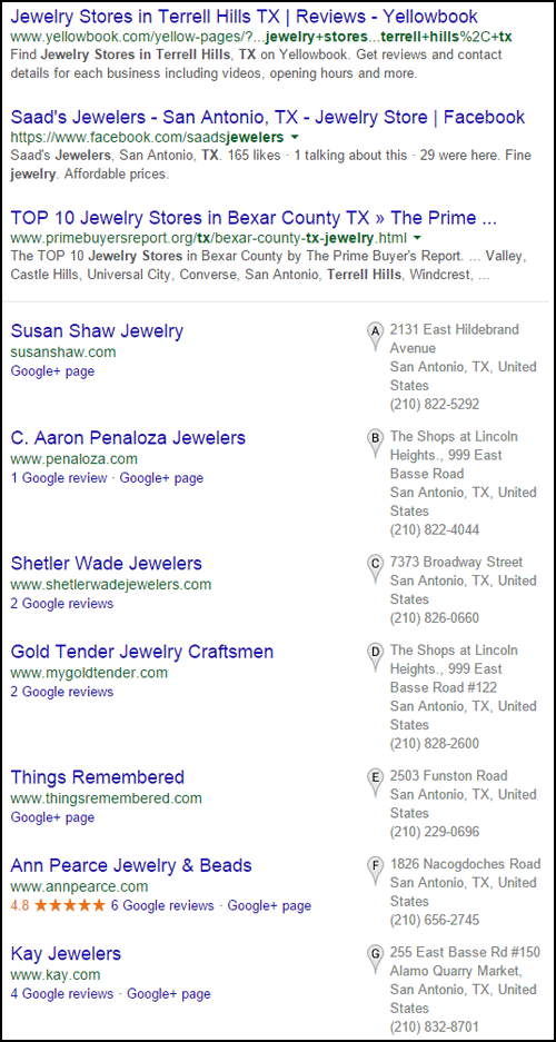
I'm skipping the 3 organic search results at the top because they are obviously not links to jewelry websites. A customer looking for a local jeweler probably wouldn't wasting their time sifting through YellowPages or Facebook when there's a local pack of 7 jewelers listed a little further down.
I immediately noticed that none of the jewelers were actually in Terrell Hills so I looked at Google Maps to confirm the location of the 7 suggested jewelers in the SERP results. According to Google Maps, Terrell Hills doesn't have any retail jewelers and the 7 suggested are all within 1 mile of that community.
The next thing that catches my attention is the 4.8 star review rating for Ann Pearce Jewelry & Beads. Even though it's the only business with reviews, I'm not looking for a bead store, so I'm skipping this one. Honestly, I don't know if it is strictly a bead store, but the name disinterests me.
Susan Shaw Jewelry is first on the list. With a quick glance of their website I know my review would be quite brutal, but I'm skipping them because they are a wholesale jeweler with a password protected website.
Even though it's not shown in the above SERP, I have to mention the store Celestial Jewel. Google Maps shows that this store is very close to the Terrell Hills border, but they don't have a website. According to their Google+ Local page their primary business is "watch repair service." After reading their online reviews I'd assume that they are a retail jeweler, but they are misclassified. They could easily fix this by accessing their Google My Business account.
The second jeweler in the list is C. Aaron Penaloza Jewelers with the website:
http://www.penaloza.com/
This is what their home page looked like when I visited:

(click to view larger)
The process I explained above is how I typically look for my review candidates. I like to document my thinking in hopes that it illustrates how a real customer would be using Google search to find a nearby jeweler.
Inspecting the Footer
The first thing I do when reviewing a website is to look at the footer. I look for logos, addresses, phones numbers, social network icons, links to overhead pages, and website colophon information.
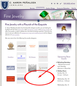
The Rafael Bridal Collection logo got my attention because I don't recognize that name or logo. The logo is not clickable so I checked out the Fine Jewelry page in search of this designer. Here's a snapshot of the Fine Jewelry page:
(click to view larger)
I've indicated a red circle in the above image for where I expected to find the designer logo and a link to their website, but it's not there.
Upon close inspection I realized the Rafael Bridal Collection logo uses the same feather as the shield logo for the store, shown here:
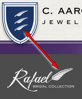
I'll assume this is a branded store line, but I can't find the logo anywhere else on their site to explain what it is. The lesson you can take away from this is that you should not put random logos in your footer unless they link to something to explain why they are there.
Overly SEO'd
There's no other way to explain it other than to say that this website has had a fair share of search engine optimization, too much in my opinion. Penaloza paid an SEO company to work on their site, I only know this because that company also put their name in the footer of the site.
18 of the 25 pages of their website have unique written copy to explain the services they provide and the products they sell. Regretfully, all that copy is difficult to read, salesy, and loaded with internal links.
Internal links are good for deep linking when you want to help a customer find a different page of your site, but this site is going overboard with at least 3 internal links on every page.
Here's an example:
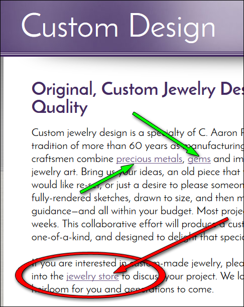
The green arrows in the above image point to the internal links for "precious metals" and "gems." The SEO company is trying to carefully craft the anchor text throughout the site to help promote the appropriate pages.
Internal linking is something you should have on your website, but their implementation tactic is egregious.
The red arrow in the above screen shot points to a "jewelry store" link that brings the users back to the home page. That is really confusing. Internal linking should only be used when it makes sense for the user to click the link to find out more information. In that example, there is no reason for someone to jump from the Custom Design page, back to the home page.
Overall, the internal linking set up on this site is awful. There are only 25 pages but those internal links make it feel like the site is infinitely deep and confusing.
Page Titles and Store Name
It's obvious to me that the SEO company spent a good amount of time to write unique page titles for all 25 pages. They are using many common search query phrases as the page titles, and they have partially matched those phrases with the headline in the H1 tag on each page.
I have to point out that the store's name is "C. Aaron Peñaloza Jewelers," the letter n has a tilde over it. However, I bet that no one types "ñ" into Google search. They should look at the keyword data in their Google Webmaster Tools reports and see if Google is matching them to "aaron penaloza jewelers" and "penaloza jewelers." The store name should always bring the most visitors to a site, but in their case I have a feeling that there's an unfortunate disconnect because of the special "ñ".
If I were their SEO agent, I would suggest that several of their page title be rewritten to use "Penaloza" instead of "Peñaloza."
Potential Over Optimization Penalty
Their home page title is written in a clumsy way:
"San Antonio, TX Jewelry Stores | Engagement Rings, Custom Jewelry, Jewelry Repair"
I would have written it as:
"Jewelry Store in San Antonio TX | Engagement Rings | Custom Jewelry | Jewelry Repair"
My suggested change uses pipes to identify a clear distinction between phrases instead of using a mix and matching of commas and pipes to create a distinction.
The page title is considered the most important ranking factor of any web page. You are almost assured to rank in the first position of Google when searching for the first few words of home page title.
In their case, I expect to see them ranking first for the phrase "San Antonio, TX Jewelry Stores," but they don't, they are in 9th place as shown here:
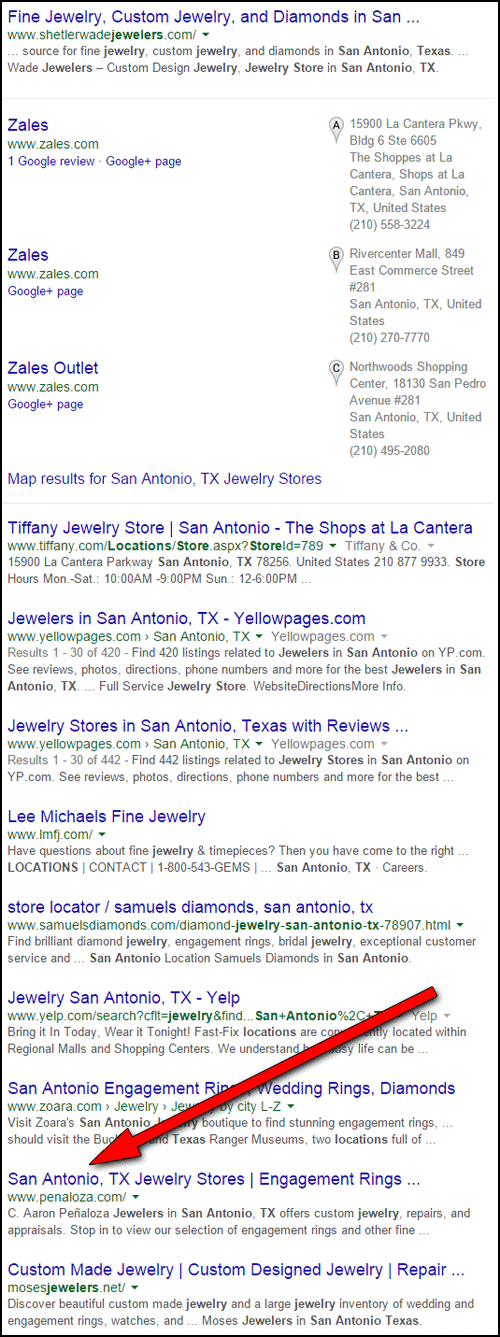
It's possible that all this SEO work was just performed and they are waiting for Google to switch up the results, but it's also possible that the SEO tactics they are using have completely backfired.
Unexpected Surprise
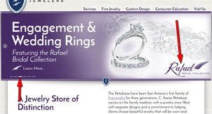
My browser was sitting on the home page when I noticed the Rafael logo rotating through the home page slider as shown here:
(click to enlarge)
That image is 3rd in the slider lineup. I completely missed it, and I'm sure many other people don't see it either. The "Learn More" link brings you to the Engagement & Wedding page.
The Rafael Bridal Collection is hidden in plain sight right in the second paragraph shown here:
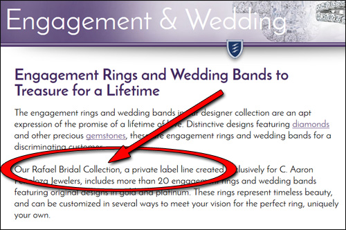
Perhaps you could say "Hey Matt, if it were a snake, it would bite you." Well, users navigate jewelry websites visually, so that snake is already dead.
That's it for this week's review; see you next time...
FTC Notice: I randomly choose this website and won't be telling the retailer jeweler that I'm doing a review. Unless someone else tells them, they will only find out about this review if they examine their Google Analytics and Google Webmaster Tools. I'm not doing this to solicit business from them, but rather as an educational exercise for everyone. This review is completely impartial and all my comments are listed in the order that I discovered them.


