Welcome to the Friday website review edition of the Daily Golden Nugget. The purpose of this review is to examine a live retail jewelry website in search for the good and bad traits. There's always something interesting to learn from in every week's review.
For this week, I started with a search using the Google Chrome browser in incognito mode. I stay incognito while searching for a review candidate so my own browser history will not influence the search results I see. Through your search history, Google has a way of knowing which websites are more important to you and they will give you personalized search results with those sites ranked higher.
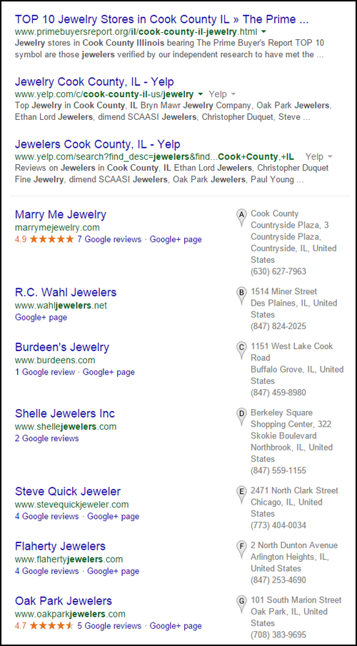
The search query I used this week was "jewelers Cook County, Illinois" and was returned these results:

These search results had several Yelp and other directory results because I searched for a county name and not a specific city. Google gave me 7 potential jewelers from Cook Country in the Local Pack.
I'll choose the first jeweler in the list, Marry Me Jewelry with this website:
marrymejewelry.com
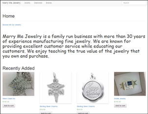
This is what their home page looked like:

(click to enlarge)
Usability Issues:
For a jewelry store, my first reaction is that this site is unattractive. I immediately recognized this as a responsive website design, but it's devoid of nice photography and color.
The font you see in the above screen shot looks a lot like Comic Sans. I found it hard to believe that any web designer would willingly use Comic Sans on a jewelry website, so I looked at the source code and was shocked to see the "Playball" font listed as the correct font.
Here's the Playball font:

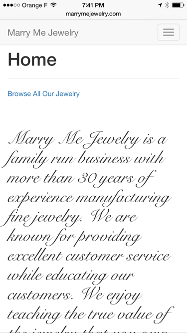
In the absence of the Playball font the source code says to use a "cursive" font. This is how it looks on my iPhone with a built in cursive font:

I tested this site on another Windows computer, and it seems like Windows is defaulting to Comic Sans when Playball and cursive fonts are not available.
Clearly the website designer messed things up here. You cannot rely on users to have nonstandard fonts installed on their computer. When using non-standard fonts, you must program your website to include font files as part of the code.
The overall appearance of this site looks like they designed it for mobile devices and completely forgot about how it would look on desktop.
What I Didn't Like About the Site:
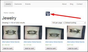
This site was created with WordPress with an e-commerce plug-in. The functionality is very sloppy and it hides the product category navigation behind an incorrect icon.
Take a look at this screen shot:

(click to view larger)
The red arrow is pointing to an icon that is usually used as the "Add to Cart" button, but they are using it to show/hide the product categories. You should not use icons that have a typical accepted meaning for an unusual purpose on your own website. The bounce rate of your website will increase if you make the learning curve too high.
What I Liked About the Site:
Well, I like that they have a blog. Sadly the one and only entry is from August 15, 2014 announcing the launch of their new website. The website screen shot shown in the blog post (http://marrymejewelry.com/new-website-launched/) is different than the website I see today, so I'm not sure what happened there.
Assuming the blog post is accurate; they say that they are uploading their inventory every day to the website. This is a really important step for all retail jewelers to eventually take because online customers now expect to see accurate inventory in online catalogs.
I recognize the format of the product SKUs they have online, and I'm guessing they are using The EDGE as their inventory control software. The websites I create for retail jewelers also has the ability to receive daily inventory from the EDGE.
I could beat up this website a little more, but I've already covered a few really important issues you could learn from.
Until next week...
FTC Notice: I randomly choose this website and won't be telling the retailer jeweler that I'm doing a review. Unless someone else tells them, they will only find out about this review if they examine their Google Analytics and Google Webmaster Tools. I'm not doing this to solicit business from them, but rather as an educational exercise for everyone. This review is completely impartial and all my comments are listed in the order that I discovered them.


