
Let's imagine that there's a special gift giving day coming up soon and I need to buy a gift. Assuming that I live in Englewood, Colorado I might do a Google search for "buy jewelry gifts in Englewood Colorado."
Today is the weekly website review edition of the Daily Golden Nugget. The goal of this review is to randomly search Google for a retail jewelry store and learn something from scrutinizing how they manage their website and online identity. There's always something to learn from these reviews, whether it's learning from something good, or bad.
There's always room to make your website better.
Here's a snapshot of the Google SERP for the above query:
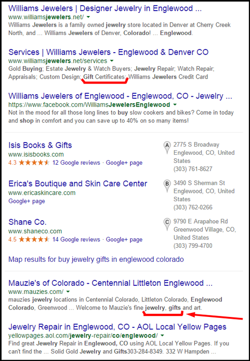
Williams Jewelers is the highest organically ranked jeweler in that SERP, and I might choose them If I were looking for a random jewelry store; but since I searched for the phrase "jewelry gifts" I was more drawn to the result for Mauzie's of Colorado.
You can follow along with this review here:
http://www.mauzies.com/
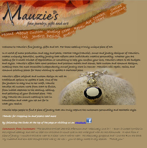
This is what their home page looked like:
(click to enlarge)
The home page is very artistic; I might even describe it as quaint. Look closely in the above image and you'll see how the top menu wraps around the header graphic. Clicking that menu reveals a very old HTML programming technique called imagemapping.
Back in the 90s, before we had style sheets and JavaScript to create fancy visual effects, website designers would create elaborate designs in PhotoShop then slice them up into parts. We would then overlay those image parts with hyperlinks. It's that overlay process that was called an imagemap.
This is not a very good start to the review. Very quickly, I can tell they are using HTML programming that dates back to the dawn of the "world wide web."
In recent years, my company is programming websites for jewelers based on our previous experience with website tracking and business intelligence. Our goal is to create websites that help customers find what they are looking for, but also portray the right image for a jeweler.
Prior to the advanced tracking that guides us, we would design websites based on the store owners wants and desires. That was usually a very long process that resulted in a lot of indecision and ultimate disappointment. Websites would take months, even years to launch because the jeweler wasn't satisfied.
The Mauzie's website design is very reminiscent of one of those old projects where the business owner wanted something they could fall in love with. You should never fall in love with your website's design!
To continue on with my fictitious journey to locate a jewelry gift, I click on the "Online Shopping" option in the top menu. This brings me to the Mauzie's Etsy shop shown here:
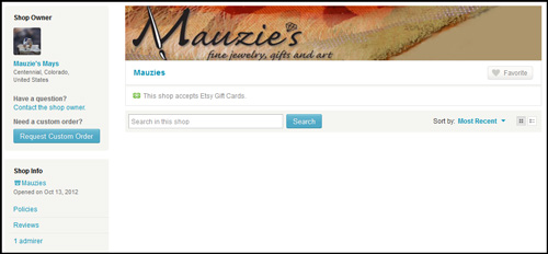
In case you can't tell, it's a blank store. Nothing is for sale.
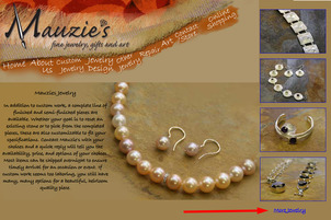
Back on the website, the top menu has options for Custom Jewelry, Jewelry Design, and Other Jewelry. Perhaps a "jewelry gift" can be found on the Other Jewelry page, shown here:
(click to enlarge)
Notice the red arrow in the above image. If you click that "More Jewelry" link 8 times you will cycle through 8 similar looking pages with 4 photos each. This technique is quite archaic, but on the other hand, as I sit here pretending to be a determined customer, after looking at the type of jewelry shown here, I now feel a sense of satisfaction that it will be worth my time to visit the store in person.
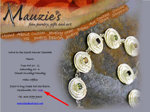
With this in mind, I now click on the Contact/Store link in the top menu to get directions to their store. Here's their contact page:
(click to enlarge)
Notice the red arrow in the above image that points to a "Map" link. I assume that link once worked back in the stone age of the World Wide Website (when this site was built), but changes in how Google Maps works have invalidated that link completely. They would realize this if they were paying attention to their website.
Speaking of paying attention to their website, I decided to look at their Facebook page here:
https://www.facebook.com/mauzies
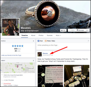
This is what it looked like at the time I wrote the review:
(click to enlarge)
They update their Facebook page several times a month with their latest inventory and photos. Although it seems like a good idea to update their Facebook page that often, what they are failing to realize is that their Facebook page only has 674 likes, and therefore not very likely to reach many existing customers, let alone new customers.
They've allowed their website to flounder while concentrating on their social media. This is a problem I see over and over again among many retail jewelers, and within other industries. You should never abandon your website in favor of social media.
If Mauzie's were to ask me, I'd tell them that it's time they converted their website from hard coded HTML, and started using a content management system that they could update daily, with ease. Then I'd show them how to use different social media to lead people back to their website and eventually into their store.
That's it for this week's review.
See you next time!
FTC Notice: I randomly choose this website and won't be telling the retailer jeweler that I'm doing a review. Unless someone else tells them, they will only find out about this review if they examine their Google Analytics and Google Webmaster Tools. I'm not doing this to solicit business from them, but rather as an educational exercise for everyone. This review is completely impartial and all my comments are listed in the order that I discovered them.


