
This is the Friday website review where I dissect a random retail jeweler's website to find the good and bad that we can all learn from. Although I write about website design, search engine optimization, and online marketing every day, sometimes all that stuff doesn't make any sense unless you see exactly how it applies to a real website.
That's why I dedicate one day every week to these reviews of randomly selected jewelry stores.
Normally I ask someone on my team to give me a random city name, but this week's review candidate came to our attention while working on another research project.
The store is A. Scott Rhodes Jeweler in Wilmington, North Carolina. The website is http://ascottrhodes.com/.
I find the design of this website to be quite charming. It was designed back when web developers spent way too much time trying to perfect the look of a website to closely match the physical store. That was back in 2006 according to the footer of the website.
This website also appears to have a responsive design because the width of the site changes fluidly for every browser or window size. But it's not really responsive, it was just designed with a simple technique that we all used back then.
Instead of providing a harsh critique on the site, I think I should quickly go through all the pages of the site and provide recommendations for their inevitable upgrade.
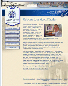
Starting with the home page shown here:
(click to enlarge)
Every page of a website should have a main heading using the H1 tag. Typically that same heading will match the page title and perhaps even the URL. The heading on their home page uses an image to display "Welcome to A. Scott Rhodes." The use of images for headings was common back then, especially when you needed to use a specific font like they are doing here.
The improvement here would be to use one of the many font style sheet methods to deliver that special font to the browser and then display the heading "Welcome to A. Scott Rhodes Jeweler." Notice how I added the word "jeweler" to the headline, which I felt was incorrectly left out.
The home page needs some type of product photography. Right now it has Scott's smiling face amidst 200 pretty boring words. Because this was written back in 2006, I would have expected those 200 words to be stuffed with jewelry related keywords, but it's written naturally... It's just boring and would not excite customers to visit.
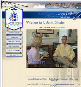
A link from the bottom of the home page brings you to a video interview of Scott Rhodes on the Cape Fear Now! TV show as seen here:
(click to view larger)
This video is also quite dated, especially considering that the Cape Fear Now! show has been bought by CW and renamed. You'd have to sit through this slow paced 8 minute video to find out Scott's history and experience that should be written on the website in the first place.
During the interview it's said that Scott is the only jeweler in North Carolina using the Gemvision Digital Goldsmith. I have to assume that's not the case anymore and therefore this video should be archived or at least a date should be included. Otherwise, one of Scott's competitors could cite false accusations.
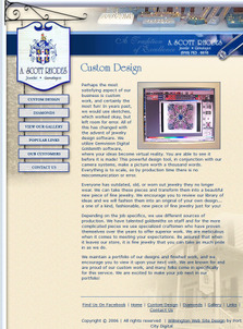
This next page talks about their custom design process:
(click to view larger)
I find it rather ironic that they use the expression "a picture worth a thousand words" on this page because they don't include any pictures of the jewelry that they've custom designed. Instead, they show a photo of the computer screen (it's an old style CRT screen too) with the software. Although the software looks impressive, it does not prove the quality of the custom design work, nor does it show the potential ownership experience that a customer would eventually experience themselves.
The better approach would be to show a bunch of custom design pieces from sketch, to rendering, to final product. Each item could have a description of what the customer was looking for and how it was accomplished.
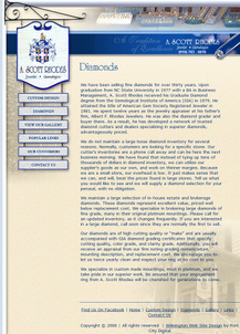
Since the title of the next page is "Diamonds," I assumed it would be all about diamonds:
(click to view larger)
In fact, this page is a 371 word editorial explaining Scott's experience working with diamonds in his father's jewelry store and the reasons why they don't stock an inventory of diamonds in the store. An editorial improvement to this page would be to show multiple diamond photos and the best settings for them to be in. This would help illustrate that a customer can buy any diamonds from Scott Rhodes even though they are not stocked in the store, and it portrays ownership experience again by illustrating how a diamond could be matched to an appropriate setting.
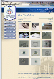
Their photo gallery is the next page in the left navigation, shown here:
(click to enlarge)
It looks like they are using the photo gallery to show their custom design work and the current products in their store. But as I said, this site hasn't been updated since 2006 so that inventory surely doesn't exist anymore, and much of the featured styles are probably not in demand anymore.
Instead of a photo gallery, this part of the site should be renamed as the online catalog, and it needs to be kept up to date with current inventory. They could keep the custom design photo gallery, but only if they link to it from the Custom Design page. I'd still prefer to see some of these photos right on the custom design page.
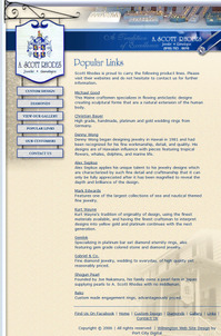
This next page seems to be miss-named as Popular Links:
(click to enlarge)
This page is actually a list of jewelry designer name, brief descriptions, and links to those designer websites. I would call this a "Designer Links" page, not "Popular Links."
The better strategy would be to flesh out each brief description a little more and convert this from a single page with 10 links into 10 individual pages with the designer logos, a few product images, and links to the sites. This 10-page strategy would carry a lot more weight in Google's search index.
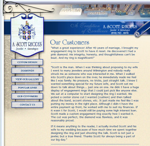
I was a little mislead by this next page name called "Our Customers," shown here:
(click to view larger)
I expected to see photos of their customers, but this is really a testimonials page. A better name would have been "What Our Customers Say" or simply "Testimonials."
There are ten testimonials on this page, making it the longest page on the site. Customer testimonials are always great, but they should also always include the name and town of the person giving the testimonial. Although a potential customer will probably never attempt to contact your previous customers, the names and towns is a slight step towards proving the legitimacy of all that praise.
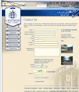
The Contact Us page is the last one on the website, shown here:
(click to view larger)
I have to say that this contact page has an uncanny resemblance to the same layout my own company was using circa 2006. The form fields, CAPTCHA, address, photos, and even the Map link to Mapquest.com... uncanny!
Anyway, other than the link to Mapquest, this page is still very functional. It's possible that more people would fill out the form if all the non-required fields were removed, but he'd have to test it. For the record, the link to Mapquest.com still works, but most people would rather use a mapping system that ties to the one on their smartphone, like Google Maps or Apple Maps.
The last thing I need to comment on is the footer link to the A. Scott Rhodes Jeweler Facebook page found here:
https://www.facebook.com/ascott.jeweler
First, this is a Facebook profile rather than a business page. That limits the ability for the store to network because people have to request friendship rather than simply liking the page. If you have friends instead of fans (likes), your Facebook presence is set up incorrectly.
Second, as of this writing (November 17, 2014) the last post to this profile was August 29, 2014. Updates should be made to your social profiles much more frequently than this.
Third, I also found that A. Scott Rhodes, Jeweler does in fact have a business page here:
https://www.facebook.com/pages/A-Scott-Rhodes-Jeweler/80694280924
This is the page that should be linked from the footer of the website. Sadly though, as of this writing the last update to this page was... April 27, 2009. That's 5 years, 7 months ago... WOW!
That's it for this week's website review. Return again next week for more ways to directly apply website knowledge to live websites.
In the mean time, give me a call if you are if you are in the market for a new website. That's the core of my business.
FTC Notice: I randomly choose this website and won't be telling the retailer jeweler that I'm doing a review. Unless someone else tells them, they will only find out about this review if they examine their Google Analytics and Google Webmaster Tools. I'm not doing this to solicit business from them, but rather as an educational exercise for everyone. This review is completely impartial and all my comments are listed in the order that I discovered them.


