This is the Friday website review where I take a look at a random retail jewelry store website and dissect it to discover all the good and bad things we can all learn from.
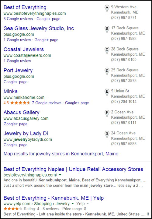
For today's review, I started with a search for "jewelry stores in Kennebunkport, Maine" and was given this Google SERP result:

From that list, I'm choosing Coastal Jewelers. The first jeweler isn't in Kennebunkport and the second jeweler in the local pack doesn't have a website. Coastal Jewelers is the first jeweler in the list that matches my request.
Their website is:
http://www.coastaljewelers.com/
This is what it looked like when I first landed on it:

(click to enlarge)
The main image on their home page immediately tells me that they make custom jewelry. I like that they have a single hero image on their home page without the slider fading feature that's so popular on websites right now. Instead of bombarding me with multiple messages, they simply state that they sell "Fine Custom Jewelry."
The only problem with that hero graphic is that it didn't link to more details about their custom design service.
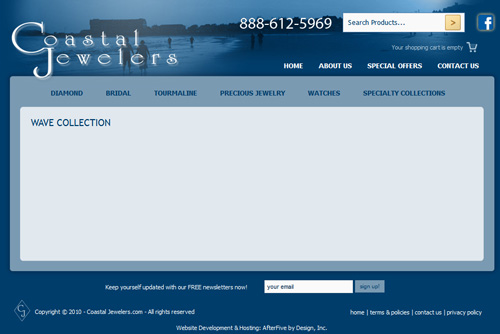
Their home page is also very simple with only the hero image, 2 photos of products, and a large image at the bottom to advertise their Wave Collection. The Wave Collection ad says it is exclusively available at Coastal Jewelers, and I'm thinking it's their own design. Unfortunately, the link leads to a blank Wave Collection page shown here:

I also noticed that the copyright in the footer of the site says 2010. The website has an older design which dates back a little further than 2010, maybe to 2008.
As I click around the site, I'm finding several blank pages, like their "207Collection" located here:
http://www.coastaljewelers.com/index.php?option=com_virtuemart&Itemid=46
and the "KPT Collection" located here:
http://www.coastaljewelers.com/index.php?option=com_virtuemart&Itemid=45
You shouldn't have blank pages visible on your website. They should be hidden from public view until they are completed.
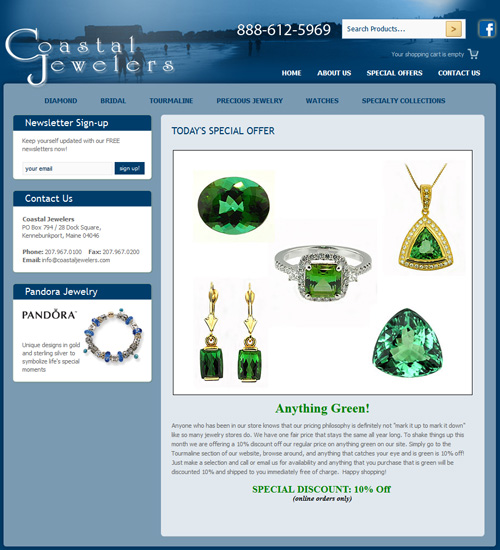
The Special Offers link at the top of their website leads to this page:

The message on that page says "To shake things up this month we are offering a 10% discount off our regular price on anything green on our site." Sadly, that page hasn't changed since August 2, 2012. Perhaps they chose green that month because peridot is the birthstone for August. Regardless, they've been offering "10% off green items this month" for more than 2 years now.
They have very few pages of information on their website that would be considered quality information for Google to ingest. Most of their site is simply part of their online product catalog.
According to their source code, they are using Joomla 1.5. As of this writing, the latest version of Joomla is version 3.3. As an e-commerce site, they should not allow themselves to fall so far behind. They've missed out on several security patches that leave their website vulnerable to hacking.
As of this writing, the latest large scale hacking breach hit Home Depot and compromised 56 million credit cards, including my own. I received a new card in the mail but wasn't affected at all by the theft of my now old card number. The owners of Costal Jewelers could face hefty fines and face the possibility of losing their merchant account privileges if credit card numbers ever get out into the wild as a result of their website being hacked.
You must maintain your online security and software updates if you're going to have an e-commerce site that captures credit cards.
That's it for today's website review. Check back again next week for more hands-on website analysis.
FTC Notice: I randomly choose this website and won't be telling the retailer jeweler that I'm doing a review. Unless someone else tells them, they will only find out about this review if they examine their Google Analytics and Google Webmaster Tools. I'm not doing this to solicit business from them, but rather as an educational exercise for everyone. This review is completely impartial and all my comments are listed in the order that I discovered them.


