Today is the Friday website review edition of the Daily Golden Nugget, and it's a special one too! In honor of Halloween, I decided to search for a jeweler that would be in, or nearby any town with a Halloween themed name. Naturally the first part of this adventure was to locate some towns with Halloween related names. I found these...
The first one I found was Scary, West Virginia. No jewelers in that town but I did find a store called Elizabeth's Attic within about 5 miles. Honestly their website is downright scary, http://www.elizabethattic.com and I'm just going to skip over that.
Then I found Frankenstein, Missouri, but no jewelers were around that area. Spiderweb, South Carolina also didn't catch me anything good to sink my teeth into.
Apparently I needed to carve my own way to a review candidate. I was trying to use the normal Google search to find jewelers, but because it's Halloween, Google thinks I want costumes and costume jewelry. I had to switch over to use Google Maps and refine my search.
After some poking, cutting, and scraping I finally found a jeweler near Pumpkintown, South Carolina. I used the measure tool built into Google Maps (it's an option when you right click) to select the closest jeweler, which is TR Jewelers, a 15 mile drive down Route 288, otherwise known as Pumpkintown Road.
Here's their website:
http://travelersrestjewelers.com/
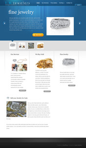
This is what their home page looked like:

(click to enlarge)
The design of this site looks pretty good because the color scheme is attractive and it matches the very popular website trends of today. This is a standard WordPress template, and it's one of three that their web design company offers as shown here:

The TR Jewelers site is very small with only 6, rather bland and unattractive pages. What they have on their website is pretty boring too. It almost seems like they copied from other retail jeweler sites when writing the information from theirs.
I also checked the history of their website and found that they first launched it in June 2013, so I'll call this a decent first phase of their website. The next phase would be to add a product catalog so online users can see the types of product they carry, and then phase three would be to add a blog.
I think I should also point out that when you do add a product catalog and a blog to a website you also have to make a commitment to continually add products and blog entries. These are not set-it-up-and-forget-it systems. They are organic and need continual feeding to benefit your jewelry store.
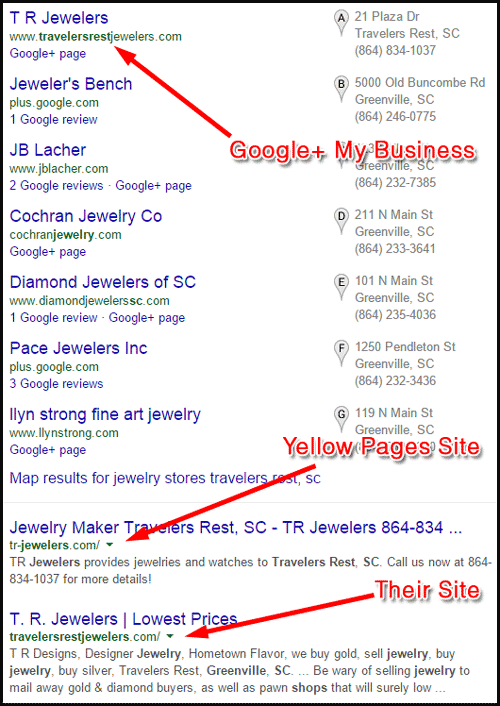
I decided to look at their competition so I went back to Google to search for "jewelry stores travelers rest, sc" and was given these results:

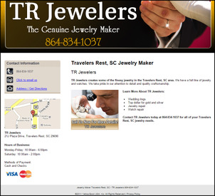
It seems like they are the only jewelry store in Travelers Rest, but there are a lot of options further south in Greenville, SC. They are paying for a second website with the domain name tr-jewelers.com. This is a Yellow Pages micro-site that you can see here:

(click to view larger)
This Yellow Pages site is outranking their 6 page site, and I was disappointed when I initially found it. Upon closer inspection I noticed the 2011 copyright in the footer of the YP site, which means this was their first official website that they didn't discontinue when they launched the other site in 2013. I'm hoping they will consider canceling this YP service once it comes up for renewal.
Returning back to the TR Jewelers home page now, let me show you a very common mistake that novice webmasters make. I'm referring to a "webmaster" as the person who maintains the content of the website after the web designer laid it out and the web programmer set it up.
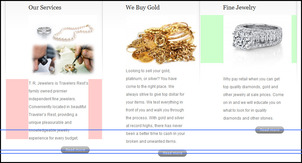
This is a screen grab from part of the home page, about half way down:

(click to enlarge)
This shows 3 columns of content whose layouts are unbalanced. The pink boxes shown in the first column show the right and left margins around the written copy. Notice how the left margin is much wider than the right. The green boxes show the margins to the left and right of the photos. These two are uneven, with the right margin being much thinner than the left. The 3 blue lines show you the horizontal level of the Read More buttons. The three paragraphs of copy should have been the same length so those three buttons could all line up on the same horizon.
Although this type of layout analysis might seem trivial, it's small details like this that creates a subconscious reason why someone doesn't like a website. Users won't be able to articulate why they bounce from your website, but the lack of symmetry will frighten them away like just like you might run screaming from a walk-through Halloween horror house attraction.
That's it for this week; next week I'll try to scare up a larger site that we can bite into.
FTC Notice: I randomly choose this website and won't be telling the retailer jeweler that I'm doing a review. Unless someone else tells them, they will only find out about this review if they examine their Google Analytics and Google Webmaster Tools. I'm not doing this to solicit business from them, but rather as an educational exercise for everyone. This review is completely impartial and all my comments are listed in the order that I discovered them.


