
Have you ever wondered how your jewelry store's marketing compares to other jewelers? Well, wonder no more because there's a way you can view that comparison in Google Analytics.
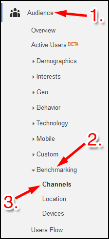
It's called the Benchmarking report, and it's available under the Audience -> Benchmarking -> Channels menu as shown here:
Here's a sample report I ran:
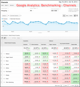
(click to view larger)
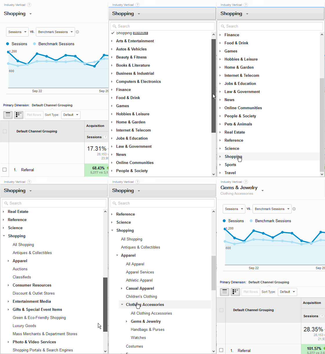
Because of the way I have my Google Analytics account set up, this report automatically shows a comparison for "Shopping," but that's a really broad category that needs to be narrowed down. To do that, you would click on the word Shopping at the top of the report, then follow these clicks:
1. Click Shopping to open the submenu
2. Click Apparel (we'll pretend this is a word anyone still uses)
3. Click Clothing Accessories (again, less than perfect)
4. Click Gems & Jewelry (okay, finally)
5. Click All Gems & Jewelry
Here's what that looks like:
You will see Gems & Jewelry at the top of the report once you've selected it:

Here's what my report looks like:
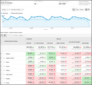
(click to enlarge)
All of the numbers you see in red indicate that your website is receiving less traffic than the benchmark average. The numbers in green indicate that your website is outperforming the benchmark average.
The Benchmarking Channels report is showing you all the different ways that people can find you. They are listed as:
1. Referral - When someone clicks a link from some other website to your website
2. Organic Search - When someone clicks on a link from a search engine
3. Direct - When someone types in your domain name directly
4. Social - Any click from a socially shared link from dozens of social systems
5. Paid Search - Clicks from AdWords ads
6. Display - Clicks from AdWords banner/image ads
7. Email - Any click from one of your email marketing campaigns
8. Other - Everything else that can't be easily identified
Each of these 8 items is referred to as a Marketing Channel, or just Channel for short.
There's a lot of red in the above screen shot because this particular website property relies mostly on shared links, organic search, and direct domain name typing.
The red you see in this report can help you understand how you should be retuning your marketing efforts. If your business is struggling, then this report will show you where you might want to spend more advertising money.
Here's how it breaks down:
1. Referral - When this is red, you need to figure out a way to have more websites linking to yours.
2. Organic Search - When this is red, it means you seriously need to add more content to your website. Try adding more blog posts to your website.
3. Direct - When this is red, it means your offline ads are not working, or you are not doing them at all.
4. Social - If this is red, then it means your social networking efforts are either unsuccessful or you're not doing it.
5. Paid Search - If this is red, it either means your online paid ads are not working very well, or maybe you're not even doing it.
6. Display - If this is red, it either means you are not using banner advertising, or you are not properly segmenting your banner ad targeting.
7. Email - If this is red, then it means your email marketing campaigns need a lot of work. Try signing up for email newsletters from your competitors to see what they are doing. Use their work as inspiration, but don't copy it directly.
So that's the Benchmarking Channels report and how you can potentially use it to help guide your marketing efforts.


