
In this edition of the Daily Golden Nugget, I'm going to show you one of the more visually interesting reports inside Google Analytics. It's the User Flow report, and with it, you can see how your website visitors are moving through your website.
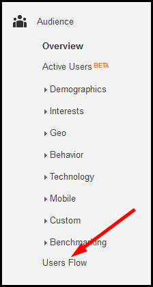
At the time of this writing, the first report you see when logging into your Google Analytics account is the Audience Overview. From that report, you simply click on the User Flow link on the left menu as shown here:
The report you see there shows all the visitors to your website and how they moved from one page of your site to another. Instead of looking at all your visitors, I want you to look at your mobile traffic only. Please refer back to this Nugget from last week to see how to segment your mobile traffic on this report.
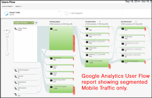
This is what my report looks like with mobile segmented traffic:
(click to enlarge)
What you see here is a visualization of what countries your visitors come from, what page they land on first, and what subsequent pages they click on.
The first thing I want to point out is how 5,380 people entered the website through the "/" page and 602 entered through the "/index.html" page. These two pages are actually the same page. Here's a larger view:
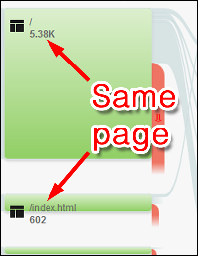
By default, Google Analytics will track every page of your website separately. From their point of view, the page they track when someone clicks on your domain name is a different page than your index.html or index.php page.
So this: perosijewelers.com
Is different than this: perosijewelers.com/index.html
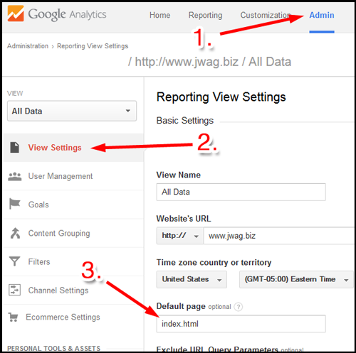
Obviously these are the same page, but Google Analytics doesn't know that unless you tell it. Follow these 3 steps to tell Analytics what your default home page is:
1. Click the Admin link at the top of the screen.
2. Click the View Settings link that will appear on the right side of your screen.
3. Type out your home page in the "Default page" box.
Here's what that looks like:
Google Analytics will start tracking your pages differently as soon as you make this settings change, but this setting will not change the previously recorded data.
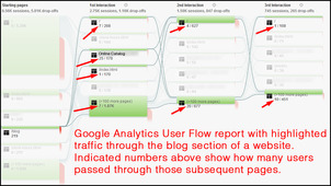
Getting back to the User Flow report, notice that there are 219 mobile users who arrived through the blog pages. If you're spending time and money on blogging, wouldn't it be good to know how this is benefiting you? You can see that visual benefit by highlighting the blogging traffic.
Click on any one of the page flows to more closely examine the traffic through that page. When you click on one of those green pages see the popup window shown here:

Click the option to "Highlight traffic through here" to reveal this new traffic pattern:
(click to enlarge)
With the traffic highlighted like that, you can see exactly how many people continued from the blog pages of your site to other pages. Clearly we can see that 25 visitors continued to the online product catalog. Most likely those 25 people were reading blog that linked to a specific product or area of a product catalog.
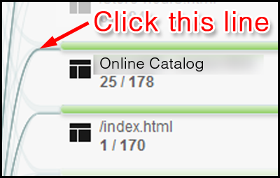
We can continue to dig even deeper by clicking on the dark gray line shown here:
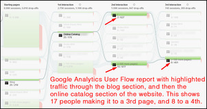
This is the new user flow report I saw:
(click to enlarge)
This new report isolates those 25 mobile visitors completely. We can see that 15 of them continued on to other pages of the site while 2 went to the home page. Of those 17 people, 8 of them continued even further.
Even though I'm only showing mobile traffic in the reporting today, it seems like there's a good chance that the blog attracted at least 8, but hopefully 17 paying customers over the last 30 days.
In conclusion, you can see that the Users Flow report in Google Analytics can be used to help improve the usability of a website and test to see if your marketing efforts are attracting real customers.


