
Welcome to the Friday website review, where every week I randomly review the website of a local retail jewelry business somewhere in the US. The goal is to find something good, or bad, that we can all learn from and apply to our own business.
For this week's review, I'm heading over to Washington state and searching for "fine jewelry stores bellevue wa." When doing these searches, I always use the Google Chrome browser in incognito mode. This allows me to see non-personalized search results.
In case you don't know, Google tracks every web browser and pays attention to the search history. They do this through cookies that are set in the browser. They track even more information when you log into your account. Since I'm always looking at, and searching for jewelry related websites every day, my personalized results are always skewed towards jewelry stores. With the incognito mode, I'm able to hide all those personalized settings and see results just like a normal consumer would see them.
In fact, this is what I saw when doing that search:
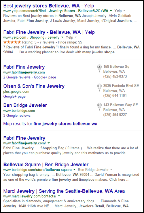
It looks like Fabri Fine Jewelry will be today's review candidate since they caught my attention with 3 placements in the results. Their Yelp listing is in the top organic place, and they have the top local listing, and their website is listed first after the businesses.
Here the Fabri Fine Jewelry Website:
http://www.fabrifinejewelry.com/
This is what their home page looked like:
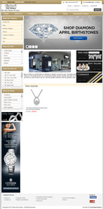
(click to view larger)
I'm a website designer and analyst, so I immediately recognize this design style as an e-commerce site. From my analysis, I know that customers always like to browse product catalogs, so this layout probably works in their immediate favor.
My attention was drawn immediately to the 3 black rectangles showing "New Arrivals," "Best Sellers," and "Clearance." Have you heard that butterflies are one of the current trending styles of jewelry? They did a good job of using butterfly earrings in their New Arrivals image, shown here:
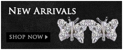
Unfortunately, their website doesn't have butterflies on the New Arrivals page shown here:
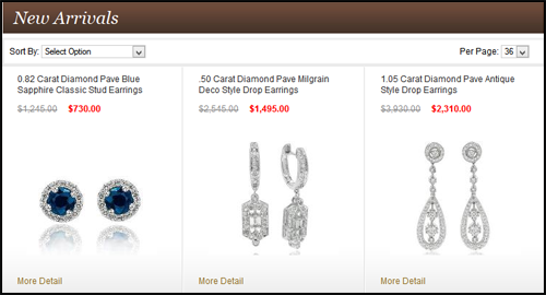
This situation is sure to cause customer confusion and discontentment. Any photo used as a lead-in and a link, like butterfly earrings, should always appear on the next page that it links to. I expected to see those butterfly earrings, but now I'm disappointed. Real customers would be disappointed too.
They made the same mistake with the Best Sellers banner on their home page too. The black home page banner shows a ring with rose, white, and yellow gold, but that ring is not on their Best Sellers page anymore.
I started clicking through their product category navigation on the left side, shown here:
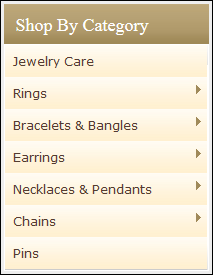
I found it very strange that they have Jewelry Care as their first navigation item on the top left. That link brings you to a page that shows these products:
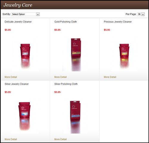
I know a lot of jewelers who sell Connoisseurs' line of jewelry cleaning products. I even have a supply of it myself for when I work on jewelry photography, but it's a poor representation for a jewelry store to show this as the first set of products in their navigation. It should be last. I don't want to see cleaning materials when I click on a jewelry catalog.
The order of the rest of the navigation seems to make sense: rings, bracelets, earrings, necklaces, chains, pins. This is the order of popularity I would have put them in as well.
Navigating over to their contact page I found something that I never like to see. They have a list of 8 employees with their email addresses. Each email address is shown as a clickable link that will allow you to click to immediately send an email using your email program. Even though this seems like a good idea, and it's customer friendly, this method also allows email scraping programs to acquire your email address.
Exposed emails like this always lead to more email spam, and it even leads to more virus attacks through email. The better idea is to simply have a contact form that people can email you through. Fabri does have a contact form, but they also have these exposed emails.
Here's what the contact page looks like:
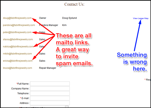
By the way, having your emails exposed like this is against PCI compliance. So you can't do this if you have e-commerce on your website.
I also noticed that there a strange "View Larger Map" link on their contact page, but there's no map. Clicking that link brought me over to Google Maps, but this led me to a serious realization...
They don't have their address on their website. Anywhere!
Your store address should at least be on your contact page. I also like to put it in the footer of every page. E-commerce sites also need to have the address on the Returns, Policy, and Terms pages. Remarkably, Fabri Fine Jewelry doesn't have their address on any of these pages.
This is a further disconnect from their local customers. Their site is set up for e-commerce, including a shopping cart and checkout, but it's not designed to satisfy their local clients. There's absolutely no way to locate this jewelry store other than to go back to Google search, or to visit their Yelp or Facebook pages.
The first thing that Fabri needs to do is fix their Google Maps image on their contact page, and then they need to write out their address on several more pages.
I'm not sure how any local business could make a mistake like this. Omitting your address from your own website is pretty bad. This mistake could have been avoided if they had a third party look at their site. Sometimes a website programmer and the store owners are just too close to a website project to notice something like this.
That's it for this week's review. Let me know if you'd like a private, more in-depth review of your own website.
FTC Notice: I randomly choose this website and won't be telling the retailer jeweler that I'm doing a review. Unless someone else tells them, they will only find out about this review if they examine their Google Analytics and Google Webmaster Tools. I'm not doing this to solicit business from them, but rather as an educational exercise for everyone. This review is completely impartial and all my comments are listed in the order that I discovered them.


