Welcome to the Friday jewelry website review edition of the Daily Golden Nugget. The goal for today is to examine a random retail jeweler's website and learn from something they did right or wrong.
I don't plan these reviews out, and I usually write these reviews as I work through the discovery of each site, documenting my first thoughts as well as how different stuff fits together.
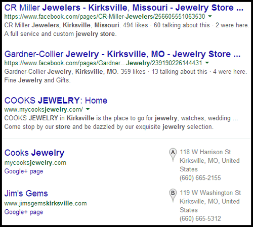
This week, I searched for "jewelry stores Kirksville, Missouri" and was given this Google SERP:

I was drawn to the uppercase organic listing for "COOKS JEWELRY" followed by the Google+ Local listing for them as well. I also had a "that's cute" moment when I saw their "mycooksjewelry.com" domain name.
The meta description also caught my attention because it's well written:
"COOKS JEWELRY in Kirksville is the place to go for jewelry, watches, ... Come stop by our store and be dazzled by our exquisite jewelry selection."
At first I thought that was a well written meta description but then I noticed the ellipses in there. That means Google wrote that description itself.
Let me see if I can figure out why...
Here's the original meta description I pulled from the page code:

The first part of the description matches what I see on the SERP, "COOKS JEWELRY in Kirksville is the place to go for jewelry, watches," but Google cut out the rest.
Here's how I interpret the actions of Google's automated system:
1. The rest of the description was irrelevant for my "jewelry stores" query because the word "jewelry" and "stores" were not present in "wedding rings and such services as engraving, cleaning and repair"
2. Google then scanned quickly through the text of the page and found this section:

That section of the page included both of my search words, but what's even better is that the complete sentence fit within the 150 character meta description limit. So Google grabbed it and created a "Franken-Snippet."
Moving now to the Cooks Jewelry home page here:
http://www.mycooksjewelry.com/
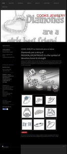
Here's their home page:

(click to enlarge)
Please click on that image to see the full size version of their site. I want you to take notice of that heart pendant photo. I didn't process that at all, that's exactly what I saw first on their site.
I think it's safe for me to say that jewelry is part of the beauty industry. Your jewelry needs to look beautiful online otherwise your customers will bounce right off your site.
The savvier internet users today will recognize bad images on a website and they'll know immediately that you didn't bother trying. They'll translate that into potentially poor service in your store and go elsewhere.
That image slider had 6 images in rotation, but only 3 of them were correctly in focus. The rest were either out of focus from the camera, or were incorrectly resized images from their computer.
Suffering through a bad looking image slider on the home page is okay. Usually you can click past it and look at better pages of the website. But Cooks decided to put that slider on every page of their website. I couldn't escape it.
That's a really bad choice. Not only are they reinforcing their ineptitude with image sliders, but I have a feeling that they don't take the time to use their own website. Otherwise I think they would understand how annoying it is to have to scroll down past that slider on every single page.
The content on this website is quite simple, to say the least. The site was created with the 1&1 website builder.
At the time of this writing, the 1&1 website builder was $6.99 for the basic version and $9.99 for the pro version. Unless you have a creative talent for website design, the money you save on these inexpensive sites will be far less than the money you lose from customers who bounce away from your site.
And that's it for this week's website review, check back next week for my next potential website roasting.
FTC Notice: I randomly choose this website and won't be telling the retailer jeweler that I'm doing a review. Unless someone else tells them, they will only find out about this review if they examine their Google Analytics and Google Webmaster Tools. I'm not doing this to solicit business from them, but rather as an educational exercise for everyone. This review is completely impartial and all my comments are listed in the order that I discovered them.


