
Five months from today, you will be launching your last minute Christmas advertising campaigns and counting down the last 7 days before the big holiday. Have you started to prepare your website and holiday ads yet?
The other day, I was walking through one of those stores that sells Christmas items all year long and I couldn't help but remember that now is the time for those "Christmas in July" sales events. However, considering that today is Friday, I immediately started to wonder how many towns were named "Christmas" and if there were any jewelers who would make good website review candidates.
My search began...
I found 9 localities in the USA with Christmas in their name. I quickly searched for jewelry stores in all of them but came up empty handed.
I began my search in Google with "jewelers in Christmas, Orange, Florida" but I couldn't tell which jeweler in the results was closest. Normally I would just take the top ranking jeweler in the SERPs, but I wanted to find out which jeweler was closest to me if I were in Christmas, FL.
When I switched over to Google Maps and searched for "jewelry stores near Christmas, Orange, Florida," I saw this map:
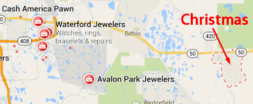
According to the map, Avalon Park Jewelers is the closest jeweler to Christmas. Let's take a look at their website here:
http://www.avalonparkjewelers.com/index.html
This is what the home page looked like:
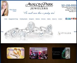
(click to view larger)
It turns out that Avalon Park Jewelers is located in Orlando, but I couldn't see that from the map.
While browsing their website, I discovered that they just celebrated their 3 year store anniversary this month. I'm pleased to finally come across a jeweler that opened their doors during the recession when so many other jewelers were going out of business.
Even so, this website and their entire online presence was probably bootstrapped together quickly with a very low budget. The site has a lot of usability and SEO issues, but I'll be gentle in hopes that everyone can learn something from this website review...
The first thing that troubled me was the slow loading speed of the website. I'm on a fiber internet connection and nothing should be slow for me. It's common now to have high speed cable or fiber internet access at home, so make sure your website is always running fast. Besides, Google pays attention to speed too.
You know those home page sliders I wrote about last month? It looks like Avalon Park Jewelers (APJ) is over the moon about them! They are using the very popular Nivo Slider, not just on their home page, but all of their pages!
The Nivo Slider might be one of the contributing factors to the slow speed of their site. My web browser was reloading the Nivo JavaScript on every page.
I didn't like their font size, or the font weight that they used throughout most of the site. Take a look at their About Us page here:
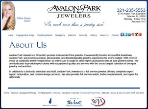
(click to view actual size)
You can see in that screen shot that they are using the basic font "MS Sans Serif" in bold as their body copy with single line spacing. This is extremely difficult to read. They should have selected a better font, made it larger, and increased the line spacing. This small change would make the site more enjoyable to browse through.
The navigation of the website needs some rethinking. Trying to see a selection of engagement rings took too long. When clicking the Engagement Rings link from the top menu I was brought to this page:
http://www.avalonparkjewelers.com/engagement-rings.html
From there, I had to wait for the Nivo Slider to load, or I could look at the 4 designer logos. I decided to click the Victor logo which then brought me to this page:
http://www.avalonparkjewelers.com/victor.html
I expected to see products on this page, but instead there was just another Victor ad and a link to "View Collection." Clicking the view collection link brought me to this:
http://www.avalonparkjewelers.com/victor-collection.html
I said I would be gentile, so I'll just say that after making me click and wait 3 times to finally get to the Victor collection, I expected a lot more information and larger photos than what you see here in this screen shot:
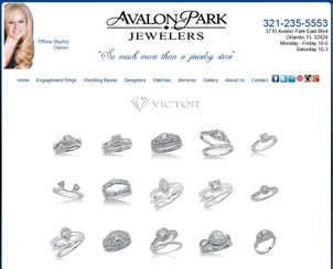
(click to view larger)
Moving on now... They have a link for "Gallery" on their top menu. It's a blank page. Don't have blank pages on your website, especially when they are linked from your top menu. Hide them until you populate it with something good.
They have a services page here:
http://www.avalonparkjewelers.com/services.html
From their Services page, you can click to visit individual pages for their Layaway, Custom Designs, Jewelry Repair, and Watch Repair. Of those 4 pages, the Custom Design page is set up well, but the other 3 need more information. The way those pages are right now was disappointing to me.
Jumping now to a comment about their SEO... All the pages of their site have the same page title. Every page of the website should have a unique page title that correctly states what that page is.
The last thing I want to mention is their list of social icons jumping out from their top menu. They have these 5 social icons: Facebook, Twitter, Foursquare, Pinterest, Instagram, and Google+. I was pleased to see these social icons, especially for a new jeweler, but not so pleased when I clicked each one.
Here's what I found at the time I wrote this review:
Facebook:
https://www.facebook.com/AvalonParkJewelers
status: Updated frequently
Twitter:
https://twitter.com/apjewelers
status: Last tweet on June 21, 2014
Foursquare:
https://foursquare.com/v/avalon-park-jewelers/4e432e1a091aa49bbaa11ccf
status: The link from their website doesn't actually link to the correct place. It also looks like they have not claimed their venue listing.
Pinterest:
http://www.pinterest.com/apjewelers/
status: Updated recently, and they have a good assortment of boards with 104 pins in total.
Instagram:
http://instagram.com/avalonparkjewelers
status: Last updated 27 months ago with only 2 photos. This looks bad.
Google+:
https://plus.google.com/100609611478392447694
status: Last updated on May 1, 2013 with only a few posts. This also looks bad.
When it comes to social media, you should either use your accounts or not, but don't tell customers about the accounts you have created but are not using. It makes you look neglectful.
That's it for this week's review.
FTC Notice: I randomly choose this website and won't be telling the retailer jeweler that I'm doing a review. Unless someone else tells them, they will only find out about this review if they examine their Google Analytics and Google Webmaster Tools. I'm not doing this to solicit business from them, but rather as an educational exercise for everyone. This review is completely impartial and all my comments are listed in the order that I discovered them.


