Website usability is always a point of contention between visual website designers, data analysts, and website owners. The website owner always wants their website to look good, the designer is always trying to satisfy the owner, and the data analysts seems to always be in a losing position of 2 against 1.
Of course, then there's the uncomfortable situation some months later when the website owner is upset that the website is not driving more business the way they had hoped. Usually this is when the data analyst is given a fair chance to present data and make suggestions to improve the website design.
I have to be honest, even though I spend a lot of time evaluating data and publishing my findings, I too am often ignored when my suggestions are not aesthetically pleasing. Take, for example, the rotating images that have become so popular on website home pages. These images are often referred to as "rotators," "sliders," "hero," and "carousels." The assumption is that these attractive images will draw people further into the website.
However, time and time again companies like CrazyEgg.com and AttentionWizard.com report that these are overly distracting and they take too long to get people to their goal. My own data usually shows that users don't click on these slider images at all.
Last week I came across even more compelling evidence to show how these rotators can work against your desired goal... Data from the USA.gov website.
Michelle Chronister, the User Experience Team Lead for USA.gov, freely published the analytics case study presentation she gave at the DC, VA & MD Search Engine Marketing Meetup event on May 27, 2014.
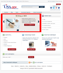
In her presentation, Michelle referenced this version of the USA.gov website:

(click to view larger)
She explained that, although users clicked the right arrow of the slider, the actual content of the slider was only popular if those topics were also popular in other areas of the website. In other words, the only slider images that performed well were also performing well on their respective sections of the site.
Obviously, you could use your home page slider to only promote popular areas of the site, except that this approach would not help you promote new home page announcements.
Testing of the USA.gov home page was performed several times in 2012 using the heatmap tracking ability from CrazyEgg.com. Each test included between 10,000 to 20,000 website visitors within a 24 hour period.
Some of the usability conclusions they came to were:
* They use prime page real estate that could be used for more effective content.
* They're hard to use on some mobile devices.
* They're difficult to make universally accessible for keyboards and all types of assistive technologies.
After more than a year of analysis and planning, because obviously the government always plans too much, a new USA.gov website launched in June 2014 that would remove the home page slider. They replaced it with links to the most popular areas of the website and improved navigation.
The conclusion from the above mentioned presentation was that you should always test your website and analyze your results to discover improvements. Never stop testing, improving, and retesting.
The bottom line of today's Daily Golden Nugget is that aesthetically pleasing websites can sometimes impede your sales and stunt your business growth.


