This is the Friday Website Review edition of the Daily Golden Nugget. For this week I'm driving 3 hours north of my home in New Jersey to Saratoga Springs, NY to look for a jeweler.
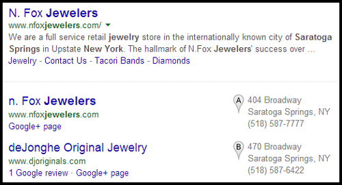
This is the search results returned to me when searching for "jewelers saratoga springs ny"

I'm choosing N. Fox Jewelers since they had the top organic and Google+ Local results. Here's their website:
http://www.nfoxjewelers.com/
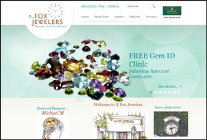
Initially, I was pleased with the look of their site when I landed on their home page. Here's the first thing I saw:

(click to enlarge image)
I liked the look of the site because it appeared to fill my browser, and I assumed it was responsive. I was also a little impressed to see the first image in their slider series was an attractive array of gemstones calling attention to the Gem ID Clinic they are having on June 21, 2014 (that's tomorrow). The simple mention of their Gem Clinic made me assume that they keep their website updated a lot.
Boy, was I skunked!
First of all, their website wasn't responsive at all. In fact, it's poorly designed and requires left-right scrolling on a few of their pages... Including their home page.
Next, as I browsed their website, I discovered that they update a few event pages during the year, but their blog hasn't been updated since January 1, 2013, and only a few times prior to that. The website would have seemed more active if they had left an archive of the past events, but they didn't.
As I said, the website was not responsive, and they didn't have a mobile version either. So don't bother trying to use this on a smartphone because you've have to pinch zoom a lot. On the other hand, it is pleasant to use and look at on the desktop and tablet.
Their top navigation menu has several nested levels. While using it, I discovered that the really deep levels will extend off the right side of a 1280px wide computer screen. What this shows you is that they didn't think about the most popular screen sizes when designing their menu. They obviously assumed users would have something at least 1366px or wider... and it means their website designer didn't test this either.
I might be beating them up a little too much, so let me move on to a few things I did like about their website...
They organized all their jewelry designers into a section they call "Bridal Suite" that you will find on their top menu. Within that area of their site, they've dedicated individual pages to different designers. In my experience, this approach works well for search engine optimization because Google can match people searching for specific jewelry designers to these specific design pages.
Their designer pages had a mix of designer information, product images, videos, and well placed educational information. They had a link to a specially-built diamond search website that looked like a micro-site offered by their diamond dealer. This was jarring at first because it was a black website with their name and music (music... really?), but I realized the diamond search worked well. I do have one suggestion here though, and that's to link from their main website directly to the diamond search page, rather than the page with the music.
Most of the web pages have unique Page Titles with the name of the page first, followed by the store's name. You don't necessarily need the store's name in the Title as long as it's mentioned somewhere else on the page, like the footer, which they do. Except for the home page, you should not have the name of the store as the first item in the Title. So, they did this correctly.
On the other hand, they completely missed the boat with their Meta Descriptions. In fact, I could not find any meta descriptions mentioned anywhere on their website. Without them, you are allowing Google and Bing to make up their own descriptions for each page. This is a bad approach.
What seemed to be missing most from the website was an About Us page. Their top menu includes a link to the Contact Us page, and from there I found links for directions, employment, and charities, but still nothing about them.
The logo at the top of the page states that I should "Experience. the N. Fox Difference." but I don't have a real reason to, beyond my growing love/hate relationship with their website.
But then all the way down in the footer of their website, I discovered a link for "The N. Fox Difference" which brought me to this page:
http://www.nfoxjewelers.com/page/the-n-fox-difference-28.html
That page then brought me to another page of testimonials and an FAQ. This was poorly buried on their site and should be moved to the top navigation.
Lastly, let me talk about what made me laugh as I started writing this...
As I was browsing through their navigation I noticed "404" listed in their watch menu. My immediate thought was "Oh no! They have a 404 Error somehow bleeding into their navigation menu!"
But when I clicked it I was brought to a page called "The 404 Fox Watch For Him."
I was very confused... Doesn't everyone know that "404" is the error code for a dead web page? I really didn't understand what was happening here until I read the page a few times. Yeah, I'm too much of an internet geek to realize right away that Fox Jewelers had their own watch brand called the "404 Fox" which is apparently named after their store address of 404 Broadway in Saratoga Springs.
So yeah, I gave myself a good laugh when I realized how silly I was.
And that's it for this website review, hopefully you found out something useful from it.
FTC Notice: I randomly choose this website and won't be telling the retailer jeweler that I'm doing a review. Unless someone else tells them, they will only find out about this review if they examine their Google Analytics and Google Webmaster Tools. I'm not doing this to solicit business from them, but rather as an educational exercise for everyone. This review is completely impartial and all my comments are listed in the order that I discovered them.


