For this week's edition of the Friday Website review, I'm searching for "jewelers in Azusa, California" to find my review candidate.
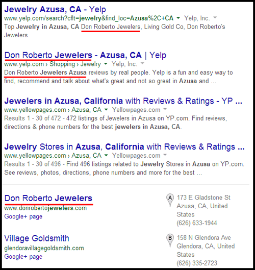
Here's what the top Google organic results look like when using Chrome's incognito mode:

I've underlined all the organic results showing Don Roberto Jewelers. The top 2 results showing Don Roberto are from Yelp and the top Google Local result is for them as well.
Here's the website: http://www.donrobertojewelers.com/; you might want to open it up to follow along as you read this review.
They have a responsive website design. The typical reasoning behind a responsive website design is that you can create a better user experience for users on smaller smartphone screens. The side effect of responsive design is that you often end up with different looking websites on different size desktop computer screens as well.
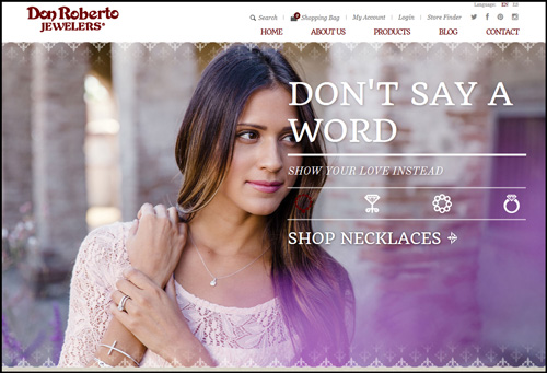
For Don Roberto, this is what their home page looks like on a wide format laptop screen:

This is how their home page looks on a typical 1280x1024 desktop screen:

The wider version of the page shown above has better placement of the headline, but you can't see the jewelry the model is wearing. You can see the jewelry in the second, taller version, but the headline overlaps the model's face.
In other words, neither of these layouts work correctly.
The better solution would have been to create a website design that only changes once the screen resizes below a certain width. This would allow you to better control how all desktop and laptop computers view the site, and also accommodate the smaller screens.
I like to refer to websites designed like this as quasi-responsive. My personal preference is to maintain the same design for any screen wider than 1100 pixels, but then allow it to change the layout once the screen goes below 1100 pixel width.
Furthermore, I have seen very interesting early testing results so far that show how it's good to use this quasi-responsive design for tablets, desktops, and laptops, but then redirect smartphones to an actual mobile (non responsive) version of the site that has correctly sized images for mobile devices. I call this method responsive content and you need to be careful to do it correctly.
In fact, I have a Nugget coming up next week where I will show how Google is detecting automatic website redirecting from the desktop to the mobile site, and they are showing error messages to users when the site does it wrong.
Sadly, I feel that the people who created the Don Roberto responsive design spent a lot of time making the website look really good when viewed on a smartphone, but they didn't spend nearly as much time seriously considering how desktop users would be using the site.
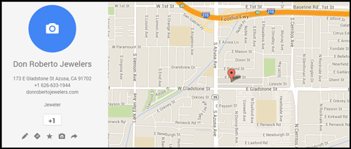
I wasn't familiar with Don Roberto Jewelers, and I had no idea that they had 72 store locations. The Google Local listing shown in the above SERP results links to this Google+ Local page:

That listing has not been claimed through Google Places for Business as I explained a few weeks ago.
The Google+ footer link from the Don Roberto website brings you to this Google+ Local page:

This one was claimed by the store, and they are socially sharing posts.
A jewelry store this large could gain an enormous amount of local search engine ranking if they went through and claimed all their Google+ Local listings and updated them.
I've poked several holes in their design without even talking about their SEO or other aspects of the site. Their photography is all well done, from the editorial shots they are using on landing pags to the individual product photos in their catalog.
I don't like the way the product catalog functions on my desktop, but I do recognize that the same functionality will come in handy on a smartphone. Again, this is another reason I feel their website was designed with more thought given to smartphones than desktops.
They have a built-in language module that allows on the fly switching from English to Spanish. The website uses a cookie to control the language switching which allows for the Google recommended method of using the same URL to control the language.
Overall I'm more dissatisfied with the user experience I'm having with this site even though the product photography is beautiful to look at. This might be the first time where I feel the usability of a site falls so flat that I just want to leave... and I'm going to do just that.
That's it for this week's basic review.
FTC Notice: I randomly choose this website and won't be telling the retailer jeweler that I'm doing a review. Unless someone else tells them, they will only find out about this review if they examine their Google Analytics and Google Webmaster Tools. I'm not doing this to solicit business from them, but rather as an educational exercise for everyone. This review is completely impartial and all my comments are listed in the order that I discovered them.


