
The right information can help you make the right decisions in business. I enjoy the process of digesting all the data I track into actionable information for the jewelry industry.
For the last 4 years, I've been running reports on the most popular web browsers and mobile devices every 6 months or so. Although I have browser tracking data that extends back to 2003, the first time I was able to successfully report mobile device usage was in February 2012, as seen here.
The iPhone has been the clear winner each time I've examined the data, and that trend continues today.
Let me explain how I gathered and calculated all the numbers below. I gather the analytics across the entire collection of jewelry website I monitor. This includes a mix of e-commerce and non e-commerce jewelry sites. Some sites have blogs while others do not. Some sites have catalogs of thousands of products while others do not. Some jewelers spend a lot of money on online marketing and social media while others do not.
In other words, the data presented here comes from a very broad range of website types which should represent the retail jewelry industry in the most generic way possible.
I'm also reporting this data differently than I've done before. In the past I was always carving out the individual data for desktop, smartphones, and tablets and I would report each data set on a scale of 1 - 100%.
The numbers below are all reported relative to one another. Each of the line graphs below shows the specific percentages within their categorized device segment as shown in the pie chart.
Device Usage
As you can see, the pie chart shows 60% usage by desktop users, 28% by mobile users, and 12% by tablet users. Those are rounded numbers with the real numbers showing out to 2 decimal places in the table below.
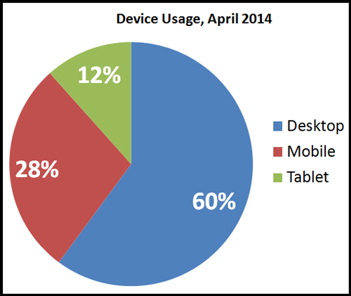
As you look at the table below you will see the combined non-desktop device usage is 39.88%. This does not surprise me at all, and it follows the trend I've been tracking since 2012 that you can see in this line chart:
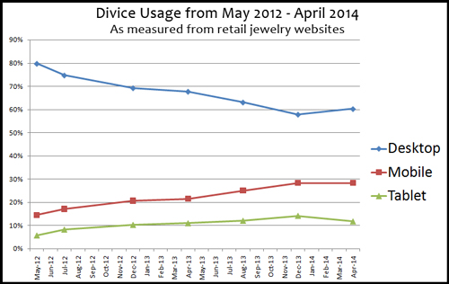
Adding the mobile and tablet measurements together you get:
May 2012: 20.24%
July 2012: 25.32%
Dec 2012: 30.84%
April 2013: 32.36%
Aug 2013: 37.03%
Dec 2013: 42.29% (expected, and predicted spike)
April 2014: 39.88%
Let me be very clear about these numbers once again. These represent the retail jewelry industry only, and they were measured across more than 100 different websites. I'm stressing that because I've been reading reports that claim mobile usage is already at 50%, but I simply do not see those numbers.
I suppose it's possible that some industries are experiencing 50% mobile usage, but that's obviously not the case for retail jewelers. I assume the day will eventually come, but I'll predict that we won't see that number until 20 months from now during the Holiday Season of December 2015.
Here's the table used to create the above charts:
| Device Usage, May 2012 - April 2014 | |||||||
| Apr-14 | Dec-13 | Aug-13 | Apr-13 | Dec-12 | Jul-12 | May-12 | |
| Desktop | 60.12% | 57.71% | 62.97% | 67.64% | 69.16% | 74.68% | 79.76% |
| Mobile | 28.25% | 28.27% | 25.09% | 21.48% | 20.65% | 17.13% | 14.56% |
| Tablet | 11.63% | 14.02% | 11.94% | 10.88% | 10.19% | 8.19% | 5.68% |
Desktop Browser Usage
Knowing the browser usage within each of those device segments will help you understand how to design new websites. No matter what website design you choose, you should always make sure that your audience can use the site across all devices.
This means someone must test your website across all devices and browser types.
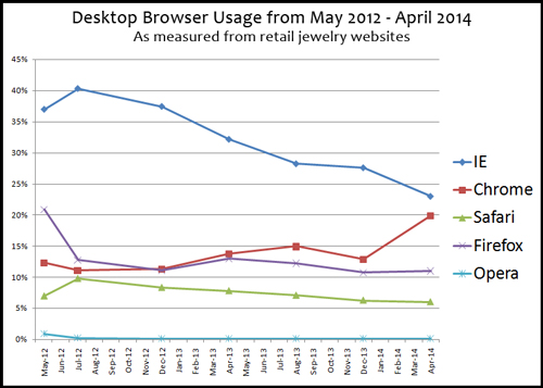
As you can see, Internet Explorer on the desktop, once the undisputed web browser champion, has declined down to 22.99% of all browser usage. It still has the largest percentage of users, but it continues to decline.
Let me throw in a few extra numbers that I processed that you won't find in the tables or charts here... The measured Windows users dropped from 51.9% during August 2013 to 47.8% for December 2013. It lost market share to the Apple Macintosh, Linux, and Chrome OS. But it bounced back up to 50.04% for April 2014 where it regained ground from Macintosh users. Linux and Chrome OS continued to grow during the last 4 months as well.
Although some other analysts might say this oscillation of Microsoft Windows usage is due to their Windows 8 OS, I feel these numbers changed because of the temporary bubble of mobile users in December. If you are one of those who hates Microsoft you will be happy to know that they are still losing ground, but they are losing it to portable devices, not to the Macintosh OS.
The growth of Chrome's popularity shows that jewelry buyers are becoming savvier about their web browser choice and are not relying on the default browser provided by their operating system.
The decline of Safari on the desktop has very little to do with how many people are using the Windows OS. Windows uses only contribute 0.17% to that overall 6.03% you see for Safari. Safari is the default desktop browser for Macintosh computers.
Here's the table used to create the above chart:
| Popular Desktop Browsers, May 2012 - April 2014 | |||||||
| Apr-14 | Dec-13 | Aug-13 | Apr-13 | Dec-12 | Jul-12 | May-12 | |
| IE | 22.99% | 27.58% | 28.22% | 32.14% | 37.41% | 40.28% | 36.95% |
| Chrome | 19.87% | 12.87% | 14.93% | 13.73% | 11.32% | 11.09% | 12.33% |
| Safari | 6.03% | 6.29% | 7.09% | 7.81% | 8.34% | 9.79% | 6.97% |
| Firefox | 11.02% | 10.74% | 12.23% | 12.94% | 11.04 % | 12.77% | 20.87% |
| Opera | 0.10% | 0.10% | 0.12% | 0.11% | 0.12% | 0.17% | 0.88% |
Mobile Browser Usage
I really hate the built in browser for my Android smartphone, and it looks like many other users are starting to realize there are better choices too. This is the first time in my 2 years of tracking that the Safari browser is losing ground in my reports as you see here...
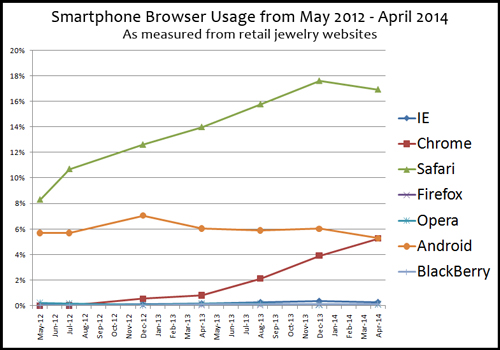
Here's some more extra data from my analysis: iOS usage dropped from a high of 18.02% in December 2013 to 17.56% in April 2014. Based on the increased bubble of users during the 2013 Holiday Season, I don't view this as a "loss" but rather a "more accurate" representation of the trends. There's ALWAYS a bubble of users in December that throws all my tracking off which I also explained in my desktop analysis above.
It's more accurate to recognize the continued growth during non-bubble times. In which case it's important to realize that iOS usage was 16.06% in August 2013 and that's grown to the 17.56% in April 2014.
However, I will say that the growth rate for the iOS has slowed with a growth rate of only 1.5% over the last 12 months while the Android has gained 2.29% market share within the retail jewelry market.
Here's the table used to create the above chart:
| Popular Mobile Browsers, May 2012 - April 2014 | |||||||
| Apr-14 | Dec-13 | Aug-13 | Apr-13 | Dec-12 | Jul-12 | May-12 | |
| IE | 0.28% | 0.38% | 0.27% | 0.17% | 0.11% | 0.08% | 0.08% |
| Chrome | 5.27% | 3.94% | 2.13% | 0.83% | 0.54% | 0.02% | 0.00% |
| Safari | 16.94% | 17.61% | 15.78% | 13.99% | 12.61% | 10.70% | 8.30% |
| Firefox | 0.13% | 0.10% | 0.04% | 0.08% | 0.04% | 0.03% | 0.01% |
| Opera | 0.12% | 0.08% | 0.15% | 0.16% | 0.07% | 0.15% | 0.21% |
| Android | 5.29% | 6.01% | 5.89% | 6.04% | 7.04% | 5.69% | 5.68% |
| BlackBerry | 0.11% | 0.10% | 0.13% | 0.11% | 0.00% | 0.00% | 0.00% |
Tablet Browser Usage
Although tablet computers have been around since before 2003, it wasn't until Steve Jobs introduced the iPad tablet that people really started to accept this as a truly usable device.
The iPad is still the dominant player in the tablet market as you can see here:
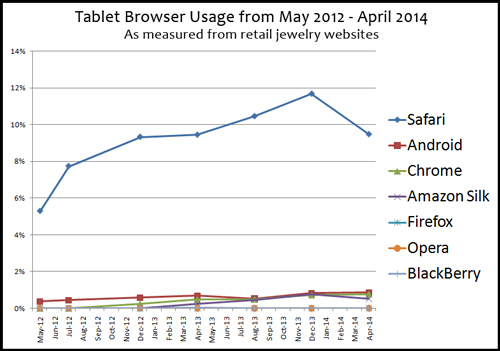
That chart doesn't give a clear picture of what's happening below the 1% level, so here's the same chart zoomed in below 1%:
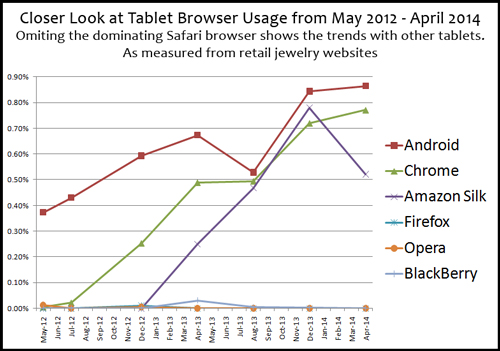
Safari on the iPad is losing market share, but there more to these numbers... It looks like the entire tablet industry is leveling out, and losing users to smartphone and desktops.
Notice the Amazon Silk browser in the above chart. I'll attribute the high blip in December 2013 to all those people who received the Amazon Kindle Fire as a gift that month. Those new owners were probably testing out all the features on their new toy before deciding that the Kindle is only good for reading books.
Here's the table used to create the above two charts:
| Popular Tablet Browsers, May 2012 - April 2014 | |||||||
| Apr-14 | Dec-13 | Aug-13 | Apr-13 | Dec-12 | Jul-12 | May-12 | |
| Safari | 9.47% | 11.67% | 10.45% | 9.44% | 9.32% | 7.74% | 5.29% |
| Android | 0.86% | 0.84% | 0.53% | 0.67% | 0.59% | 0.43% | 0.37% |
| Chrome | 0.77% | 0.72% | 0.49% | 0.49% | 0.25% | 0.02% | 0.00% |
| Amazon Silk | 0.52% | 0.78% | 0.47% | 0.25% | 0.00% | 0.00% | 0.00% |
| Firefox | 0.00% | 0.00% | 0.00% | 0.00% | 0.01% | 0.00% | 0.00% |
| Opera | 0.00% | 0.00% | 0.00% | 0.00% | 0.00% | 0.00% | 0.01% |
| BlackBerry | 0.00% | 0.00% | 0.00% | 0.03% | 0.00% | 0.00% | 0.00% |
Here's something interesting to consider now that you've seen the breakdown of each individual device type... Remember that I'm reporting all these percentages relative to one another. Take a look at the top browsers used by jewelry customers in order of popularity
22.99% Internet Explorer for desktop
19.87% Chrome for desktop
16.94% Safari for mobile
11.02% Firefox for desktop
9.47% Safari for tablet
Conclusions
Although I'm predicting all portable device usage to reach 50% in December 2015, by the time we get there I will also predict that you will lose money if you don't have a mobile solution for your website. These numbers do not indicate if it's better to have a responsive website design or a responsive content design, they simply state that you must have one or the other to provide the best customer experience.
Furthermore, it's important for you to experience your website the same way your jewelry customers are. The total of all the users is 80.29% when you add the top five browsers together. These are the desktop browsers IE, Chrome, and Firefox, and then Safari on mobile and tablets.
Make sure you have IE, Chrome, and Firefox installed on your desktop computer so you can at least check how your website looks. On the mobile side of things you should be investing in an iPhone and an iPad, otherwise you won't have the same experience as your customers.


