This is the Friday Jewelry Website Review to help you learn more about your own website by looking at a review from another jeweler's real website.
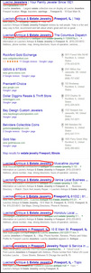
This week I ventured over to Freeport, Illinois in search of a jeweler who sells estate jewelry. Specifically, I used the search query "estate jewelry Freeport, Illinois" and saw these really interesting results:

(click to enlarge)
Except for the 7 Google+ Local results, Luecke Jewelers completely dominates the entire page! I've underlined and circled the important points to notice on that SERP. Seven of the ten results say "Antique & Estate Jewelry." The first organic result is their website, but all the rest are some type of local business directory.
At first I thought that Luecke Jewelers intentionally added themselves to all those business directories, but upon investigation I discovered they are random business directories that probably purchased database lists of business information.
I have to assume that, once upon a time they paid for a business listing ad, like Yellow Pages, using the name "Luecke Antique & Estate Jewelry," and it's that business listing that found its way into all these directories. I only mention the possibility of a paid ad because when I investigated further I found out that their corporate name is Luecke Jewelers Ltd. I had expected "Luecke Antique & Estate Jewelry, Inc." or something similar.
In either case, they are dominating their local market for "estate jewelry" because of these listings. Do you have a specific niche that you'd like to dominate in? You could claim all of your own local business directories and tweak your business name to match. It's always a good idea to claim all your local listings anyway and edit all the information for consistency. That's not just a suggestion; it's a valuable SEO tactic.
Let's dive into their website here: http://lueckejewelers.com/; you might want to open it up to follow along as you read this review.
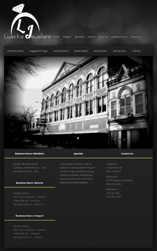
I was very pleased to see a new website design you see here:

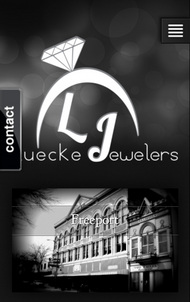
This is how it looks on a smartphone:

Although I do like the design, the most obvious flaw is the size of the top header. Including the top menu, it's 430px tall, and that's the same size on every page.
They also have the same very tall footer on every page which includes the store hours and addresses for all 3 of their locations.
Sadly, most of the site is an empty shell. I believe they launched this brand new site design in mid October 2013 using http://lueckejewelers.net/ as the domain name. But then early November, they merged the .com and .net versions of the site just in time for the holiday season, but they never finished it.
It looks like they are trying to figure out what to do with themselves in the new world of online marketing. I also see that they only joined Facebook back on February 8, 2014, just 12 weeks ago.
They have 14 pages on the site. I'll make some recommendations on what type of content to add to them...
http://lueckejewelers.com/
They currently have 3 rotating photos of their storefronts. It might be better to use large jewelry photos instead. They should also add some current information at the bottom of the page under the heading of Specials that's already there.
http://lueckejewelers.com/?page_id=48
This is their Freeport store location page. Their entire site uses that horrible "page_id=##" scheme, which has no SEO value. They should mask those variable names and create real pages instead.
They only have the store photo and contact info on this page. They should give more details about what's carried in the store.
http://lueckejewelers.com/?page_id=54
This is the Belvidere store location. Again, they only have the store photo and contact info on this page. They should give more details about what's carried in the store.
http://lueckejewelers.com/?page_id=51
This is the Monroe store location. Like the previous two, they only have the store photo and contact info on this page. They should give more details about what's carried in the store.
http://lueckejewelers.com/?page_id=32
This is the About Us page. Currently it's blank. This page could be used as the history of their store, or details of the current people and services they provide. Since they've been around since 1921, I'm sure they have a very rich history that probably should have a dedicated History page.
http://lueckejewelers.com/?page_id=30
This is the Locations/Hours page. It's badly formatted right now with a zip code search feature. This is a useless page as long as they have the locations and store hours in the footer of every page. With 3 stores, it's pretty useless to have a zip code search. They should keep the interactive map, but remove the silly search.
http://lueckejewelers.com/?page_id=39
This is the contact page which is badly formatted with the addresses, phone numbers, and email addresses for each store. Their email addresses are clearly visible which opens them up to spam emails. It would be better to include a form on this page with a CAPTCHA to protect against unwanted spam.
http://lueckejewelers.com/?page_id=7
This is supposed to be their Diamond Jewelry product catalog. It's an empty page.
http://lueckejewelers.com/?page_id=9
This is their Engagement Ring catalog. They are embedding the product catalog from one of their suppliers' right into their website. Although they are using a technique that's rising in popularity, the website they are using wasn't designed to be embedded like it is. This doesn't really look good and they should rethink this technique.
http://lueckejewelers.com/?page_id=77
This is their Wedding Bands page. They have a slide show on this page with several nice looking photos, but there are no details for those photos. I can't zoom in closer, I don't know what they are, and I'm left with an extreme feeling of wanting more.
http://lueckejewelers.com/?page_id=11
This is their Jewelry Repair page, except that they have no written details about their repair service. The only thing on that page is a 30 second TV commercial that they uploaded to YouTube. The commercial itself mentions their jewelry repair service, but again, I want more details about their specific repair services.
http://lueckejewelers.com/?page_id=13
This is their Estate Jewelry page. Considering how popular they were in the SERPs for "estate jewelry" I expected a lot more on this page other than just another slide show of a few estate items. Once again the slide show does not allow me to zoom in or see specific details about the estate pieces. It's a letdown.
http://lueckejewelers.com/?page_id=17
This is their Sterling Silver product catalog page. Once again they have another slide show here with really good looking jewelry, but the lack of additional details leaves a bad taste in my mouth even though it really is beautiful eye candy. Imagine how customers feel.
http://lueckejewelers.com/?page_id=15
This is their Watches page. They are embedding the Citizen Watches website into this page, but the layout technique they are using doesn't quite fit the way they are trying to display it. This will cause usability frustration. I suggest they change the way this embedded website works so it links directly to one of the Citizen product catalog pages instead of the Citizen Watch home page.
That's it for this week's basic review.
FTC Notice: I randomly choose this website and won't be telling the retailer jeweler that I'm doing a review. Unless someone else tells them, they will only find out about this review if they examine their Google Analytics and Google Webmaster Tools. I'm not doing this to solicit business from them, but rather as an educational exercise for everyone. This review is completely impartial and all my comments are listed in the order that I discovered them.


