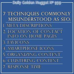
 Over the last two days I've explained some basic SEO techniques and some more advanced SEO techniques that fall into the category of customer acquisition. I'd like to continue this search engine optimization conversation by reviewing 7 points of website usability that often get mistaken as SEO items.
Other SEO professionals might view these 7 points as actual factors in search ranking, but I personally have not see a specific "optimization" benefit. On the other hand, each of these points does improve the overall user experience, which translates into better chances of converting a simple website visitor into a customer.
Here they are...
1. Meta Descriptions - Most of the websites I review every Friday have missing, or incorrectly written meta descriptions. It's no wonder this is 1st on my list of usability issues. The meta description is the description that users see in search results. Every page of your website needs to have a unique description, but more importantly, every description needs to provide a really good reason why the user should choose your page rather than one of your competitors. The meta description is a 150 character sales message whose sole purpose is to get the click.
2. Location of Contact Information - There seem to be a few "standard" locations for your contact information. I've found that you should have links for your Contact Us, Directions, and Store Hours at the top right of your website design so users can find it quickly. However, you can also have your store name, address, phone number, and store hours in larger text towards the top of your home page. The placement of that information helps people who simply want that and nothing else. This is especially important on mobile websites. Two days ago I mentioned the store address as item Number 6 in my list of 7 basic SEO tactics basic SEO techniques, saying it should always be in the footer. The placement explained here is more for faster usability than for SEO.
3. Favicons - The favicon is the 16px square image that appears in the address bar of your web browser. You can reference my previous Nugget on favicons byclicking here. There's an extra special quality of a website when the user sees your logo in the address bar. It helps with your overall store branding.
4. Smartphone Icons - Have you ever tried to bookmark or favorite a website on your smartphone? Your smartphone will typically create a miniaturized version of your website to save as the icon image. However, if you're ambitious, you can create your own icon for the smartphones to use instead. This technique makes your mobile website seem like a self contained mobile app, rather than simply a website. You need to create a special version of your logo in multiple sizes. More directions on this can be found here.
5. Organizing Content - There are certain pages that everyone expects you will have on your website. Things like the About Us page and Contact Us. All the other content on your website should be set it up in such a way that makes the most sense for usability. You need to make sure the content and links flow from page to page so it's intuitive to understand. Make sure the pages are organized together in a way that makes sense.
6. Clustering Content - When I first learned about clustering content in 2008 I felt as if someone hit me over the head with a truth that was so obvious, but I was too blind to realize it. What's clustering? In case you don't know it, the human brain has trouble remembering more than 4 or 5 items in a list of things. With lists of 7 items you are more likely to remember the first 3 and the last 2, but items 4 and 5 get mentally lost. What worse, your eyes will play tricks on your and you might not even see items 4 and 5! The solution to this mental mind trick is to group your navigation links, whether in a dropdown menu or side navigation, into clusters of 4 to help with readability. All you need to do is add a little extra padding after every 4th link in a list.
7. Response Time - Although there is plenty of evidence that makes us all think that website speed is an important ranking factor, it's probably one of the lesser factors. My feeling is that it's more important to have a fast website to please your users than to please Google's search algorithm. Google has said over and over that you should build your website for the benefit of people, not them. A fast website means it's well designed from the back end, not the front. In other words, the databases driving the system need to be fast, otherwise the website will take too long to render.
When setting up your website, remember that Google wants you to design for actual human usability. Don't design your website for the benefit of Google's computers.


