 This is the Friday jewelry website review where I take a look at a random retail jewelry store's website to see what they are doing right or wrong, and use them for real world learning
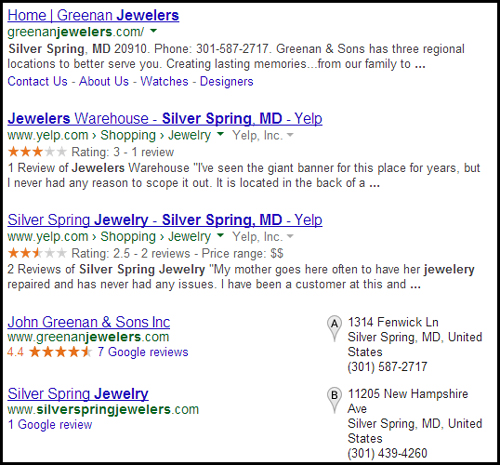
 This week I'm heading to Silver Spring, Maryland in search of a jeweler. Using Google's Chrome Incognito Mode I searched for "jewelers Silver Spring Maryland" and saw these search results:

Looks like there are 3 top jewelers: Greenan, Jewelers Warehouse, and Silver Spring Jewelry.
Greenan Jewelers is the top organic listing and the top Google+ Local listing. Both Jewelers Warehouse and Silver Spring Jewelry have Yelp star ratings, but when I look at that SERP it's the 4.4 rating for John Greenan & Sons that attracts my attention.
It only takes 5 Google reviews to have that star rating appear.
Here's the website: http://greenanjewelers.com/; you might want to open it up to follow along as you read this review.
Incorrect SEO Issues:
I'll start with the SEO issues because one of them is clearly visible in the SERP screen shot above. Look closely and you'll see the blue headline for the Greenan Jewelers organic listing says:
Home | Greenan Jewelers -- This is their page "Title"
They are using the Drupal CMS, and although their web site is using the latest HTML coding techniques, the search engine optimization settings (SEO) for their site are badly missing.
In fact, that word "Home" is just the CMS' way of naming their actual home page. The CMS is pulling the page name, "Home," to use as the Title of the page. A quick look through their site and I see the same thing is happening on all their pages.
This same problem happens on a lot of content management systems. It's considered one of those infamous "short cuts" that will make SEO easier, but it's really better to do it yourself.
Fixing this is easy--just go into the administrative area of Drupal (or your own CMS) and look for the "Home" page SEO settings. Depending on your CMS, the setting might actually have the word "Home" in it, or it will be blank. Just change it to whatever's appropriate.
In this particular case I would change the home page Title to be something like "John Greenen & Sons Jewelry, Silver Spring, MD"
Usability Issues:
I found the Designers page a little disrupting for navigation.
This page here: http://greenanjewelers.com/designers
They have links for:
* Simon G.
* Gabriel & Co.
* Unique Settings of NY
* Novell
* Coast Diamond
* Kimberley Diamond
The first 2 in that list link to other pages on the Greenan website with embedded product catalogs but all the rest leave the jeweler's website and jump to the designer's actual website.
I never like links that jump to other websites, but if you must use them, they should always open in another browser window. For those of you who are tech savvy, you might feel like arguing that anyone can right click and choose to open in a new window if they wanted. My counter argument is that you don't want to force your users to think like a website nerd. Just make is user friendly to begin with.
The same offsite linking happens onhttp://greenanjewelers.com/watchestoo.
What I Didn't Like About the Site:
I was hoping for more. This site looked promising from the first page. With 3 different store locations I would think this retail jeweler would take their website more seriously.
Their About Us page was boring with non-descript "Fluff" type wording that any jeweler could use. They should have written about their actual store's history, or maybe even introduced the store employees.
http://greenanjewelers.com/about
Their Ring Designer page is a complete letdown. I'm not sure why I would attempt to design a ring on their website if I can't somehow save that design, or print it out and get a quote. Instead it's an elaborate ruse just to get you to search an online database of diamonds.
http://greenanjewelers.com/ring-designer
Their Custom Design page is just like their About Us page. Non-descript fluff that any jeweler could be using. Custom Design pages usually work a lot better if you show photos of your real custom design pieces.
http://greenanjewelers.com/custom
Their Services page continues the boring factor. It's just a bulleted list of services that's not likely interest customers at all. Each of the items in that bulleted list should be explained with at least a sentence.
http://greenanjewelers.com/services
Lastly, I don't like that the copyright at the bottom of all their web pages says "2011." It's February 2014 as I write this. The footer copyright is an immediate telltale sign that this website has been abandoned.
In today's world there's no reason the copyright at the bottom of your pages should have the wrong date. Any high school level web programmer has the ability to write 1 line of code to automatically always show the correct year. The fact that the copyright is out of date simply means they either put this website together on their own, or the person who put it together didn't care enough to pay attention to tiny details.
That's it for this week's basic review.
FTC Notice: I randomly choose this website and won't be telling the retailer jeweler that I'm doing a review. Unless someone else tells them, they will only find out about this review if they examine their Google Analytics and Google Webmaster Tools. I'm not doing this to solicit business from them, but rather as an educational exercise for everyone. This review is completely impartial and all my comments are listed in the order that I discovered them.


