 This is the Friday Jewelry Website Review where I look at a random jewelry website to give you ideas on how to improve your own website.
I began my search this week looking for "jewelry stores in scranton pa." The top listing in the both the organic and Google+ Local results were for Boccardo Jewelers and their website boccardojewelers.com. Instead of seeing their website, I actually got the "account suspended" notice from Blue Host.
I actually found this earlier in the week when looking for website review candidates. It's hard to believe that any jeweler during the busy Christmas season would let their website hosting lapse like that. I imagine that their sales suffered and their competitors were happy to accept last minute new customers.
Litman Jewelers was the next in the list of Google+ Local results, but I prefer to skip large chain stores in these reviews.
That brings me to the 3rd choice of Ciccotti's Jewel Case. They have 7 Google reviews with an average 4.9 rating. Here's the website: http://www.ciccottisjewelcase.com; you might want to open it up to follow along as you read this review.
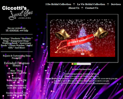
This is a screen shot of their home page during the 2013 Christmas week:

In the above screen capture you'll notice an image with the bells and Merry Christmas message. That was an animation that appeared for the first 15 seconds you were on the site, then it was replaced by other photos of the outside and inside of the store.
Store Hours:
When you look closely at that screen capture above, you'll notice that they posted their extended Christmas hours in the left margin. Earlier this week I published the top 10 list of holiday landing pages for 2013. The Store Hours page was 7th on that list.
Ciccotti's had the right idea when they posted their extended hours on their home page, except they didn't mention Friday. With a quick glance I'm sure some people thought they were closed, but it was more likely that they were open from 10am to 5pm. I had to search in their footer to find those hours. That wasn't very user friendly.
Website Music:
Another non-friendly issue is their use of music on the home page. In the past, when I managed a few website with music on their home page, they always had a lower bounce rate. It's always seemed like users would rather click the back button, or abort by closing their browser, than use a website that immediately started playing sound.
Website Design:
I personally found the website overly distracting. It looks like a bundle of fiber optics illuminated with purple light which would be better suited for an electronics or engineering company than a jeweler. I also found the white text to difficult to read when it appeared on top one of the bright tips of the fiber optics.
The overall design of the website is actually pretty poor. According to the internet archive at http://web.archive.org, they've had their website since 2003 but have done very little with it. They first started using that purple fiber optic background on July 24, 2012 and they have shifted their pages around without adding anything new to their site.
Their biggest website design change happened in February 2013 when they added links to their Yelp, Google, and Yellowbook reviews to their home page. At that time, they also added pages for the I Do Bridal Collection and the La Vie Bridal Collection to their website.
You can click this image to the left to see a larger view of the biggest addition to their website since 2012 is their La Vie Bridal Collection page here:
http://www.ciccottisjewelcase.com/Diamonds.aspx
There are 169 ring photos on that page but there is no way to zoom in on the images or even click to see more information. They really need to rethink this page.
Adding a product catalog to a website is the easiest way to bulk up the number of pages on your site, and attract a greater number of website visitors.
Incorrect SEO Issues:
It looks like no one has worked on the basic search engine optimization factors of their website since they first designed it in 2003. The page titles, meta descriptions, and meta keywords have been the same for 10 years.
Naturally they should not be using meta keywords, because they have been dead since 1997.
I also noticed that they are not using Google Analytics or Google Webmaster Tools, which is a sure sign that they really don't know anything about the internet.
Online Reviews:
It looks like Ciccotti's was trying to acquire a few reviews in May and June 2013. They probably asked their customers to write some reviews for them and actually got 5 Yelp reviews. Yelp has a way to detect unnatural reviews and they have removed them from Ciccotti's Yelp listing here:
http://www.yelp.com/biz/ciccottis-jewel-case-scranton
This is a link to the "not recommended" reviews:
http://www.yelp.com/not_recommended_reviews/PGc89aMH7YD5L2iW_eoEMQ
Yelp started hiding non recommended reviews in 2013. It won't look good if your reviews are hidden because it's an obvious indication that you are trying to affect your online organic results.
Here are the key takeaways from this review:
1. Don't let your website flounder.
2. Redesign old websites.
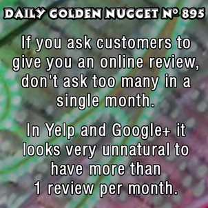
3. Don't ask too many customers to give you online reviews.
4. You should, at least, install Google Analytics and pay attention to how effective your website is.
That's it for this week's basic review.
FTC Notice: I randomly choose this website and won't be telling the retailer jeweler that I'm doing a review. Unless someone else tells them, they will only find out about this review if they examine their Google Analytics and Google Webmaster Tools. I'm not doing this to solicit business from them, but rather as an educational exercise for everyone. This review is completely impartial and all my comments are listed in the order that I discovered them.


