 I'm traveling all the way down to Key West, Florida today to (virtually) visit a local jewelry designer and store. I started off my trip with a quick Google search for "key west jewelry stores" and found Local Color in the number 1 spot on in the Google+ Local listings.
 Here's the website: http://www.localcolorkeywest.com; you might want to open it up to follow along as you read this review.
Having done a little bit of traveling myself, I know that many unique local shoppes in touristy areas have completely different needs than the everyday average shoppes on "Main St, USA." At first I didn't think it would be valuable to review this website, but then again, I've not yet reviewed a store that was in an extremely hyper-local touristy area... This could be interesting...
Even though Key West, FL is only about 5 square miles in area they support about 10 million tourists per year. Realizing that they couldn't possibly sell to everyone, Local Color set up an e-commerce website to stay connected with their customers long after they've returned home from their vacations. Those of you in high tourist areas should consider the same business model.
The website layout immediately tells you they have e-commerce. The 8 images on the home page command attention and invite you to click them. Considering the 10 million tourists I know that this website will be viewed a lot on a smartphone, so I tested those out too.
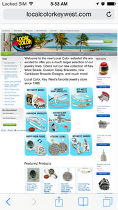
 I hadn't noticed when viewing the website on my desktop, but those 8 images are actually shaped like Apple iOS icons, they even look a little like them too. The image to the right is from my iPhone.
The website doesn't have a mobile version, but it's slightly responsive. On both my Android and the iPhone those 8 icons remained readable on the small screen while the header and the navigation on the left reduced in size. The general font size also increased, reducing the overall need to pinch-zoom on the smartphone.
Local Color makes their own unique line of jewelry relating to many of the local sights and sounds. In particular, they make their own line of beads that "fits all bead lines." You can see it here:
http://www.localcolorkeywest.com/key-west-beads/
Although I've never personally been to Key West, I know a bit about the city from friends who have visited and from business coach John Jaworsi who lives there. In particular, those who visit the city might appreciate the rooster bead to commemorate the local sounds:
http://www.localcolorkeywest.com/key-west-chicken-bead/
Those visiting during storm season may or may not want to remember their adventure with their own hurricane bead here:
http://www.localcolorkeywest.com/hurricane-bead-with-vermeil-eye/
And of course, there's even a bead for the large gay community and tourism here:
http://www.localcolorkeywest.com/rainbow-key-west-bead/
There are many other unique "Key West" bead that they commemorate...or, from a business point of view you could say they are capitalizing on tourist very well. This is exactly the same as Pandora making beads that are only available at specific shops around the world.
They spent a lot of time working on the URL structure of their website. All their products have specific URLs without any variables in the address. Perhaps this is just a function of their Big Commerce CMS that they're using. These could use a little work to improve their targeted keywords and remove unnecessary URL trash.
For example:
http://www.localcolorkeywest.com/ss-3mm-key-west-hook-bracelet-w-14k-wrap/
Instead of "ss-3mm-key-west-hook-bracelet-w-14k-wrap"
it might be better to have "key-west-stirling-silver-bracelet-w-14k-gold-wrap"
I also see that they're using the same meta description and meta keywords on every page of their website. The meta description should be unique for every item and the meta keywords are not needed at all--no use wasting time on them.
Even though they didn't get the basic meta descriptions/keywords right, they did spend a little time programming their site for proper sharing on Facebook. There are hidden HTML codes on all their pages that turn those Facebook Like buttons into more valuable website sharing buttons. In other words, they hired a programmer to set up their Facebook integration specific for their site, rather than using the basic widgets that Facebook has available. Good job there!
Okay... I could cry... They don't have Google Analytics set up on their website. Someone tell me how you could spend time tweaking the small things I've mentioned so far but completely leave out Google Analytics from your website. I was going to suggest that their Analytics is probably reporting 60% or more mobile usage instead of the normal 35% for normal jewelers... but they will never know unless they set GA up. It's very sad that they are leaving so much business intelligence untapped.
They have a "Links" page on their site with links to only a few local places and organizations. For a site like theirs, I think this page has a lot of lost opportunity. This page should have resources to help tourists connect, or reconnect, with other local businesses.
That's it for this week's basic review. Give me a call or drop me an email if you'd like a personalize, deeper evaluation of your own website. I'm available for usability analysis, basic SEO advise, and deep Analytics evaluations.
FTC Notice: I randomly choose this website and won't be telling the retailer jeweler that I'm doing a review. Unless someone else tells them, they will only find out about this review if they examine their Google Analytics and Google Webmaster Tools. I'm not doing this to solicit business from them, but rather as an educational exercise for everyone. This review is completely impartial and all my comments are listed in the order that I discovered them.


