
 This debate between a dedicated mobile website and a responsive website rages on. The winner has not yet been announced and I'm pretty sure it will be a few years more before we know for sure.
 At the moment I'm still partial to the dedicated mobile website. In reality it doesn't matter if you have a responsive design or not, but rather how you use it and manage the content.
Every day, more and more business owners are diving into website creation. With systems like WIX.com it's easy to get a website up and running in no time. The real problem comes when you find out the need for continual content creation. The lack of written content and photography is not as bad as poorly written content and photographs along with lousy website organization.
Last week I stumbled across this website and decided to make it a case study of responsive website design. It's pretty bad... Take a look at http://www.fordsjewelers.com/ on your smartphone or just follow along here.
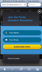 To the right you can see the initial popup screen when landing on the mobile site. Although it looks fancy, this jeweler didn't consider that the mobile user needs fast information about them and will not want to be pressured into signing up for their newsletter. A mobile user is probably looking for directions, a phone number, or products.
  You will have to click on this next screen shot to see it larger. I stitched several screen shots together so you could see how long the home page appears on a smartphone.
The Ford's website uses WordPress as the content management system. WordPress is incredibly flexible and can have any design, but the one they chose has similarities of a blog and a normal website. It really doesn't lay out very well they way they did it.
The mobile home page shows 4 designer logos without any hint of what jewelry those logos represent or that something will happen when you tap one of them.
Below those logos you will find 8 abbreviated blog posts which aren't very dynamic or engaging. One of the blog posts is titled "Back From Vacation" and the very next one just says "Vacation."
The home page is very long when viewed on a smartphone and I doubt someone will scroll all the way to the bottom--which is sad because the store's contact information (address, phone) is in the footer of the page.
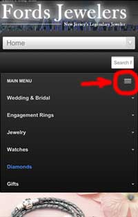 I have a feeling that no one really took the time to consider how the website would look on a smartphone. Although their website design "responds" to the size of the screen someone is using, the method of responding will confuse some users. Take, for example, the Main Menu shown in this image to the right. I've circled 3 lines that appear on the design which might make sense to some users, but not others. That specific symbol is common on iPhones but not on Androids, so an Android user might not even realize that the sites main navigation menu is hidden in there.
If you do happen to tap on that 3 line icon, you will expand the product menu for all their jewelry categories as shown. Each category has an additional submenu as well. These submenus are very tough to navigate because once you open it with a simple tap you can't easily figure out how to close the submenu again.
The entire user experience on this website is unsatisfactory when used on a smartphone. This is definitely a situation where the store owner bought into this idea of a responsive website, and I give them a lot of credit for attempting to take this approach.
I won't blame the owners of Ford's Jewelers directly for how this works because they probably relied on their website programmer or the person managing their content to correctly organize how the site will appear on mobile devices. The owner is probably proud to have a responsive website without realizing how difficult it is to use.
This really is a good example of a failed responsive website design. They should redesign it again, even if that means changing how the desktop design works.

