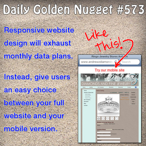
 There's a growing debate over mobile websites and the technology behind them. The debate is if (1) you should create a mobile website that is separate from your real website and is specific to mobile devices or (2) if you should program a single website that is able to detect what type of device is being used, then adapt to the user's needs.
Up until early 2012 the philosophy was to have 2 different websites because the people browsing your website via mobile have different needs than those browsing from a desktop. Let's take a look at some of those needs and how people are using different mobile technologies, and then maybe you can judge for yourself which of the 2 ideas are better.
Mobile devices are used throughout the day while people are sitting at their desk, in front of the TV, and while out and about. Sometimes it's easier to grab a smartphone or tablet for a Google search than it is to use your desktop computer. During the day some people are limited by what they can do on their work computer and they are forced to use their smartphone.
The situation I've described above is what's becoming known as a simultaneous screening, or in simple terms, multi-screen usage. People who use their mobile device at the same time as a desktop or a TV are expecting to have full availability of a website without being limited to a mobile website.
On the other hand, let's think about the needs of a user who is somewhere other than in front of a desktop or TV. During these times the smartphone keeps us all connected, and depending on their needs, the user might want to read a full website or they could be thankful for a stripped down mobile website.
When people are in a hurry they will need immediate access to store hours, directions, product information, and whatever is relevant for them to make a quick, yet informed decision. In this case the mobile website would be a welcomed solution.
Website technology has evolved to the point where a single web page can detect the type of device being used, and display a website appropriately. This is known as "responsive website" design. This solution seems like the best of the desktop world and the mobile world, but there are legitimate pros and cons.
The biggest concern I see is that the adaptive design forces mobile users to download all the content on a web page. This immediately increases data plan usage, and the unsuspecting mobile user would easily exhaust their data plan in a single afternoon.
Another concern I see with responsive websites is that they don't work correctly on older smartphones. "Older" smartphones are only 2 years old, and they do not work at all on non-smartphones.
The dedicated mobile websites are not the perfect solution either because they require you to spend double the time to set up your website because you are truly creating a secondary website. The mobile website will be faster and more appropriately designed for a mobile device. If you choose to create a dedicated mobile website you will have to anticipate exactly what information a mobile user needs most.
The debate over mobile or responsive websites will continue until everyone owns smartphones at least as smart as the Apple iPhone 5 and the Samsung Galaxy S III. Don't ask me when that will be because I still see people using the iPhone 3 and the original Galaxy S even though they are now 3 years old.
The best solution is to have a website that detects the presence of a smartphone and offers the user to switch to it for faster browsing. Additionally, I recommend all new website designs be tested in the latest Android and iOS browsers to make sure they work 100%.


