
In last week's Golden Nugget, I presented some interesting information showing the comparison of web page visible content to the hidden HTML code in the background. From that post, you could conclude that your website goal should be to fine tune your code to prevent too much hidden code, a problem that is known as "code bloat."
I'm digging a little deeper into this topic again today because of the emails, phone calls, and a bunch of social media comments I received after last week's post. I found two great examples to help further illustrate this topic.
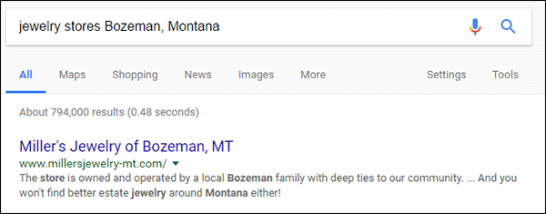
This week, I used the search phrase "jewelry stores Bozeman, Montana" to find potential jewelers to compare. In the results, I found Miller's Jewelry on page 1, organic position 1, as shown here:
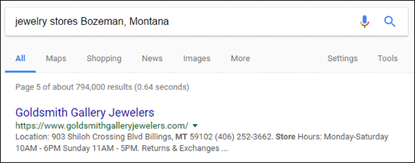
I also found Goldsmith Gallery Jewelers on page 5, organic position 41, as shown here:
The functionality and design of both sites is very similar. The Miller's website is built with WordPress and WooCommerce software platform while the Goldsmith Gallery site is built with the Magento ecommerce software platform. What makes these sites interesting is that the Miller's website suffers from worse code bloat than Goldsmith Gallery, yet Miller's is number 1 while Goldsmith Gallery is far down in the depths of cyberhell on page 5 of the search results.
This doesn't make sense when you apply what I explained last week, so why is this happening? Could my analysis method from last week be wrong? Let's dig in and find out...
Code Bloat Report
The first thing I did today was look at a select number of pages to see what their code bloat ratios were.
I've color coded the following table to show similar pages between the Goldsmith and Miller websites. The home page of both sites had the same small 7% of visible words. Compare that to the home pages I looked at last week which had at least 17% of visible words.
Other than the similar percentage on the home page, every code bloat percentage I measured always showed Goldsmith Gallery to have a more favorable level. Here are my measurements for 4 pages within each site:
| https://www.goldsmithgalleryjewelers.com/ | ||
| code word count | visible word count | % of visible words |
| 4165 | 281 | 7% |
| http://www.millersjewelry-mt.com/ | ||
| code word count | visible word count | % of visible words |
| 5558 | 362 | 7% |
| https://www.goldsmithgalleryjewelers.com/engagement-rings.html | ||
| code word count | visible word count | % of visible words |
| 6542 | 680 | 10% |
| http://www.millersjewelry-mt.com/category/bridal/engagement-rings/ | ||
| code word count | visible word count | % of visible words |
| 7188 | 275 | 4% |
| https://www.goldsmithgalleryjewelers.com/about-us | ||
| code word count | visible word count | % of visible words |
| 3558 | 406 | 11% |
| http://www.millersjewelry-mt.com/about-us/history/ | ||
| code word count | visible word count | % of visible words |
| 5686 | 273 | 5% |
| https://www.goldsmithgalleryjewelers.com/timepieces.html | ||
| code word count | visible word count | % of visible words |
| 4130 | 311 | 8% |
| http://www.millersjewelry-mt.com/watches/ | ||
| code word count | visible word count | % of visible words |
| 5777 | 418 | 7% |
It is believed that code bloat is only a small percentage of the ranking algorithm that Google uses. Until last week, I had never found a good example of how it affected ranking. I believe the Miller website is employing good SEO strategies that far outweigh the problems created by the code bloat.
Mega Menu Usage
Both websites are using very large menu navigation with multiple rows. This method is known as a "mega menu" and it allows a user to jump to any page of your website with a single click. This menu structure removed all barriers and landing pages on a website, effectively flattening the file structure of the website. Many SEO professionals, including myself, disagree with this menu method in favor of the silo structure.
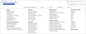
Let's take a look at the jewelry mega menu on both sites. This is what Miller's looks like:
(click to enlarge)
The Miller's menu shows each of their main jewelry categories grouped with the subcategories right below them. The subcategory names include the name of their main category. This seems very repetitive, and for me, it looks quite messy.
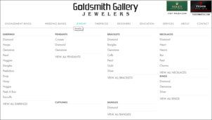
This is what Goldsmith Gallery looks like:
(click to enlarge)
The Goldsmith menu presents a silo structure using a headline at the top of each column with the breakdown of individual subcategories below it. This is a very clean look, and I feel it's more user friendly.
I feel that the Goldsmith Gallery looks cleaner, and is easier to read while the Miller's menu is cluttered and quite repetitive. In this case, the looks are counter intuitive for SEO.
As smart as Google's system is, it is still just a machine that only knows what you tell it. Advanced artificial intelligence, called RankBrain, is now used to help determine the search results, although it is scarily accurate sometimes, when it is wrong, it is very wrong.
Although the Miller's mega menu is cluttered, every menu item is a real two or three word search phrase that Google can match directly to a query. Google already understands these two word queries and the search intent behind them; in short, Google fully understands that Miller's is a jewelry store.
On the other hand, the Goldsmith Gallery mega menu is nothing more than a long list of single words. Not search phrases, just single words. Although it looks cleaner, and we understand it when we look at it, to Google, this might be perceived as random words without context, which would lead to code bloat.
Creating More Context
Google does its best to figure out the topic of your website based on the information you give it. Most of that information is gleaned from the body of your pages. Depending on the site structure, they might learn from your navigation too. Over the years, I've noticed that Google tends to give less weight the information in the header and footer of a website, probably because it is repeated so many times on the site.
When I searched for "jewelry stores Bozeman, Montana" today, Google showed me all the stores that they about in that area. Then they ranked them according to the information on their websites.
Since Miller's is in the 1st spot and Goldsmith Gallery is in the 41st spot, we could say that Google is 100% positive that Miller's is a "jewelry store" but they are not so sure about Goldsmith Gallery.
Google knows that the following words/phrases all mean the same thing:
* jewelry stores
* jewelry store near me
* jewelers
* jeweler near me
Those phrases all relate to types of business, and if you want your business to appear within the results for those phrases you need to use those words in the body of your website somewhere. Using the "site:" search command, you can run a quick test of your own to see how Google classifies you.
Here's what I get when I search for site:goldsmithgalleryjewelers.com "jewelry store"
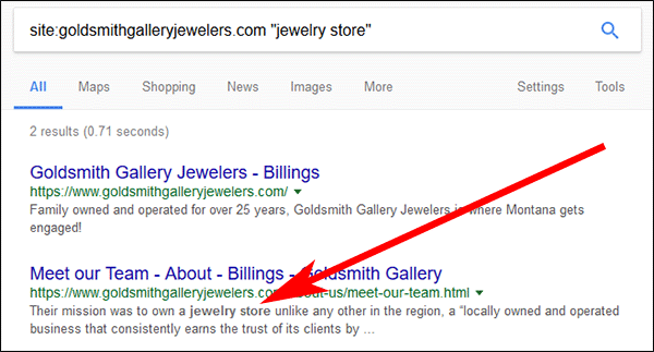
According to those results, Google only knows of 1 occurrence of "jewelry store" on the Goldsmith website.
Here's what I get when I search for site:millersjewelry-mt.com "jewelry store"
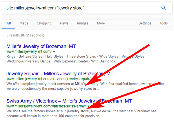
At first glance, it looks like Google understands the Miller's site more, even though this doesn't look like much yet.
I next did a similar search for site:goldsmithgalleryjewelers.com "jeweler" and found bigger differences between the two sites:
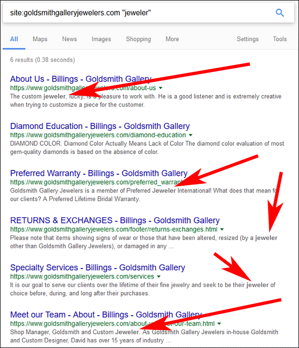
Google only lists 5 pages using the word "jeweler" while the Miller search for site:millersjewelry-mt.com "jeweler" had more than 200 as shown here:
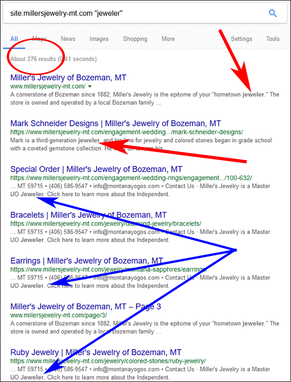
The red arrows in the above screen grab show a few of the unique pages that use the word "jeweler." The blue arrows point to the pages that Google recognized where the word appears in the header or footer. As I said, it's my experience that these pages carry less weight.
Although I'm not showing it, I did this test again using these two searches:
site:goldsmithgalleryjewelers.com "jewelers"
site:millersjewelry-mt.com "jewelers"
Google gave me 401 results for Goldsmith Gallery and 214 for Miller's. Most of the results for Goldsmith indicated the footer of their website. Many of the Miller's pages also indicated the footer, but there were several more pages where the word appeared in the body content.
This simple test tells me that Goldsmith Gallery Jewelers is assuming too much with their website. Although it might look good and function well, once people get to the site, the content they have on the site isn't doing a good job attracting people from organic results.
But Wait, There's More
Without having full access to SEO tools to measure these sites, I can only make general observations of why they are raking the way they are. Other than sniffing through the visible words on their site, I can also look at the background code to see what's happening.
Within the code, I'm looking for the meta tags that they are using. There are a lot of different meta tags that will help the search engines understand the context of your website and other tags that will help social networks understand your website.
Here's a short screen grab of the Goldsmith Gallery HTML code:
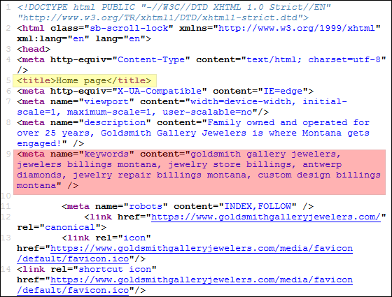
The area in yellow indicated the title of the home page, which actually says "Home page." This should probably say something like "Goldsmith Gallery Jewelers - Bozeman, Montana," but instead we see the default setting for the Magento system that they are using. They have neglected to change an of their default page names throughout the pages that I looked at. This is very sloppy, and it's no wonder that Google is penalizing them for it.
The area shown in pink shows another sloppy meta tag setup. Even though the "meta keywords" are not used any more, it seems like every website system (or inexperienced SEO professional) wants to insert them by default. Google ignores this tag, and those keywords, but when I see them I know that no one with real experience has bothered to work on the SEO of this website.
On the other hand, I found a lot of good things when examining the Miller's Jewelry HTML code:
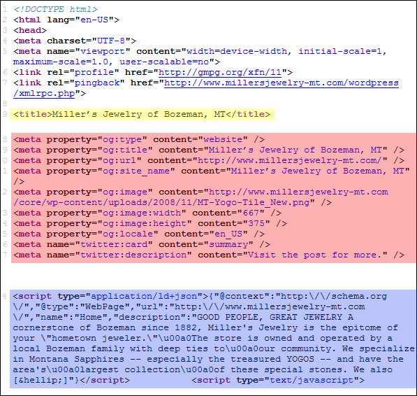
The area in yellow shows the title for the home page, in this case it nicely says "Miller's Jewelry of Bozeman, MT."
The area in red shows several correctly used meta tags that relate to Facebook and Twitter. Even though Google doesn't use these tags to help with ranking, it does use them to help correctly classify every page of the website. Miller's has these tags set to display specific information for every page of the website, which means Google will have an easier time understanding every page.
The area in blue shows an extra, really good, step that Miller's is using on their site. They have special schema.org tags that are designed specifically to help search engines understand what's on every page. Most businesses do not understand what this is, and most SEO professionals have yet to fully grasp the need for them even though they have been around for about 7 years now. I commend Miller's for using them.
Conclusions
In conclusion, it appears that even if your website suffers from code bloat, you can implement the correct usage of meta tags, schema.org tags, and include enough keyword information on your website to still achieve first place ranking.
Even though it looks like Goldsmith Gallery Jewelers has spent a lot of money building their website, that money wasn't spent wisely. Their site needs a lot of SEO analysis followed by many hours of real labor to correct its problems.
That's it for this week; I'll see you next time...
FTC Notice: I randomly choose this website and won't be telling the retailer jeweler that I'm giving them these flop fix ideas. Unless someone else tells them, they will only find out about this Nugget if they use Google Alerts or examine their Google Analytics and Google Search Console. I'm not doing this to solicit business from them, but rather as an educational exercise for everyone. This #FridayFlopFix is completely impartial and all my comments are based on previous experience in my website design and marketing agency, and from my personal research data.


