 Don't want to read? This week you can also watch the video recording of this review here!
Welcome to the weekly #FridayFlopFix website review. Every Friday, I search a random town for an older website that needs help improving, and I suggest fixes for their flops.
This week, I searched Google for "jewelers Odessa, TX" and saw these results:
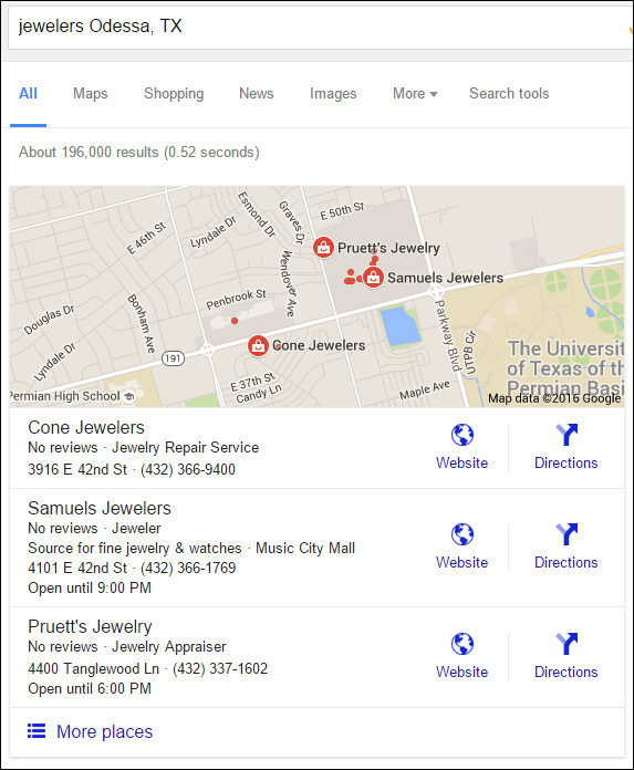
Of the three jewelers listed, there the Pruett's Jewelry website could use the most help. Here's their site:
http://www.pruettsjewelry.com/
First Impressions
This is what the website looked like when I first visited:
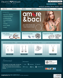
(click to enlarge)
This website design is several years old. The top menu navigation reminds me of the website design concepts from about 10 years ago. Sure enough, when I check the time stamp on the website it dates back to August 7, 2009. This website theme was probably waning in popularity in 2009 when they chose it. I also notice that the copyright date on the bottom still says 2009! That's a sure sign that they have not updated their website in nearly 7 years. Ouch.
They lead me right into a GOTCHA!
The large Amore & Baci image on the home page was inviting to click. Here's the page it leads to:
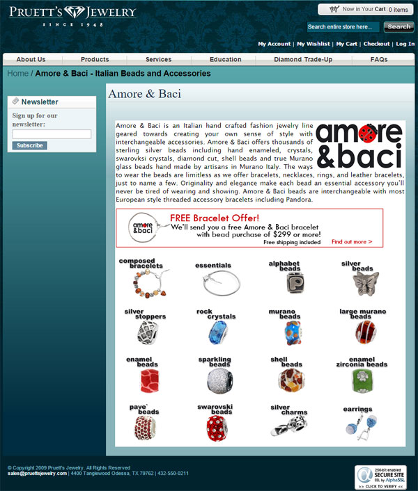
It looks like they carry a full line of beads similar to Pandora. Sadly, all 16 of the images you see in the above screen shot lead to this dead page message:
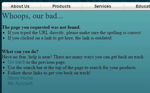
The big flop here is that they have a home page hero image leading to this catalog landing page, but then every page under it is dead. To me, this seems like they deleted these pages after they stopped carrying the product line, but neglected to update their website. This really needs to be fixed. The hero image needs to be removed from their home page and the Amore & Baci page needs to be deleted.
Yawn
Except for the product catalog pages of their site, the rest of the pages are quite boring. They didn't include any images to help the reader. Specifically, the About Us page has no photos of the store; the Services page has brief write-ups about their repair appraisals, and custom design service; and the Education page talks about the 4C's without showing any supporting images.
Confusing Magento Implementation
Their website is powered by the Magento ecommerce system. Magento is extremely flexible and can do anything you set your mind to, but it looks like they installed a default theme and didn't pay much attention to usability. Every item in the product catalog has a link to add it to a comparison list. I don't often see a comparison feature on a retail jeweler's website, so I decided to check this one out.
I added a few items to my compare list, but then I realized that the website didn't have an obvious way to view that comparison. I searched on the shopping cart page, checkout page, and throughout several pages of the catalog. I was about to give up when I happened to scroll down to the bottom of one of the product detail pages and noticed the comparison list down there. Here's a screen shot:
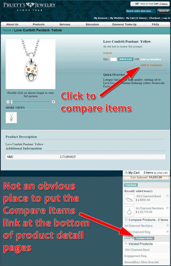
Looking closely, you'll also notice the shopping cart details and other related items in that list at the bottom of the page. I would fix this by reorganizing the product detail page so the related items are positioned horizontally with their photos. I'd also remove the shopping cart details from the footer and reorganize the header to show the current total and a link to the item comparison page.
Conclusions
I give them a lot of credit for setting up an ecommerce website in 2009. Although the look of their website is a total flop by today's standards, and it should have been refreshed in 2010, I consider them to be far more advanced than most jewelers who haven't yet taken the ecommerce leap. I also notice that their ecommerce is still active and their secure certificate is still valid, which I assume means they are selling from their website.
I suggest a new design, but first I recommend that they remove all traces of Amore & Baci from their site, assuming they no longer carry that Ostbye line.
That's it for now; I'll see you next time...
FTC Notice: I randomly choose this website and won't be telling the retailer jeweler that I'm giving them these flop fix ideas. Unless someone else tells them, they will only find out about this Nugget if they use Google Alerts or examine their Google Analytics and Google Search Console. I'm not doing this to solicit business from them, but rather as an educational exercise for everyone. This #FridayFlopFix is completely impartial and all my comments are based on previous experience in my website design and marketing agency, and from my personal research data.


