
In this week's Friday website review, I'm heading to Morgantown, WV to find a candidate jewelry store to review.
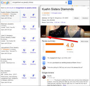
When I started my search with the phrase "morgantown wv jewelry stores," I saw these Google results:
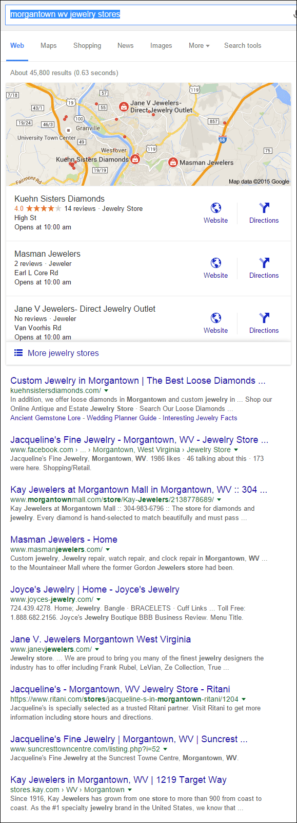
In the new Google Local 3-pack format, the listing for Kuehn Sisters Diamonds stands out above the other two options simply because that listing shows an average star review rating. Admittedly, the average 4.0 rating isn't very high, but those 4 gold stars do command attention when the other two listings don't have them at all.
Let's have a look at the Kuehn Sisters Diamonds website at:
http://kuehnsistersdiamonds.com/
This is what the home page looked like when I first arrived:
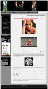
(click to enlarge)
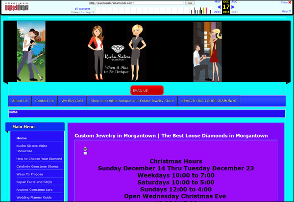
I recognize the template this website is using; it's been around for several years. I immediately wondered if this was a new website design or a holdover for several years that needed to be refreshed. This type of question always leads me to the Internet Archive Wayback Machine at http://web.archive.org.
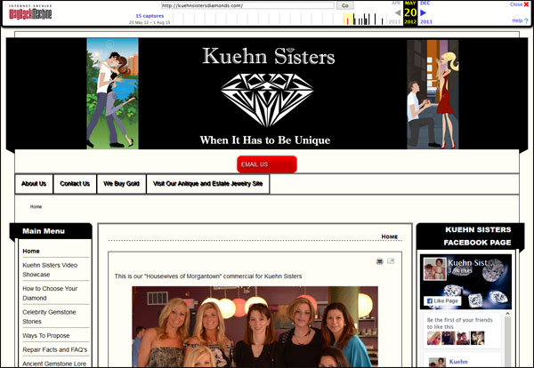
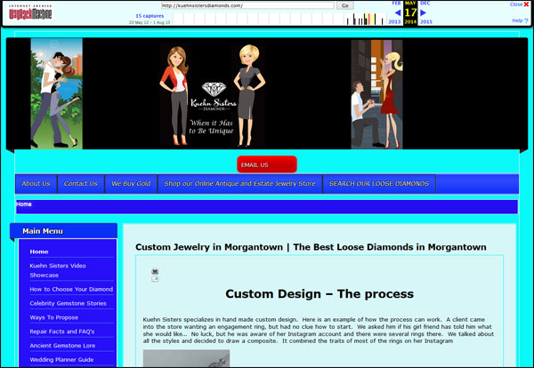
By all appearances, the kuehnsistersdiamonds.com was launched in May 2012 and has been updated a few times since. Here are a few snapshots from the past...
May 20, 2015:
May 17, 2014:
December 17, 2014:
August 1, 2015:
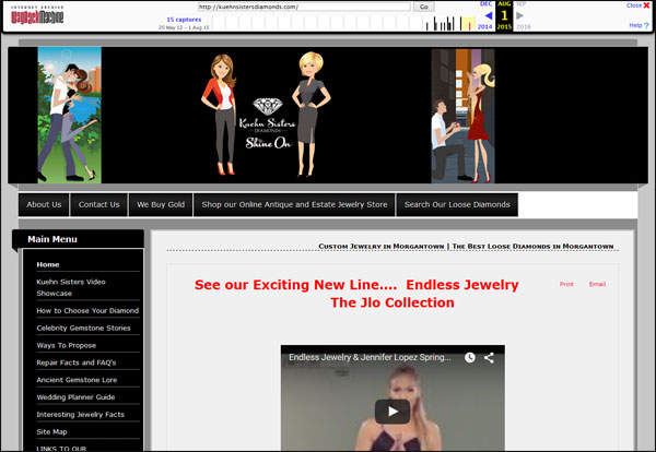
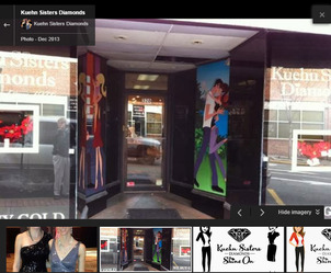
So it would seem that they've been using the same template design since they launched, but switched up the colors a few times. Initially I felt the cartoon caricatures in the header of the website looked a little campy, but as I was investigating more about the store, I found a storefront photo showing these same caricatures. Let me walk through how I found them...
Functionality of the Google SERP has changed with the new 3-pack display. Previously, when you clicked the store name you would go to the website, but now it shows you the version of Google Maps you see here:
(click to enlarge)
This side-by-side panel layout is similar to the previous Google Local 7-pack layout in that it shows the store information on the right. I decided to investigate the photos shown there, which brought me to this screen:
(click to enlarge)
A close look at that photo reveals that those cartoon caricatures flank the sides of their front door, and I assume they also use them in other advertising. Therefore, it makes sense to use them on the website; however, their tall nature doesn't lend itself nicely to the positioning in the header like they have it. A better approach might be to ask their graphic designer to help design a completely new website using these caricatures as the primary design element and build around them.
Google Store Photos
As you can see with this live example, it can be helpful to upload your own photos to your Google My Business account. I suggest that you update the photos on a regular basis to include some new inventory and store photos. You can even delete outdated photos as you upload new ones.
Kuehn Sisters Website Style
The more I click around their website, the more I realize that it was built in-house by someone without website design experience. I give them credit for putting a lot of effort into gathering and writing the content, but the presentation is poorly done. Here are some specifics that bothered me...
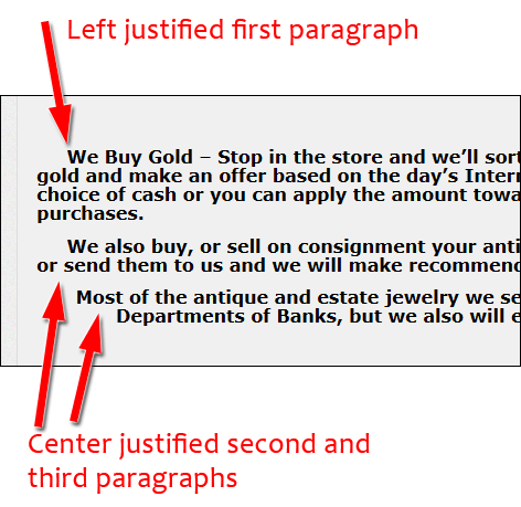
The paragraph justifications changed from page to page on the site, sometimes even having different justifications on the same page like you see here:
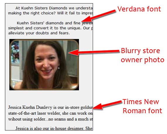
The About Us was a design mess with the use of Verdana font in some areas, the Times New Roman font in others, and blurry photos of the store owner as you see here:
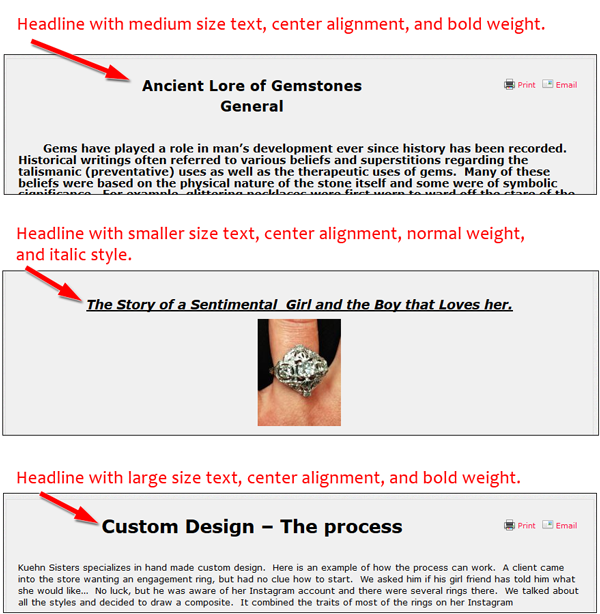
The main header looked different from page to page. This type of design inconsistency confuses website visitors. Here are a few examples:
Multiple Kuehn Sisters Websites
The last topic I'd like to cover today is my discovery of multiple Kuehn Sisters Websites. In addition to their main kuehnsistersdiamonds.com website, I found links to...
kuehnsistersantiques.com - This website has an online product catalog that allows a checkout through PayPal. It has the same website design as the main site.
kuehnsistersgold.com - This website is dedicated to explaining their gold buying process.
Creating mini-sites like this is a type of search engine optimization strategy that works sometimes; it all depends on the implementation. Mini-sites like this work well if the information is streamlined on a specific topic, like buying gold, but not the attempted e-commerce site they have. Regardless, they missed the mark and they should integrate these two sites back into their main site.
A better use of these alternative domain names would be to simply use them in their print ads to help track visibility.
That's it for this week's website review, see you next time...
FTC Notice: I randomly choose this website and won't be telling the retailer jeweler that I'm doing a review. Unless someone else tells them, they will only find out about this review if they examine their Google Analytics and Google Webmaster Tools. I'm not doing this to solicit business from them, but rather as an educational exercise for everyone. This review is completely impartial and all my comments are listed in the order that I discovered them.


