
For this week's review, I'm using my iPad to look up a review candidate. Every week, I use the Chrome browser in incognito mode to search for a random jeweler. In case you don't know, the iPad version of Chrome also has an incognito mode.
This week, I'm searching for "jewelry stores Eugene OR." Here's the Google SERP I saw on the iPad:
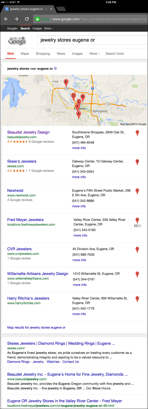
In this case, I'll choose the jeweler listed first in the local results, Beaudet Jewelry Design and their website http://www.beaudetjewelry.com
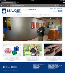
This is what the home page looked like when I first viewed it:
(click to enlarge)
Breaking down the Home Page...
The Design
It's often difficult to explain the difference between a website design and the content that's displayed on the page. The design includes the color scheme, backgrounds, and navigation. It also includes the layout of how images appear.
Oftentimes the content, like photography, can completely change the look and feel of a website, even though the design is the same as many other sites.
The website design for Beaudet is the same design I've seen across more than 100 other jewelry stores. Normally I spot this template design really fast, but this time even I was pleasantly surprised. The simple background and the three photos used on the home page created an interesting and friendly feel for a template design that's usually rather humdrum.
Hero Image
The large main photo you see above shows Charles Beaudet, owner of Beaudet Jewelry. I found that photo to be extremely inviting. Tapping it brought me to the Our Store page here:
http://www.beaudetjewelry.com/about
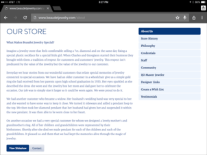
I feel this is a good landing page to link to, but it looks a little dull as you can see here:
(click to enlarge)
They should add another photo of Charles Beaudet to that page to spice it up.
Gemstones
The second thing I noticed quickly on the Home Page was the photo of the pink, green, and blue gemstones with the tag line "Color Stone Destination." As I explained in my recent podcast interview, if I owned a jewelry store, I would set up a color gemstone bar to allow customers to find their own stones.
I was excited to see if this home page gemstone photo would detail a similar service, but tapping it left me completely dissatisfied. It was nothing more than a link to their generic gemstone guide here:
http://www.beaudetjewelry.com/pages/gemstones
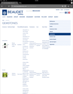
In fact, the page was horribly designed for use on an iPad, here's a partial screen grab that show the mistake that you'll find on all sites using this template:
(click to enlarge)
Engagement Stories
Back on the home page again, I also liked seeing the photo of the happy couple and the invitation to "Tell us Your 'Yes' Story." Tapping that image brings you to this page:
http://www.beaudetjewelry.com/pages/yestimonials
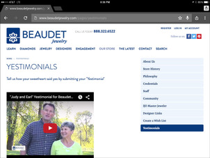
At the time of this review they had 2 video "Testimonials." This is what the top of the page looked like:
(click to enlarge)
This is a cute page, but they overlooked something obvious... They don't have directions of how to submit one's own story or video.
Custom Design
One more time back on the home page, the last image on the bottom right shows one hand placing an unique looking ring on the finger of another hand. Although it might not seem so, I feel the chosen photograph here is brilliant.
Take a close look at the subtle details:
1. It's fully in focus
2. The lighting is obviously outside on a bright day
3. The ring is unusual looking, which gives the immediate impression that it really is a custom ring.
The reason I think this is brilliant is simple because, although a good photo, it looks like an amateur photo, and therefore lends itself well to a "custom quality."
I'm hoping that I'll see more details of how to create my own custom ring when I tap that image... It brought me to this page:
http://www.beaudetjewelry.com/pages/custom_design
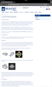
This is what it looked like:
(click to enlarge)
Although they have several photos of their previous custom work showing on this page, they could make it better by moving one of those photos to the top of the page. In fact, they could have used the same custom photo from their home page right at the top too.
Conclusion
It seems like Beaudet Jewelers put a lot of thought into the images they chose for the home page, and they did a good job at creating an immediately inviting look. The photos were interesting enough to overshadow the fact that their website layout is a lookalike of so many others. They've proven that you can still stand out.
The improvements I've suggested above explain how they can improve the user experience based on visual expectations.
Take these concepts and see how you can apply to your own site.
FTC Notice: I randomly choose this website and won't be telling the retailer jeweler that I'm doing a review. Unless someone else tells them, they will only find out about this review if they examine their Google Analytics and Google Webmaster Tools. I'm not doing this to solicit business from them, but rather as an educational exercise for everyone. This review is completely impartial and all my comments are listed in the order that I discovered them.


