In honor of the big jewelry shows in Las Vegas that came to a close on Monday this week, I'm searching around Las Vegas again for this week's website review edition of the Daily Golden Nugget.
I was still in New Jersey when I wrote last week's review of another Las Vegas jeweler, but this time I'm sitting in my hotel room at The Excalibur writing this weeks.
Last week, I simply searched for "jewelers in las vegas" using Google Chrome in incognito mode to find the top ranking jewelers. Now that I'm in Las Vegas I can do that same search and see completely different results, and that's because of how Google understands geo-targeting.
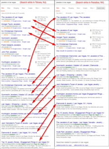
Here's a side-by-side review of the same SERP from two different geographic locations:

(click to enlarge)
The most notable change between the two searches is the Google Local Pack. Google is only showing 3 results this week when they gave me 6 results last week. I'd like to point out that these are not the 3 closest jewelers to me right now, but Google feels they are the best match for my search query.
This time around, they also have "The Jeweler of Las Vegas" in the top organic above the Local Pack instead of below it.
The other change is that "Jack Weinstein's Tower of Jewels" is ranked one spot higher now. I suspected this change might be SEO related, not location related, so I called my business partner, George, back in NJ to have him run this same search again for me. Sure enough he's also seeing this new order, which means it is probably SEO related, in that, Jack Weinstein might have improved something on their site, or Huntington Jewelers broke something on their site. One or the other happened.
Continuing with this week's review, I'm going to look at The Jewelers of Las Vegas with their website:
http://www.thejewelers.com/
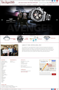
This is what their home page looked like when I first visited:

(click to enlarge)
User Interface & Functionality
The first thing I noticed was the small text size used throughout the website. Although the website has a responsive layout, the text size never changes. This becomes especially troublesome when viewing the website on my smartphone because I still need to pinch-zoom to read the text, which obviously completely contradicts the reason for having a responsive site in the first place.
Although I don't like home page sliders, I found this one to be especially annoying because the slider images were different heights that caused the home page to move up and down while I was reading it. Additionally, the slider on the home page seemed to interfere with the scroll wheel on my mouse, which was also very annoying.
Coming Soon
"Coming soon" is so 1994. Don't bother putting any "coming soon" message in the form of an icon, image, or a blank page on your website. There's no need to mention anything is "coming soon." Your website should always be changing. Instead of announcing that things will be coming soon you can simply make the announcement, and post it on social media, after it arrives.
The home page shows a diamond image with the coming soon message. I assume this is where they'd put a link for a diamond search feature. From what I can tell, it looks like that's been coming soon since December 13, 2013. That's quite a long wait, or perhaps they forgot about it.
Avoid all coming soon pages and avoid the possibility of your customers noticing that you forgot to update your website.
Dead Links on Home Page
By the look of it, The Jewelers Inc website is partially set up for e-commerce. I'm assuming this because they have the "My Cart," "Track My Order," "Wishlist," and "My Account" at the top of all their pages.
These are all dead links!
Why bother having them if they don't function? It looks to me like their web developer didn't correctly disable the default features in their website theme.
Also, all the products in their online catalog have a very large "Add to Wishlist" button that directs to a 404 Error page when clicked... Ouch.
Designer Pages
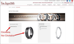
There's a section of the website dedicated to different designer jewelry that seems non-intuitive to use. The landing page of each designer looks similar to this:

(click to enlarge)
What I found interesting was that the layout wasn't tested for usability. If it had been they would have realized that the images need to be clickable. At the time, I did this review only the small text for the subcategory links were clickable as shown in the above image.
Templated Websites
In conclusion, The Jewelers Inc. is using a website service that provides pre-populated product information without any work on their part. These types of services are good for jewelers who carry designer lines and who don't have the time or skills to manage their website on their own.
The broken links and forever coming soon message I pointed out are clear signs that no one is paying attention to this website at all. The website company is not paying attention and the retailer is assuming they are paying for valuable service, when there's plenty on this website to annoy the user.
However, this version of the website is much better than the Flash version they had the last time I reviewed this site in May 2013.
FTC Notice: I randomly choose this website and won't be telling the retailer jeweler that I'm doing a review. Unless someone else tells them, they will only find out about this review if they examine their Google Analytics and Google Webmaster Tools. I'm not doing this to solicit business from them, but rather as an educational exercise for everyone. This review is completely impartial and all my comments are listed in the order that I discovered them.


