
This is another edition of the Friday Website review edition of the Daily Golden Nugget. Each week, I use Google Chrome in incognito mode to search out a random retail jeweler from around the U.S., and then I review their website.
I never know what I'm going to find when I start these reviews. My hope is that I can illustrate one of my previous Daily Nuggets with a live example.
My search began this week with the phrase "jewelers in Evergreen, CO" and saw this as my search results:
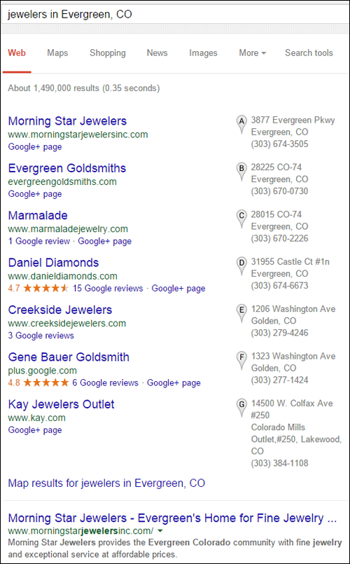
I'll use Morning Star Jewelers for today's review because they are first in both the Google+ Local pack and in the organic results.
You can visit their home page here:
http://www.morningstarjewelersinc.com/
This is what it looked like when I visited:

(click to enlarge)
Home Page Slider Issue
Right away, I'd be discouraged if I were a real jewelry buying customer. I'm writing this review on the morning of May 21; meanwhile the first image your see on the home page says "Valentine's Day Specials: Celebrate Valentine's Day - February 14." Clearly this website is not maintained.
This website design is a very familiar one among many retail jewelers. That large Valentine's Day image is part of several slider images that fade from one to the other. Even though I don't like home page sliders I decided to watch this play out. Usually the large images are clickable to page with full details about the image. Regrettably, only 2 of the 9 home page slider images were clickable.
The red image you see above invites someone to click, yet it doesn't.
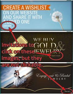
The 3 home page images you see below specifically said "learn more" or "view all" yet they did not click.
(click to enlarge)
Those types of written cues are supposed to lead users to the next step of website engagement, without the click users are simply disappointed.
Questionable Font Choice
The time stamp on this website is January 30, 2013. Without deep analysis I'll say that this website design isn't bad, but it has a much older look because of the small font size. Throughout the entire site I'm seeing 11 pixel font size, 12 pixel font size, and even some areas with 10 pixels.
Most websites are using 16 pixels or larger font sizes now. In fact, site with responsive design are using the flexible "em" measurement for fonts instead of hard coding specific pixel heights like this site has.
They could probably make this website look a lot better if they increased their font sizes all around the site.
Non Clickable Banner Ad
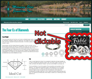
I noticed that several pages throughout the website had a square ad for Fable Designs rings. If you are going to take the time to place these banners throughout the website, you should also make them clickable to a catalog or a designer introduction page.
Here's what it looked like:
(click to enlarge)
Like the sliders on the home page, this banner seems like another lost opportunity. You should never place banners around your site without giving a clue of why it's there, and make them clickable. Otherwise you're just wasting screen real estate with what I refer to as visual noise.
Apparent Duplicate Content
Not only is this design a familiar one among many retail jewelers, the company creating these sites is using many pages of the same information for dozens of jewelry stores.
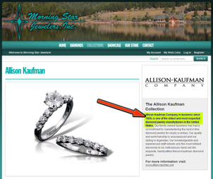
Take a look at this page with information about Allison-Kaufman Company:
(click to enlarge)
I've added the red arrow and the yellow background to call attention to the first sentence of the description for Allison Kaufman. Here's what it says:
"Allison-Kaufman Company, in business since 1920, is one of the oldest and most respected diamond jewelry manufacturers in the United States."
To illustrate how Google sees duplicate content I searched for that exact phrase. I invite you to try this yourself to see the results.
I found about 120 websites with the same Allison Kaufman information on it. I merged the first 4 pages of the Google search results into this single image for you to see:

(click to enlarge)
I highlighted the exact duplicate pages with yellow. Within the first 40 results, 39 are exactly the same. Although Google has ways of dealing with accidental duplicate pages that you might have on your website, especially in product catalogs, duplicate content found across multiple website is bad.
Google's point of view with duplicate content is that only one site will be ranked for that content in order to prevent the users from seeing multiple search results with the same information. In other words, Google does not want to waste your time by showing you identical information. You can read more about that here.
Although Google doesn't want to view this as a "penalty" against the ranking of your website, the nature of how they filter pages of identical content might cause your website to be suppressed from the results.
The jewelers shown above probably don't realize how this duplicate content is affecting them. From their point of view, the website programming company made it easy for them to set up a website without the long term care or analysis of its performance.
Conclusions
It seems like they have good intentions with their website, but the implementation is falling flat. Whoever is managing their website needs to learn more about user expectation and managing traffic flow through their website.
The duplicate content I've illustrated needs to be addressed. The best approach is to simply rewrite all the short designer descriptions.
FTC Notice: I randomly choose this website and won't be telling the retailer jeweler that I'm doing a review. Unless someone else tells them, they will only find out about this review if they examine their Google Analytics and Google Webmaster Tools. I'm not doing this to solicit business from them, but rather as an educational exercise for everyone. This review is completely impartial and all my comments are listed in the order that I discovered them.


