The weather in North America has been quite drastic through this winter. Snowfall and low temperature records have been broken all season long, and we're all counting the days until March 21st, which is only two weeks from now. Thankfully temperatures seem to be on the rise.
On the other hand, two weeks ago, the temperatures in New Jersey were lower than in Fairbanks, Alaska!
I'm certainly not a cold weather person, but many people are. In this week's edition of the Friday website review I'm heading up to Fairbanks, Alaska to see what jewelers are up there, braving the yearly frigid temperatures. A friend living in Alaska commented once, "There are two seasons in Alaska: winter and construction."
Using Google Chrome's incognito mode, I was given this SERP when I searched for "jewelry stores Fairbanks, Alaska:"
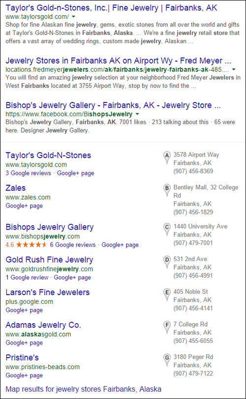
I'm going to review the website for Taylor's Gold-n-Stones because it appears at the top of the organic list and first in the Google+ Local pack. Out of curiosity, I quickly looked at all the sites in the list, other than Zales. Except for Bishops Jewelry Gallery (that's the one with the Google reviews shown above) all the rest are older looking websites.
Let's dive in to the review of Taylor's Gold-n-Stones site here:
http://www.taylorsgold.com/
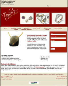
This is what the home page looked like when I arrived:
(click to enlarge)
According to the Internet Archive, this version of Taylor's website was published in November 2011. They are using the simple website builder software provided through their registrar, Register.com.
Before I start dissecting their site, I will complement them for being online since 2001. What I see today is the 4th incarnation of their website since its first launch. The simple design of this site is what Register.com was offering back in 2011. Many of the retail jewelry websites I've reviewed, only update their websites once every 5 years, maybe even less frequently.
Hopefully Taylor's is already in the process of setting up a new website, and the notes below will give them, and you, some insights for improvement.
Old SEO Tricks
Take a look at this blurb from their home page:
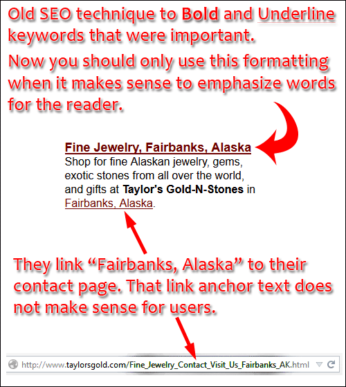
In the first sentence, we see "Fine Jewelry, Fairbanks, Alaska" formatted with bold and underlining. In the past, we used to use this SEO technique to tell Google what the important words were on a web page. The new SEO approach is to change formatting when it makes sense for users, not for the Google machine. So don't do this anymore.
In the above image I'm also showing the anchor text of "Fairbanks, Alaska" that links to their Contact Us page. That method of linking the city name was also another old SEO trick for Google. When linking to the Contact Us page you should simply use the words "contact us" or "click here to contact us."
Missing Information
The phone number and address are at the top left of every page as shown here:

The website builder template probably populated this information, but it would have been better for the full store name to be included using this format:
Taylor's Gold-n-Stones
3578-B Airport Way
Fairbanks, AK 99709
(907) 456-8369
The formatting I'm showing above will better match other online directories. Google has more faith in the information it finds online when the store name and address match across multiple websites.
Even though you might not like the formatting used on other sites like Yelp, MerchantCircle, or Google+ Local, it's better to conform to them than use your own format.
The top right of their pages seem to be missing the social icons as you can see here:

They are inviting you to "share," but there's no indication of where we should be sharing to. Again, this is probably part of the Register.com website builder template that never got filled in, or removed.
If you are using a template, you should always deactivate and hide the features that you will not be using. Unnecessary features make a website look sloppy, and it creates frustration when someone tried to use a non-functioning or missing feature.
Difficult Navigation
The navigation of their site is not intuitive. At first glance looks like the website has only these 6 pages as indicated in the top menu:
1. Home
2. Our Unique & Alaskan Jewelry
3. Appraisals & Gemstone Treatments
4. Bridal Jewelry
5. Services & Store Policies
6. Contact & Visit Us
Those very long page names were probably created with SEO in mind. There's dropdown menu that appears under Bridal Jewelry and Services. At first it seems like the only way to get to those sub-pages is to continually hover over the menu to reveal the dropdown.
I was clicking around their site for several minutes before I realized that the links at the bottom of every page change to match the dropdown in the top menu. You can see it here:
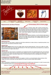
(click to enlarge)
That footer link menu structure is very difficult to read and the whole thing should be redesigned for better customer readability and usability. My personal preference is to use navigation menus on the left or right. A creative web designer would be able to give you many options.
Closing Thoughts
Many retail jewelers treat their website like a health insurance policy. They buy it, read it once, and then keep paying the same fee year after year without ever looking at it again.
Just like the human body, a website needs continual care and food to thrive, and it's only going to function as well as the food you put into it. Don't treat your website like a health insurance policy; treat it like you would your own body and keep it healthy. In turn, it will continue to feed more customers to your business.
FTC Notice: I randomly choose this website and won't be telling the retailer jeweler that I'm doing a review. Unless someone else tells them, they will only find out about this review if they examine their Google Analytics and Google Webmaster Tools. I'm not doing this to solicit business from them, but rather as an educational exercise for everyone. This review is completely impartial and all my comments are listed in the order that I discovered them.


