 This is the weekly Friday Website Review edition of the Daily Golden Nugget. The goal is to first find, and then evaluate a random jeweler's website to see how they set it up and what they are doing with it. Sometimes I find good things to talk about, sometimes bad, but always educational and unbiased.
 Each week I search a random town for a jewelry store. I always set my Google Chrome browser to incognito mode to prevent my previous personal browsing history from tainting my organic search results.
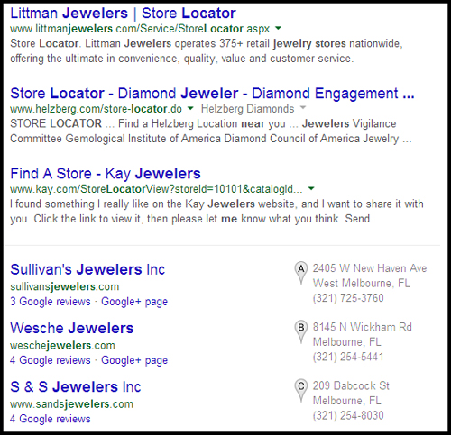
This week I used the Google search feature to set my location as Melbourne, FL, and then I searched for "jewelers near me."
The top 3 organic results included Littman, Helzberg, and Kay, all of which are large chain stores. I always skip the chain stores because I feel it's better to review independent jewelers.
The Google+ Local listing below the organic showed Sullivan's, Wesche, and S&S Jewelers as you can see here:

I'm choosing Sulican's Jewelers as the candidate for today.
Here's the website: http://www.sullivansjewelers.com; you might want to open it up to follow along as you read this review.
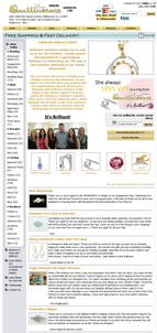
This is what their home page looked like:

(click to enlarge)
At first glance it looks like this website was designed in 2005 or earlier, but the timestamp of the website tells me it was launched in January 2009.
I was about to write how bad this website looks, but then I noticed that they have several testimonials on their home page. That gave me pause.
Testimonials are a powerful tool. They are the social proof that tells other people that you matter. In 1919, W. Clement Stone founded and built the success of the Combined Insurance Company of America with the sales tactic of showing testimonials to potential new insurance buyers. It wasn't until 2006, 87 years later, that this concept of selling through testimonials was given the name "social proof" by Robert Cialdini, in his book Influence: The Psychology of Persuasion.
This website went live in 2009 with a few testimonials on their home page, and it's been building them ever since. What do you remember about the internet from 2009? That's 5 years ago! Social media was certainly different, and only a few people understood the power of online marketing and social proofing. I applaud their use of testimonials like this. This is a good model to follow.
Although it has a simple design, their website was designed for e-commerce. Each of the buttons across the top leads to a section of their product catalog, and the navigation on the left side doesn't change very much as you navigate through the site.
Coincidentally, they are using PayPal's Add to Cart button that I explained yesterday to handle their shopping cart and checkout. This saves them the trouble and expense of testing their website for PCI-DSS Compliance.
I liked the 5 icons they had at the top of all their product catalog pages, shown here:
They were small enough not to distract from the page at hand, but large enough to invite me to click them for more information.
Clicking the images for Wedding and Gemstones brings you to a product catalog pages with those items on them. The Diamonds image lead to a 4C's education page.
The Custom Jewelry icon brings you to a nicely arranged page showing the before and after of their jewelry restyling process.
I was also nicely surprised by their Designer Showcase page too. Although I didn't like the look of this page at all, the functionality was correct. They included banner images and links for each of the designers they carry. When clicked, each designer's website opened into a new window.
What I Didn't Like About the Site:
As I said above, the design is old looking and needs refreshment. They could keep the same page structure and content as long as they apply a designer more in line with what users expect for 2014.
They also have a mobile website which detects the device you are using and automatically shows you the mobile page. Except that the home page of the mobile site doesn't display correctly and someone might think it's broken.
Usability Issues:
I discovered several links around the site that didn't work correctly. Some links were broken, some didn't work they way I expected, and some links lead right back to the page I was on.
It's a web standard to lead you back to the home page when clicking on the logo at the top of the page. Although the logo was clickable, it always led back to the page you were currently on.
I also found a strange issue with the Diamonds image I mentioned above. Sometimes it linked to the 4C's education page and sometimes it linked to the page I was on.
Navigation inconsistencies like this can turn an otherwise well thought out website into a usability nightmare.
Incorrect SEO Issues:
The obvious SEO issue that jumped out at me is that they are using the same information for both the page title and meta description on every page of their website. This:
Sullivan's Jewelers - Diamonds - Brevard's local diamond mine | It's Brilliant! | Located in Melbourne FL on US-1-92 (New Haven Ave) | Jewelry That Meets your Expectations!The proper method is to have a unique page title of only a few words and a meta description that could accurately describe what the person will find on the page.
That's it for this week's basic review.
FTC Notice: I randomly choose this website and won't be telling the retailer jeweler that I'm doing a review. Unless someone else tells them, they will only find out about this review if they examine their Google Analytics and Google Webmaster Tools. I'm not doing this to solicit business from them, but rather as an educational exercise for everyone. This review is completely impartial and all my comments are listed in the order that I discovered them.


