 This is the Friday Jewelry Website Review to help you learn more about your own website by looking at a review from another jeweler's real website.
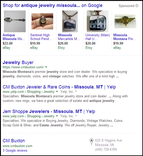
I use Google Chrome in incognito mode to search for my review candidate every week. This week I did a search for "antique jewelry Missoula Montana" and saw these results:

There are 5 products showing at the top of that screen shot. Those are Google AdWords ads placed there by eBay and Etsy.
CM Buxton Jeweler is the first organic listing below the products.
Here's the website: http://www.cmbuxton.com; you might want to open it up to follow along as you read this review.
Usability Issues:
Every page of the site has a header slide show with the same 10 images. This slide show becomes very boring after the first page, especially when you realize you need to continually scroll down past it to read the real content of that page.
Although the continual scrolling on a desktop computer is annoying, things get really bad when you view the website on an iPad. The JavaScript that controls the slideshow feature does not work on Apple devices. If you hold your iPhone or iPad in the portrait orientation (tall), you are able to see the entire website for each page you visit.
However, when holding your iPad and iPhone in the landscape orientation (wide), you only see the website header and the broken slideshow. On the Apple devices, you only see the top 630px of the page, and the header + slideshow is 627px tall. It's extremely deceiving for users because it looks like nothing changes when you tap on the navigation.
What I Didn't Like About the Site:
* There is a lot of jewelry on their website. I like that they have all this jewelry, but the photography is very poor. None of their items are fully in focus. What they need to do is change their camera settings to F36 with an ISO 400. They probably would need brighter illumination than what they previously used, and they might need a tripod for the camera. Settings like this would ensure their jewelry is always in focus.
* I don't like their logo color at the top of every page. It blends in too closely with the background.
What I Liked About the Site:
I eventually figured out that you could navigate to deeper inside pages of the product catalog. Their navigation was not intuitive to figure out, but I did understand it once I found it.
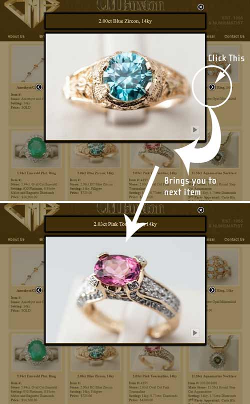
I clicked on one of the items on this page:
http://www.cmbuxton.com/coloredstone2.html
When I clicked the item, I was hoping to see more product details than what that page had to offer, but it only opened a popup of the ring.
I found it convenient that they included a right/left arrow so you can navigate through the larger product images without closing them and clicking on the next one.
This screen shot illustrates the catalog navigation:

SEO Situations:
* Every page of your website should have a unique page title, and this is exactly what they did. Their page titles are short and they accurately describe the page. Good job here.
* On the other hand the meta descriptions are not unique. Some of the pages share the same meta descriptions. Although Google does not use the meta descriptions for ranking, they do recommend that the descriptions be fully descriptive and unique for each page. An easy way to find duplicate meta descriptions is to look at the HTML Suggestions in your Google Webmaster Tools account. Google generally ignores the duplicate meta descriptions and they will replace them with their own. You should think of your meta description as a short sales message that will convince people to click your link from the SERPs. Do you want to leave your sales message up to machine automation? Or would you rather write the message yourself?
That's it for this week's basic review.
FTC Notice: I randomly choose this website and won't be telling the retailer jeweler that I'm doing a review. Unless someone else tells them, they will only find out about this review if they examine their Google Analytics and Google Webmaster Tools. I'm not doing this to solicit business from them, but rather as an educational exercise for everyone. This review is completely impartial and all my comments are listed in the order that I discovered them.


